How to Start with Product Walkthrough, Tools, and Four Stellar Examples to Follow


The difference between a user sticking with or abandoning your product often comes down to their first few minutes of interaction. Product walkthrough tools have proven an excellent way to guide and help users understand and use all your product's features.
Here's why interactive software walkthroughs (sometimes also called “flows”) matter:
- Guide new users through your product's main features to prevent them from feeling lost.
- Help users quickly understand the value of your product by leading them to their "aha moment."
- Decrease the number of support tickets by proactively explaining features.
- Draw attention to features that make your interactive product unique.
- Gather information about user preferences and behaviors for future improvements.
- Increase the chances of users upgrading to paid plans for freemium products.
In this article, we’ll share actionable steps for building an interactive product walkthrough that engages and retains your users. We will also highlight some key features of walkthrough tools in modern onboarding platforms and dive into some standout examples of product walkthroughs and their components. First, let's focus on critical steps for preparing and building an interactive walkthrough.
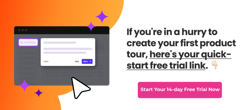
Try building your first interactive walkthrough now. Start by creating your account.
Part 1: How to start with interactive walkthroughs
Here are A few tips for creating an interactive walkthrough for your product:
1. Setting goals for a product walkthrough
Start by setting clear targets for your interactive walkthroughs. Analyze the main friction or churn points in your application. Define improvements in adoption, conversion, or usage that you would like to achieve. Think about how you can guide users or help them reach set goals while increasing their satisfaction.
To set the goals, you must:
Identify your users' friction points and needs
- What do new users struggle with most?
- What features do they often overlook?
- What tasks are essential for them to get value from your product?
Pick what to measure, for example:
- How many users stick around,
- how fast users do important tasks,
- what percentage of your customers use key features,
- number of help requests,
- how satisfied are users with your product or service.
Set clear product or business-related targets, such as:
- 70% of new users should start a project in 5 minutes,
- 50% more people should use analytics in week one,
- 20% of freemium users should convert within a certain number of days,
- lower the number of tech support tickets or calls by 30 %,
- NPS score should improve by 20 %.
2. Analyzing user onboarding use case
Before you build your guided walkthrough, it's wise to analyze your specific use case. This step helps you create an interactive walkthrough that fits your product and users perfectly.
You need to consider the following:
User types
Your users may have different preferences and needs regarding onboarding/adoption platform use. Some may welcome proactive help and guidance, others prefer to activate it when needed, and most experienced groups might find any pop-ups too intrusive and annoying. That is why you should:
- Identify your main user segments (e.g., beginners, power users, different job roles).
- List their tech-savviness levels, goals, and potential pain points.
- Consider creating persona profiles to understand each group better.
- Think about limitations and preferences of these segments or personas - experienced users prefer much less guidance, novices may need more detailed explanations.
- Avoid overloading users (even the new ones) with too much guidance.
User journey
Product walkthroughs' onboarding, adoption, and retention functionality works best when you focus on actual churn or pain points your users face. That is why you need to analyze user journeys:
- Map out the typical path users take when first using your product
- Identify common drop-off points or areas of confusion
- Note any features that are often overlooked but provide high-value
- Start with tools you most likely already have, like Google Analytics, to track user behavior in detail (paths, time on page, clicks, drop-off points
- Use heatmap tools like Hotjar or Crazy Egg to see how users use your site.
Platform key features
Is your product web-based, mobile, or desktop? What functionalities does it have, and which should be covered by (probably multiple) guided walkthroughs? Each platform has different design constraints and user expectations.
- Web-based: Consider browser compatibility and responsive design
- Mobile: Think about touch interactions and limited screen space
- Desktop: You might have more room for detailed explanations
Complexity of walkthrough
The scope of the product walkthrough you design should reflect the complexity of your product and/or the steepness of the learning curve users face.
- Assess how many features your product has and their intricacy
- Determine if you need multiple shorter interactive walkthroughs for different sections, launched individually (you do not want to have a complex product with complex onboarding added on top)
- Consider a tiered approach: basic walkthrough for essentials, advanced for power features
- Consider walkthroughs/flows, welcome or feature tours, and other onboarding content that is already available in your onboarding platform, and make new additions consistent.
User feedback
Make sure you include existing sources of user feedback or consider creating new effective feedback channels as one of the walkthrough functions along the user journey:
- Use quick built-in feedback functions available in interactive product tours (feedback element or card),
- display satisfaction rating or NPS survey CTA at a suitable moment,
- review support tickets: Look for recurring issues or questions,
- analyze user reviews: Note both positive and negative comments,
- consider user interviews or other forms of detailed feedback.
Competitor analysis
Always learn from competitors or vendors of similar products or services in other market segments and look for any you can try.
- Study similar products' onboarding processes
- Note what works well and what's missing
Data collection planning
Data is new oil - or so they say. They fuel digital processes and make them run smoother.
- Decide what user actions you want to track during the walkthrough
- Plan how you'll use this data to improve the walkthrough and product
- Think about data you may already have, such as Google Analytics
- Once you use an onboarding platform like Product Fruits, you can use its built-in analytics functions and integrate third-party platforms.
Power tip: User testing platforms. Consider UserTesting or Testbirds. These services let you watch real people use your product and hear their thoughts as they do so. You can set specific tasks for testers and see how they handle them. This gives you direct insights into user experiences and helps you understand what's intuitive and confusing in your product.
3. Ideal product walkthrough tools: transparent, no-code & AI-powered
Those responsible for customer onboarding or success prefer to be in full control when designing, building, and implementing product walkthroughs (and other onboarding or adoption tools). This is best achieved with an onboarding platform offering a no-code approach, which provides a convenient, simple, and intuitive environment without coding or programming requirements.
Moreover, onboarding or user adoption platform should work as an extra invisible layer added over your existing cloud application or service without altering its appearance or interfering with its source code. Onboarding platforms like Product Fruits allow you to build engaging interactive product tours without writing a single line of code.
Ultimate walkthrough tool tip: Let the AI do the first steps for you
AI should be more than a copywriter or headline whisperer. AI can work as an assistant that will draft entire walkthrough segments (so-called product or feature tours) - all you have to do is review or tweak them. In the case of Product Fruits, this includes:
- Smart element detection: The AI automatically identifies and selects the appropriate UI elements for your walkthrough steps - it can even automatically generate a welcome tour and product tour for you. This speeds up the creation process and reduces the chance of errors in element selection.
- Content generation: Use Product Fruits AI to generate in-app checklists and tooltips based on your product's interface and functionality. This feature can save time writing content and provide consistent messaging throughout your walkthrough.
- AI engagement: AI engages users throughout their lifecycle with pop-ups, banners, and surveys.
Our users prize AI, which can create onboarding segments, especially in the beginning, when they are unsure where and what to start with. AI makes the whole process faster and easier.
Here’s more about it:

Try building your first interactive walkthrough now. Start by creating your account.
Part 2: Four stellar product walkthrough examples
Product walkthroughs come in many forms, and learning from successful app walkthrough examples can inspire your designs. Let's explore some website walkthrough examples we have picked among our client references.
Hustro
Hustro is a construction management software application that helps streamline various processes on construction sites.
The Hustro used Product Fruits to introduce new or forgotten features to educate users. Their method stands out for its user-friendly design and thoughtful implementation.
What did we like in Hustro's walkthrough?
- They start their in-app “communication campaign promoting new features” with the announcement banner displayed with segmentation only to existing users (new users don't know what is new, right?). The announcement pop-up generated by Product Fruits AI is the first element in the overall promotion flow, leading the users through the CTA button to a new feature discovery through a step-by-step feature tour.
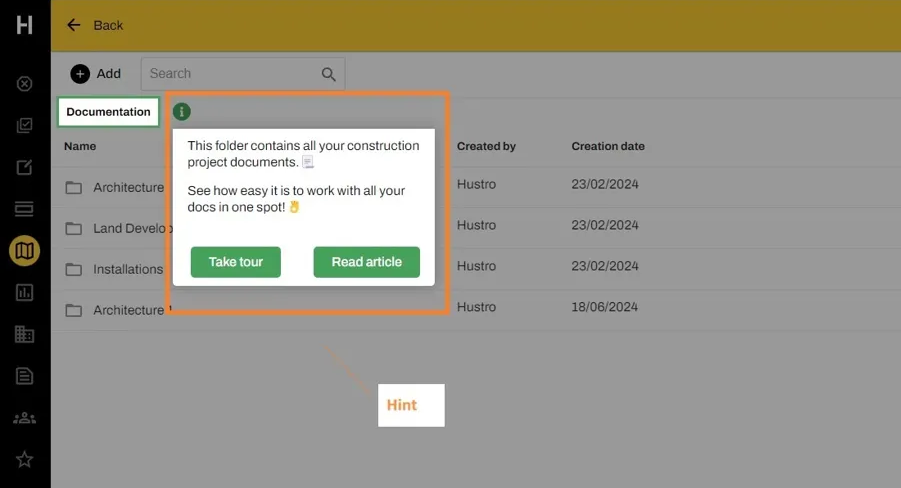
- They use tooltips and hints that appear right where users need them. This ensures users learn new features on the spot once the “Active parts” of in-app promotion are skipped, dismissed, or finished (such as the announcement banner) - see screenshot 1.
- Hustro mixes different types of walkthrough components, including feature tours, hints, and checklists. This variety keeps users engaged and caters to different learning styles.
- The walkthrough includes navigating users through new features from different angles (e.g., teaching them to use a new function through a feature tour and getting them acquainted with an article or video).
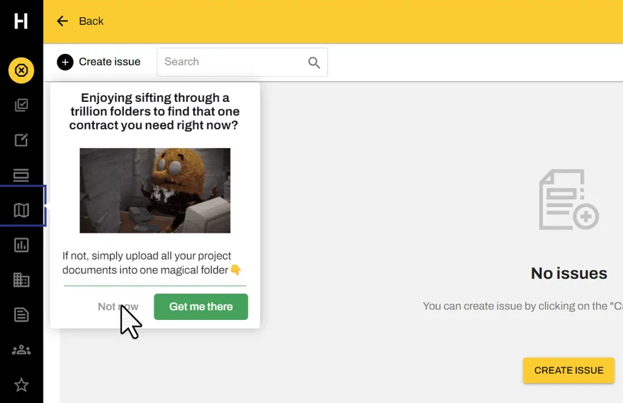
- Hustro also adds a light touch with fun images and casual language, making the walkthrough feel less like a chore - see screenshot 2.
- The "HELP" widget (Life Ring Button) in the corner ensures ongoing support for the entire platform. However, Hustro also uses this important support widget to promote new key features.
Keboola
Keboola is an analytical tool that helps companies manage and analyze their data. It allows users to connect various data sources, transform data, and create visualizations.
They used Product Fruits to improve how new users learn to use their platform and turn more trial users into paying customers. Keboola achieved this by creating interactive walkthroughs that guide users through the most significant features and use cases of the Keboola tool and by adding helpful hints and tips that appear when users need them
What we like in Keboola's walkthrough:
- They created a custom demo with three knowledge levels (respecting their learning curve): beginner, advanced, and expert
- The onboarding walkthrough looks like a natural part of their platform, as the Product Fruits Checklists are embedded into the Keboola demo site.
- Each user level by knowledge has at disposal one onboarding flow: An embedded checklist with interactive feature tours
- An announcement banner with a call to action button allows users to start their own projects after they learn all the information from the onboarding flow.
- A help center button gives easy access to information
- They quickly change and improve the user onboarding based on user feedback
- The walkthrough includes calls-to-action, like prompting users to create their project
- They use data from Heap analytics to see how users interact with the product tours
The results were impressive:
- User onboarding became 29% faster (from 17 minutes down to 12 minutes)
- Conversion rate improved by 8%
- The product team saved 20% of their time on onboarding tasks
- Reduced repetitive tasks for the team by 70%
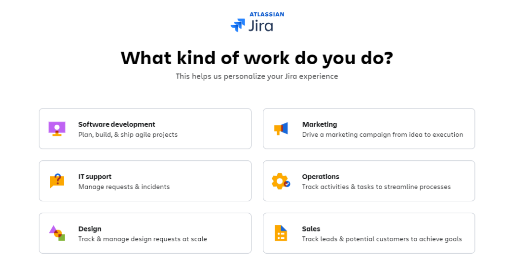
Jira
Jira is a widely used project management tool known for its flexibility in handling various workflows, particularly in software development.
Their product walkthrough aims to help new users navigate Jira's features and quickly set up their first project.
What we like about Jira's walkthrough:
- They offer a role-based onboarding experience tailored to different team members
- The walkthrough uses a step-by-step guide to create a user's first project
- They provide pre-made templates for common project types to speed up setup
- Jira uses interactive tooltips to explain key features as users explore
- The walkthrough has a progress bar to show users how far they've come
- They offer a 'sandbox' environment for users to practice without fear (only available on Premium and Enterprise plans)
- Jira provides contextual help and a quick-access knowledge base
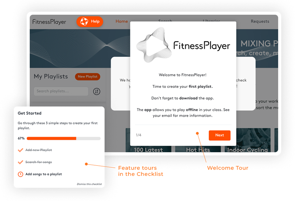
FitnessPlayer
FitnessPlayer is an app that helps fitness studios and trainers create legal music playlists for their classes. Before implementing Product Fruits onboarding flow, their primary challenge was to stop high volume drop-off from free trial by setting a simple yet contextual navigation through the first steps.
FitnessPlayer used Product Fruits to:
- Make a "Get Started" checklist for new users
- Create feature tours for creating playlists, searching songs, and finalizing playlists
What we like in FitnessPlayer's walkthrough:
- They created a simple three-step onboarding process for new users
- The walkthrough uses a checklist to keep users on the right onboarding track
- They explain each critical step in using the app through Product Fruits feature tours, which are launched either from a Welcome tour or an onboarding checklist
- A help center widget gives users easy access to resources and support whenever they need to come back to initial steps after a longer logging break
- FitnessPlayer uses in-app surveys to get feedback and improve the app
- The onboarding elements match the app's brand design
- They created different surveys for happy users and those thinking of leaving
The results were impressive:
- Reduced churn from free trial users by 70%
- Increased paying customers by 50%
- Helped users quickly understand the app's value
- Gathered helpful feedback to improve the app
As you've seen from these examples, a well-designed product walkthrough can significantly improve users' learning and enjoyment of your product.
The key is to understand your users and what they need. Then, use onboarding or a digital adoption platform like Product Fruits to build the first interactive walkthrough for your users. With its no-code approach and AI-powered features, Product Fruits makes creating, testing, and improving your walkthroughs easier.
Create your winning product walkthrough now!
Sign up to Product Fruits (two weeks are on us!) to get:
No-code interface
The platform uses a visual drag-and-drop editor, allowing non-technical team members to build interactive walkthroughs. This democratizes the creation process and enables product managers, customer success teams, and marketers to craft and update guides independently.
Customization options
You can design branching scenarios, interactive quizzes, and tooltips to guide users through your product. The platform also provides advanced targeting capabilities that let you display specific walkthroughs to user groups based on their characteristics or actions.
Integration capabilities
Product Fruits connects with widely used platforms and tools like HubSpot, Segment, Intercom, and Google Analytics. This integration lets you include walkthrough data in your current workflows and analytics systems. It provides a more complete view of user engagement and product adoption.


Weekly newsletter
Get the latest releases, tips, articles, and exclusive interviews delivered to your inbox weekly—no spam!