12 Onboarding email examples to increase trial to conversion in 2025


The very first impression of your business makes a lasting impact on the customer journey.
For many, it's usually an onboarding email. They become the first point of contact with users when they sign up for your product or service.
They move the needle toward a free trial to a paying customer or to churn.
So, no pressure… but it’s a pretty important step.
We’ve gathered 20 examples to show you how to complement your onboarding flow with emails from successful B2B companies.
Our goal is to inspire you with creative emails that come with actionable practices that will help you reach your email and onboarding KPIs.
Here’s a summary:
- Onboarding emails boast a 94% open rate, compared to the average email open rate of 26%.
- Welcome emails set the tone for the rest of the user journey and relationship with your product.
- Onboarding and educational emails continuously provide value to users by sharing helpful tips, tricks, and social proof.
- Conversion emails reinforce the value of your product and entice deals to drive users down the buyer's funnel.
- Your emails only convert if your onboarding flow is helpful, delightful, and customizable.
Why are onboarding emails important?
Onboarding welcome emails are the kickstart to a strong brand and user relationship. Welcome emails boast a 94% open rate, compared to the average email open rate of 26%.
Because of their high open rate, onboarding emails are helpful tools for communicating with users and keeping your product top of mind during their free trial or first interactions.
Emails help complement the onboarding journey by:
- Proactive conversation starter: Onboarding emails can guide users through their journey by providing helpful tips, tricks, and practices. Additionally, you can address any questions or concerns they may have about your product.
- Keep users engaged: Send emails with valuable products and features. This can help prevent them from losing interest or forgetting about your product during their trial period.
- Build a relationship between the user and brand: Share fun webinars, courses, and content that build your brand personality and authority in the industry.
- Offer timely deals and offers: Make users feel special and offer discounted offers or incentives to upgrade.
We’ve split onboarding emails into three categories to create a comprehensive guide.
- Welcome emails
- Onboarding and educational emails
- Conversion emails
Welcome onboarding emails - Go beyond the introduction
Welcome emails set the tone for the rest of the user journey and relationship with your product. It’s the first point of interaction with a new customer, and the foundation for their impression of your brand.
Because welcome emails are the first point of contact, they offer an opportunity to build your brand, welcome users, and share delightful content to start on a positive foot.
1. Start with a big welcome and introduce goals, like Coda
Welcome your users and let them know how excited you are to help them reach your goals. This shows that you understand their pain points and challenges, and appreciate their business.
Coda, a collaborative workspace platform, uses a large chunk of their email space to hone in on welcoming their users with clever and brand-specific content.
The email is straight to the point and provides users with the resources they need to accomplish their goals, in this case, “ collaboration”, “project tracking”, or “wiki hubs”.

Why does this email work?
✅ Welcomes user to Coda
✅ Directs users to resources to reach their relevant goals
✅ Includes a learning and help center in case users face any roadblocks
✅ Has a clear “start here” section.
2. Help visualize the next steps, like Miro
If your product is simple and straightforward to use, lay out the exact steps in the welcome email.
This helps to show how quickly users can solve their problems and the exact steps that need to be taken.
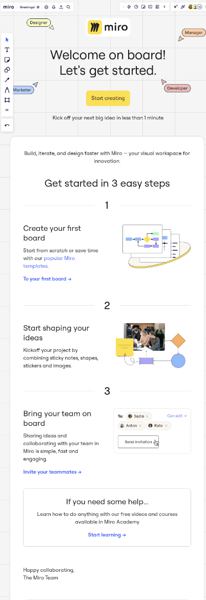
Miro, a digital whiteboard platform, does a great job of welcoming their users with helpful instructions that show users how to start using their platform.
Why does this email work?
Miro’s email works because of the following:
✅ Clear instructions that are shorter than three steps
✅ Visual aid with images to highlight what the product looks like
✅ Calls out its persona profiles: Marketer, product manager, designer, etc…
3. Use Checklists to create task orders, like Mailmodo
Checklists guide users through the set list of tasks they need to complete to be fully onboarded onto a new platform. They help reduce overwhelm and allow users to explore at their own pace.
Usually, checklists are helpful for feature-rich and extensive platforms. They help break up pieces of information into digestible tasks.
By having a checklist in your welcome email (and in your app) users can get acquainted to your platform naturally.
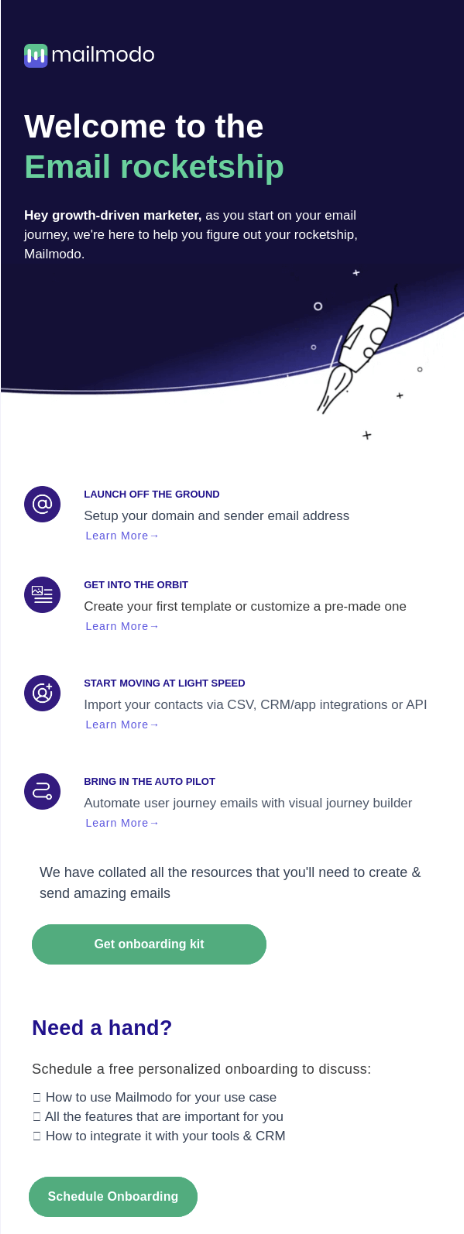
Mailmodo does a great job by welcoming new users to their platform, and offers them tasks broken down into different goals.
Bonus: Mailmodo really emphasized its brand identity through colors, visuals, and writing style.
Why does this email work?
✅ Checklist broken down by goals
✅ ”Learn more” button to direct users to the relevant resources
✅ Enhanced brand colors and personality throughout the email
4. Gamify the first interactions like LifeSum
To create habits and build intrinsic motivation, gamification in the welcome email can be a great tool.
With a set list of tasks users can tick off through actions gives users an order and direction to follow. This avoids feelings of overwhelm, and instead motivates users to accomplish tasks.
It’s also good practice to include links to your knowledge base or help center just in case users encounter any roadblocks to implementation.
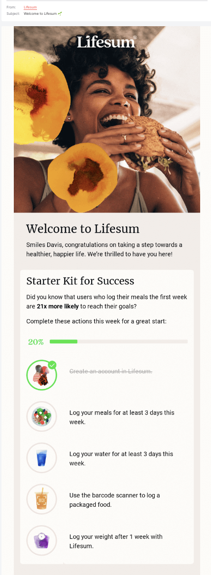
Lifesum, a health and lifestyle platform, includes a to-do list in its welcome emails to motivate users to fulfill their tasks.
Why does this email work?
✅ Includes a progress bar to motivate users
✅ Uses social proof through “users who log their meal in their first week are 21x more likely to reach their goals” .
✅ Ticks off the first item on the list to motivate the user
✅ Gamifies the process to boost intrinsic motivation from users to complete each task
Onboarding and educational emails - Continuously provide value
Once the user has signed up and is slowly starting to navigate your platform's onboarding features ( product tours, checklists, walkthroughs), then it's time for engagement tactics to begin.
The goal with emails at this stage is to reinforce the value of your platform to your customers. You want them to experience all the features and benefits you provide to drive them to the conversion.
Here are some examples of how to engage with your users.
5. Share helpful tips and tricks, like Grammarly
Yes, a platform that solves your users' challenges is the most important for customer retention. But, a platform that goes above and beyond with features and tricks that delight users is also important for customer loyalty.
Once users have reached their goal (which should be the first onboarding flow), then you can introduce the delightful features. This can be done through in-app announcements and hints.
But, if they’re ignored, a helpful email nudge is a supportive tool.
Here’s an example with Grammarly, a spelling and grammar platform that offers its users extra helpful tips and tricks.
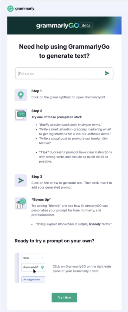
In this case, Grammarly highlights how its feature, “Grammarly Go”, helps generate text when you face writer’s block. Not only do they describe the feature, but they also offer helpful prompts and examples to show you how many creative options users have access to.
Why does this email work?
✅ Examples are shown to help explain the feature
✅ A quick button that leads the user to the feature directly
✅ Ordered steps and instructions to prove how quick and easy the feature is
6. Check up on users and offer help, like Product Fruits
Use behavioral data and onboarding completion rates to check on users struggling with product adoption.
You can send them a helpful email with recommendations and tutorials to help them get back on track and succeed in their onboarding journey.
In this case, avoiding promoting more products or plans is important. Instead, this is the time to show support to your users and become a helping hand.
Take a look at how Product Fruits, a Digital Adoption Platform, monitors users who are forgetting valuable features, offers the value behind their use, and provides instructions on how to get started.

Why does this email work?
✅ Share value behind “abandoned” features
✅Uses behavioral data to create relevant emails
✅ Keeps the email format straight and to the point
7. Provide social proof for encouragement, like Google Analytics
Social proof helps users make buying decisions. They prove that your platform has already made a positive impact on another business and is worth its dollar.
Social proof can come from customer reviews, testimonials, case studies, or recommendations. Each is from one customer who advocates the benefit of your product.
In fact, 78% of users agree product reviews are instrumental in making a purchase decision, and a WikiJob study found that social proof can increase conversions by 34%.
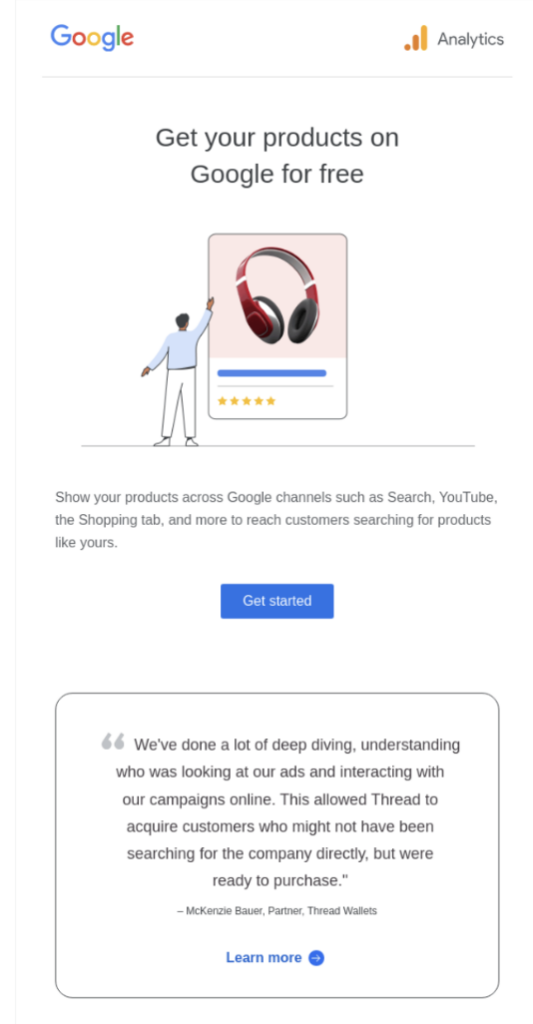
Here’s an example of how Google Analytics uses social proof. They include a client's quote stating the problem they faced, what they needed, and how Google helps them accomplish their needs.
Why does this email work?
✅ Uses a quote from an actual user with links to more reviews
✅ Social proof includes the problem most users face
✅ Relevant social proof to increase the validity and authority of a product
8. Share progress reviews and their earned value, like Loom
Send out emails that complement the actions and tasks earned from users. Through email reviews, you can highlight your user's actions and accomplishments.
These email reviews should be purely to help users see their new platform's value and encourage them to continue with the same behaviors.
Here’s an example of how Loom, a video-sharing platform, congratulates and encourages actions from users through their complementary email campaign.

Why does this email work?
✅ Puts relevant data and goal accomplishments to each user
✅ Highlights the ability of Loom to solve the problem of unnecessary meetings
✅ uses available data to personalize accomplishments for each user
9. Invite users to relevant onboarding webinars, like Zoom
Onboarding webinars are a tool to create two-way communication and boost interaction.
Webinar content can help users onboard, solve their queries, or share expert tips and tricks that maximize their results on your platform. The goal is to provide relevant and helpful content that proves your product and helps their business.
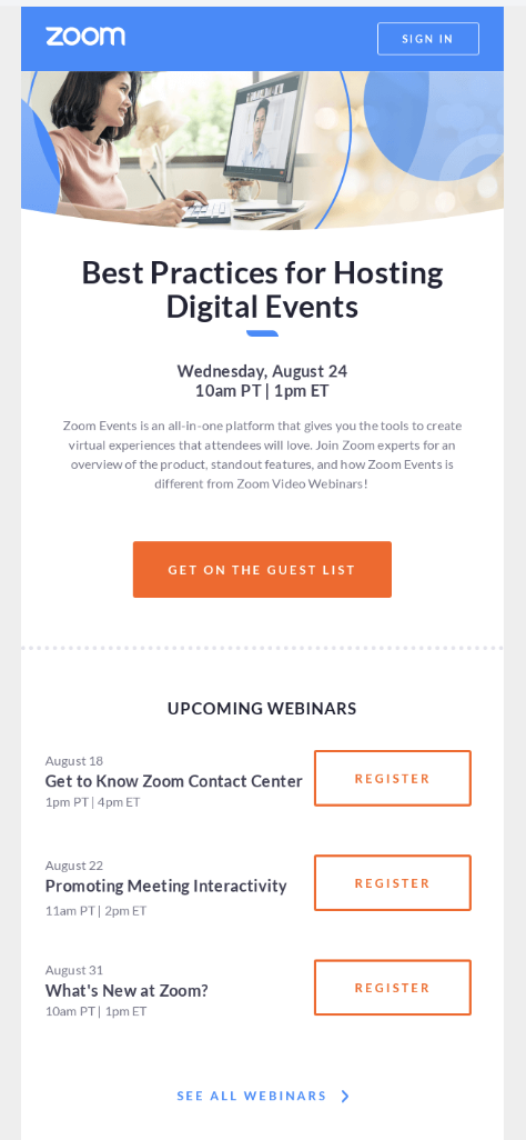
Here’s how Zoom, a digital meeting platform, includes webinar invitations in its emails. The webinar is relevant to the goals of most Zoom users and can help make using the product smoother and, therefore, more valuable.
Why does this email work?
✅ Educational webinars to show users how to maximize the success of your platform
✅ Complimentary webinars that are relevant to users needs
✅ Easy to sign up for each webinar, which increases the likelihood of signups.
10. Show Off Your features, like Stripe
Engage with users as they learn more about your platform and get them excited about other up-and-coming features.
Emails are a great way to communicate with users who might skip in-app announcements and miss out on new features.
Here’s an example of how Stripe, an online payments platform, shares insights and features with users through email.

Why does this email work?
✅Shares features and different use cases for every business to relate
✅Includes logos to build authority
✅Has clear and clean copy that focuses on highlighting feature functionality
Further reading: Product Launch Emails: How to Create + Examples, Templates
Conversion emails- Don’t lose those trial users
After the free trial ends, the countdown to when users need to convert starts. However, the work of proving the value must be done before the final days. That's when onboarding emails play a big part.
Your “conversion emails” need to reinforce your product's value and entice deals to drive users down the buyer's funnel.
11. Reinforce your platform's value, like Slack
As users approach the end of their trial, emails can serve as value reinforcers to convert them to paying customers.
It’s helpful for emails to emphasize the benefits of their product, the challenges they solve, and the next steps to take after a trial.
Here’s an example of how Slack reminds users of their Pro benefits.
They can remind users of their offer, what they’ll get from their platform, and how it helps their business.

Why does this email work?
✅Includes an offer that’s only a click away
✅Reinforces the value that a premium account offers
✅Shares deadline and pricing plan comparisons
12. Create urgency, like Shopify
Include a deadline and countdown to increase the urgency of conversion. The idea is to make customers feel like they might miss out on a great offer and, therefore, need to take action before it expires.
If you feel that there’s a delay between trial users becoming paying customers, it might be worth testing to see if countdowns and limited offers increase speed to conversion.
Here’s an example of how Shopify introduces urgency. They include a deadline for the free trial, a comparison of plans, and explain how their product solves their customer's pain points.

Why does this email work?
✅Introduces a deadline and a lost opportunity to create urgency
✅Includes a plan comparison button
✅Emphasizes the benefits of their product for business growth
Your emails only convert if your onboarding flow is helpful, delightful, and customizable
Your emails work in partnership with a strong onboarding strategy that includes a successful in-app onboarding experience where users receive their "aha moment" and understand the value of your platform.
Without the onboarding tools that communicate the value of your platform, your emails will not be as effective.
By combining our toolbox of onboarding elements with strong email campaigns, you can ensure a comprehensive onboarding experience for your users.
Want to learn more? Book a free call with our user onboarding specialists to receive a tailored approach to your onboarding goals.


