7 In-App Announcements Examples & Why they work


You've launched your new app or website, acquired new users, and checked off the marketing and sales tasks– Great! But… that’s just the tip of the iceberg.
The average app loses 77% of its daily active users (DAUs) within the first three days after installation. The real challenge is to keep those users engaged, demonstrate the app's value, and, ideally, convert them into paying customers- the ultimate goal for any SaaS brand.
In-app announcements play a crucial role in this process. They go beyond mere alerts; they guide users through instructions, highlight new updates or features, and welcome users to the platform.
They are proven game-changers, boosting retention by 30% when properly implemented.
Read this blog to learn how to use in-app announcements for various goals. We've compiled best-case examples to give you a closer look at their versatility and value.
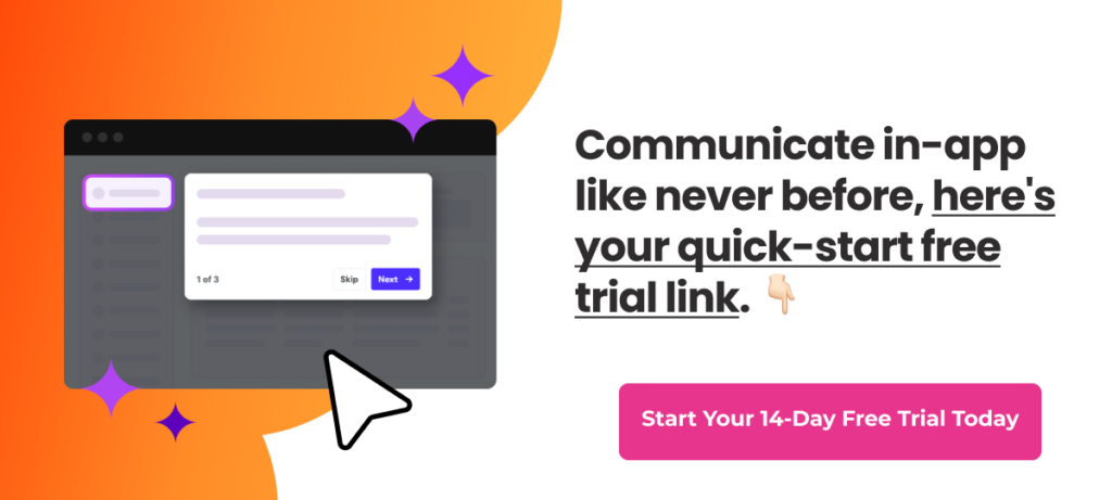
Pressed for time? Dive into Product Fruits 🍇 and craft your first in-app announcement now with a free 14-day trial!!
In-app announcements examples and types
In-app announcements enhance the user journey. They introduce new product updates that facilitate onboarding, announce offers and webinars, and gather feedback.
The following examples show how SaaS brands use in-app announcements to their advantage.
Let's jump into it.
1. Showcases exclusive offers using a banner
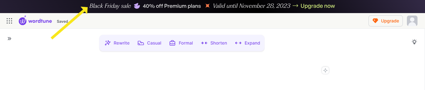
Image source: Wordtune’s summarization panel
Wordtune strategically used in-app banners on top to put a spotlight on exclusive offers, most notably during the Black Friday sale. The persistent visibility of the banner swiftly communicates time-sensitive deals and promotions to their user base.
I particularly liked this use of in-app announcements because it's non-intrusive, and doesn't disrupt the smooth user experience -- it’s subtle.
Use case: Wordtune's banner uses a dynamic announcement during events like Black Friday, special offers, or even a webinar. Banners are a great example if you want to boost user engagement and conversions in a limited-time deal or any other offer.
2. Use modals to announce new features

Image source: Visme
These pop-ups aren't just alerts or pings; they are purposeful notes created with end users in mind.
Visme's playful use of modals was a clever move to keep users in the loop and excited about what's fresh with new features.
Users learn about the latest enhancements without any effort on their end. So, I find it the perfect way to stay informed without feeling bombarded. These attention-grabbing, sleek pop-ups keep the interaction snappy and impactful while educating users about new feature releases.
Use case: If you're eyeing major announcements or gearing up for a feature launch, consider using modals in your in-app communication strategy.
Fruity tip: Tie models with a quick tour. It will be a personalized guide to the new feature, making exploration easy for your users.
3. FitnessPlayer collects user feedback on their overall experience
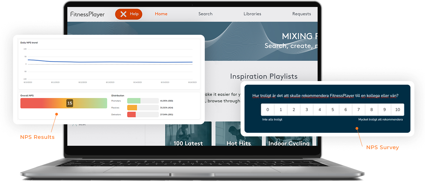
I absolutely hate it when brands overwhelm users with lengthy surveys. The response rate will be higher if it's a quick, one-question survey. Agree?
Although technically not an in-app announcment, surveys are great ways to catch a users attntion.
FitnessPlayer did the same and leveraged in-app micro surveys to collect user feedback for their overall experience.
They used Product Fruits to build the NPS survey to gauge user satisfaction and seek users at risk of churning from their pricing plan.
They kept it simple by embedding it in a friendly modal by asking one question- "How likely are you to recommend the app to a colleague or friend?" A negative likelihood of recommending the app (selecting 0-6 from 10 points) redirects respondents to the cancellation survey.
Result? You'd be amazed! (pssst… you can see FitnessPlayer’s onboarding play-by-play here).
Use case: Implement microsurveys (NPS, CSAT scores, and more) post-user interactions when seeking quick and valuable customer feedback.
Fruity tip: We also recommend API surveys in similar situations. Users can be triggered to take specific actions based on their responses. For example, offering users a discount or special offer at risk of churn.
4. Keeps users in the loop with the latest updates

Image source: Publer
Ever wish you knew about app updates without having to search? Publer gets it. They send handy in-app notifications whenever there’s something new or improved.
I believe this is an excellent strategy to drive product adoption and boost retention. When users effortlessly stay in the loop, they're more likely to stick around and explore what's new. A mutual thumbs-up for both the brand and the customers!
Use case: This is perfect for announcing the latest updates, release notes, or design improvements.
5. Personalize onboarding with a welcoming screen
Image source: Toggl
Personalized user onboarding isn't a one-size-fits-all approach. Instead, it should adapt to the user's preferences and offer a smooth introduction to the platform.
Toggl's savvy move of including a welcome screen is a user-centric win. They tailored the user journey, making users feel seen and valued. A user flow is presented to new users based on their segmentation and the direction they want to go in.
Use case: Welcome screens are most effective when segmenting new users by their roles, use cases and goals.
6. Prompt upgrades with helpful tips

Image source: Linktree
Linktree provides users with a preview of its premium features through a complimentary trial upgrade. This upselling technique increases the trial to paid conversion rates.
In contrast to traditional email promotions, this customer expansion strategy makes users more likely to engage actively with the upgrade proposition as they experience tangible benefits from the free trial.
It promotes transparency, addressing the common issues of standard emails being overlooked in spam folders or dismissed without acknowledging their value.
Use case: Brands can use a trial upgrade strategy to promote premium features and boost conversion rates. It is more effective during product launches, promotional campaigns, or when seeking to increase user engagement.
7. Notify users with in-app notifications for news and features

Image source: Wrike
Users like to stay more informed about a product's news and feature updates than anybody else. Wrike did this well by maintaining a dedicated notification center that allows users to conveniently access the comprehensive updates record. This way, users stay connected without missing out on crucial details.
This functionality helps communicate details about software updates, upcoming webinars, and other relevant content.
Use Case: Ideal feature to share information that requires user engagement, like software updates, new features, software enhancements, new features, and so much more.
Create your in-app announcements with Product Fruits
We've got to the end, and I trust these brand examples sparked your creative inspiration. It's clear that in-app announcements are like friendly nudges for guiding new users, making announcements, boosting sales, encouraging feature adoption, and beyond.
They form a crucial part of your holistic product feature adoption strategy. And to bridge the gap between your users and your product, Product Fruits provides an extra layer of customization to your platform without coding.
Why wait when you can try creating your in-app announcements today? Dive into Product Fruits 🍇 and craft your in-app announcement now with a free 14-day trial!!


Weekly newsletter
Get the latest releases, tips, articles, and exclusive interviews delivered to your inbox weekly—no spam!