Guide to User Onboarding Checklist Inspiration and Examples


The user onboarding checklist is a digital guide to help users navigate a new platform smoothly.
The checklist ensures users understand where to go and what to do, from initial setup to key features. It simplifies the onboarding process and breaks down the setup into manageable steps.
Keep reading to learn how checklists improve the onboarding process and to be inspired by some great examples of user onboarding checklists from popular SaaS brands.
Personalize your user onboarding today, 👉 create your free customized onboarding checklist now with Product Fruits free 14-day trial! 👈
What is an onboarding checklist?
An onboarding checklist is similar to a to-do list that users must complete as part of the user onboarding process.
The checklist aims to reduce frustration and friction and provide a structured roadmap to help users understand the product's value.
A good checklist drives user activation by helping them realize where and how the new tool fits into their workflow and sets them up for long-term success.
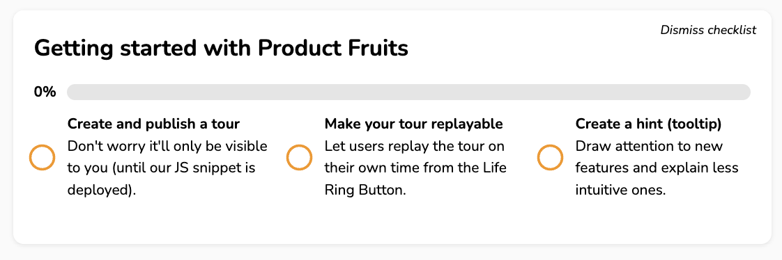
For instance, this onboarding checklist from Product Fruits facilitates a seamless start by guiding users through essential steps such as creating a tour and a tooltip. This allows users to acquaint themselves with the platform's offerings quickly.
But why should you create a user onboarding checklist?
A study revealed that 43% of users said onboarding checklists were a helpful piece of the onboarding puzzle.
And here's why Checklists help to:
- Save time: Users quickly understand the order of steps and boost efficiency by breaking tasks into manageable steps.
- Reduce overwhelm: For feature-rich platforms, checklists help set user expectations to develop familiarity and reduce anxiety.
- Active engagement: Checklists drive users to take certain actions, which makes them form habits and engage with the platform.
7 customer-centered onboarding checklist examples
User onboarding serves as a bridge between potential users and product adoption. Each onboarding flow should recognize users' diverse needs, goals, and preferences.
The same applies to each onboarding feature; it must be flexible to customize the onboarding experience.
By checking out these examples and using clever ideas, you can ensure your onboarding is right for your users.
1. DocuSign guides the user through the first two items
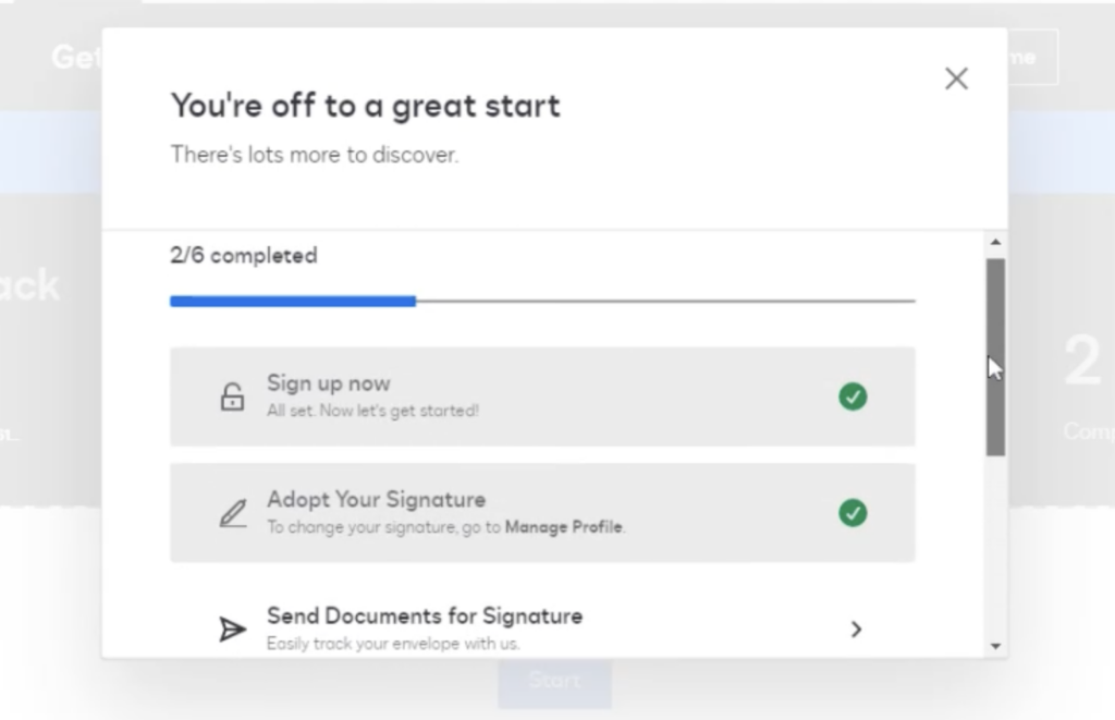
DocuSign, a digital transaction management tool, sets the bar high with a user-friendly onboarding approach.
First, they prioritize simplicity by swiftly guiding users through the initial steps and marking tasks as 'done.' This minimizes the overwhelming feeling that often comes with new platform exploration.
Second, visual cues and clear language allow users to grasp the tasks and quickly understand the benefits of each action. This sets the tone for a smooth journey.
(Image Source: DocuSign)
What inspiration can you take from the DocuSign onboarding experience?
Two things to take notes on:
- Visual clarity
Incorporate visual cues like checkmarks or hover effects to guide users through your onboarding journey. This visual aid assures users of their progress, which builds confidence in using your platform.
- Inform user autonomy
Communicate the knowledge the user will acquire, outline the steps involved, and offer options to pause or resume the onboarding journey. Checklists provide a self-serve way to give users feature tours, onboarding guides, and more. Users who check off one checklist item and trigger a tour are 21% more likely to complete it, and 60% will go on to complete another.
This further allows users to skip or retrace their steps, reinforcing the freedom to explore and onboard at their own pace.
2. Evernote points to the checklist right after entering the app
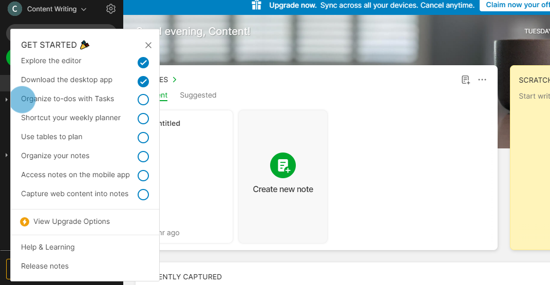
Evernote, the note-taking app, facilitates user onboarding by centering the checklist upon entering the app.
This strategic placement gives users immediate access to all the essential pointers they need to complete, alongside options for upgrading, help, and learning resources.
(Image Source: Evernote)
What inspiration can you take from the Evernote onboarding experience?
Here are a few things to take notes on:
- Checklist at your fingertips
Take a cue from Evernote and make your checklist easy to find. When users open your app, ensure the checklist is visible and clickable.
This simple tweak makes onboarding a straightforward journey for your users.
- Help and learn without the hunt for support resources
Following Evernote's lead, integrate help and learning options into your checklist. No more digging through menus – make these resources easily accessible.
Fruity Tip: Link your checklist to your knowledge base and help center. That way, users can quickly access all the tutorials and resources they need to navigate the platform confidently.
- Take advantage of your CTA opportunities
Instead of a generic CTA button, try personalizing your messages.
Tailor your CTA suggestions based on how users interact with your app, and make it feel like a customized journey rather than a routine upgrade.
3. Loom adds links to resources directly from the checklist tasks
Loom, the video messaging app, keeps things easy with a concise six-step checklist. It goes the extra mile by adding direct links to tutorials within each checklist item.
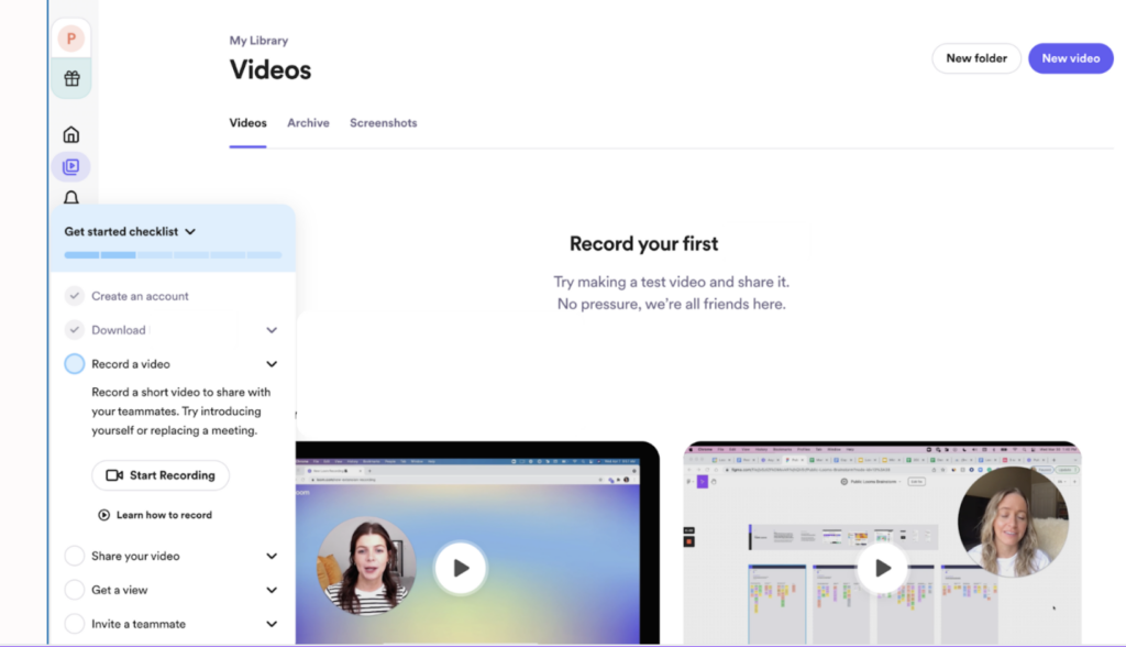
What inspiration can you take from the Loom onboarding experience?
Here are a few things you could add to your checklist:
- Simplify the steps to amplify learning
Cut unnecessary steps and make the onboarding journey short and sweet. Provide users with the resources they need for further learning to turn each step into a valuable learning opportunity.
- Embed learning in every step
Infuse learning directly within your onboarding steps. Instead of just guiding users through tasks, show them how tutorials are linked seamlessly.
You can incorporate the life ring button as a quick-help feature. This ensures users have instant access to assistance whenever needed.
Additionally, you can leverage the knowledge base as a comprehensive resource—similar to a library of information. Users can dive deeper into concepts and troubleshoot independently.
Together, these make learning easy, and support is always handy.
- Clarity is the key
The thumb rule is to communicate in the simplest terms.
Clearly explain what users need to know to start using your product. Through well-crafted onboarding copy, user interface (UI), and user experience (UX) design, uphold transparency and declutter the user experience. Avoid jargon that might befuddle users.
4. Calendly does a clever integration and activation through checklists
A complicated onboarding process can make users want to switch, and 89% of potential customers consider doing so if things get too tricky. So, retaining users and ensuring they get the most out of a tool is equally important.
Take Calendly, the go-to meeting scheduling app, for example. It stands out for simply integrating the activation moment—connecting your calendar—into its onboarding journey.
Right after signing up, Calendly gets you moving smoothly. It asks you to create a special link and set your time zone—essential moves to ensure you get the most out of Calendly. The suggestion to sync your calendar is a nice touch, and a progress bar shows you how far you've come.
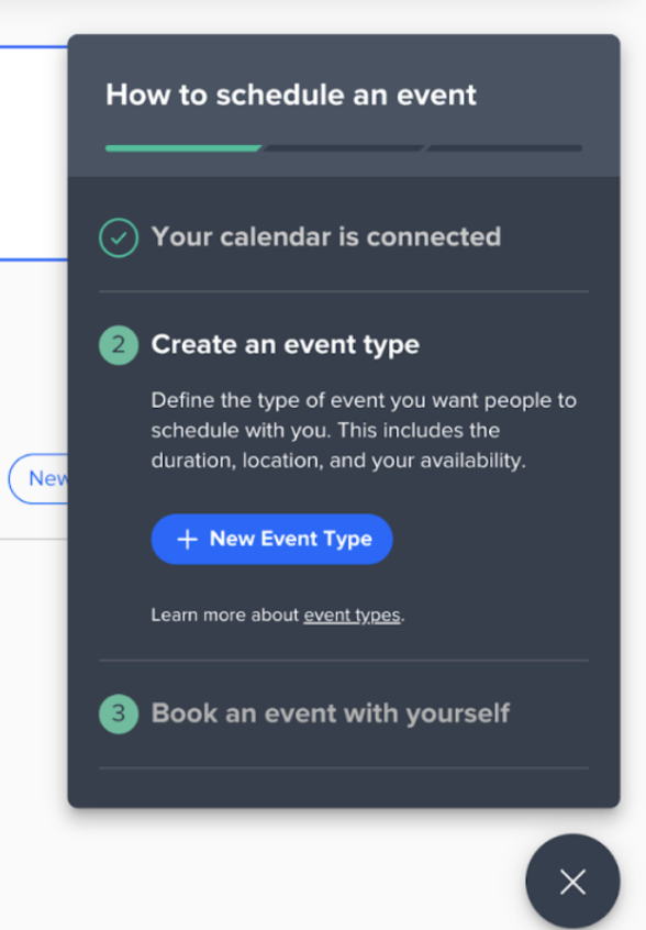
What inspiration can you take from the Calendly onboarding experience?
Here are some ideas to include in your checklist:
- Have flexibility in your onboarding checklist
Allow them to shape their journey, skipping or returning based on their liking. Placing them in control promotes a sense of ownership over the onboarding process.
- Conversational onboarding
Go beyond mere guidance; engage users in a conversation. Understand their preferences and needs and try to make onboarding an interactive dialogue rather than a unilateral process.
You can gather information using interactive elements like chatbots or interactive forms and tailor the onboarding experience based on individual responses.
Encourage users to ask questions and provide timely responses to make the interaction more dynamic.
- Address user challenges proactively
Proactively tackle user challenges by anticipating potential hurdles within your product.
For example, Calendly emphasizes integrating it with the user's calendar for maximum potential and value.
Recognize it as a crucial step, but make it easy and part of the onboarding checklist so users can do it without any trouble.
5. Intercom splits the checklist into chunks
Rather than having an endless list of items, group them into easy-to-digest chunks if you create a more comprehensive product onboarding checklist.
Intercom nails user onboarding by ditching the overwhelming checklist chaos. Instead of throwing everything at users, break down the steps into manageable actions.
Each chunk has a specific set of tasks, which makes it much less overwhelming. This way, users can conquer one task at a time, feeling accomplished without the headache.
It also shows how long each task will take to complete and how many tasks are in each chunk.
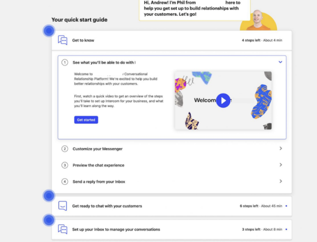
What inspiration can you take from the Intercom onboarding experience?
Here are some things to add to your checklist:
- Break up your onboarding tasks
If your product onboarding checklist is extensive, don't bombard users with overwhelming tasks. Break down each feature into multiple steps to ensure a gradual learning process.
To organize your onboarding effectively, you can organize tasks based on user goals, roles, or experience levels. Tailoring the onboarding journey to these factors can make it more personalized and manageable.
For example, new users might have a different set of tasks than experienced ones. This approach enhances user friendliness and provides a more customized onboarding experience.
This makes the onboarding process more user-friendly and less daunting.
- Time and task transparency
Provide users with estimates of the time required for each task and an explicit count of tasks in each chunk. This sets realistic expectations and enables users to plan their engagement effectively.
Fruity tip: User onboarding tools like Product Fruits let you add simple user onboarding checklist widgets without coding. You can either embed your checklist or use it as an overlay.
6. Hubspot includes step-by-step guidance
Every phase of HubSpot's onboarding journey is meticulously planned and structured. It offers users a structured path to navigate the platform's features, optimize their marketing efforts, and achieve their business goals.
At every step, users receive explicit instructions. Clear content eliminates ambiguity and streamlines the learning curve.
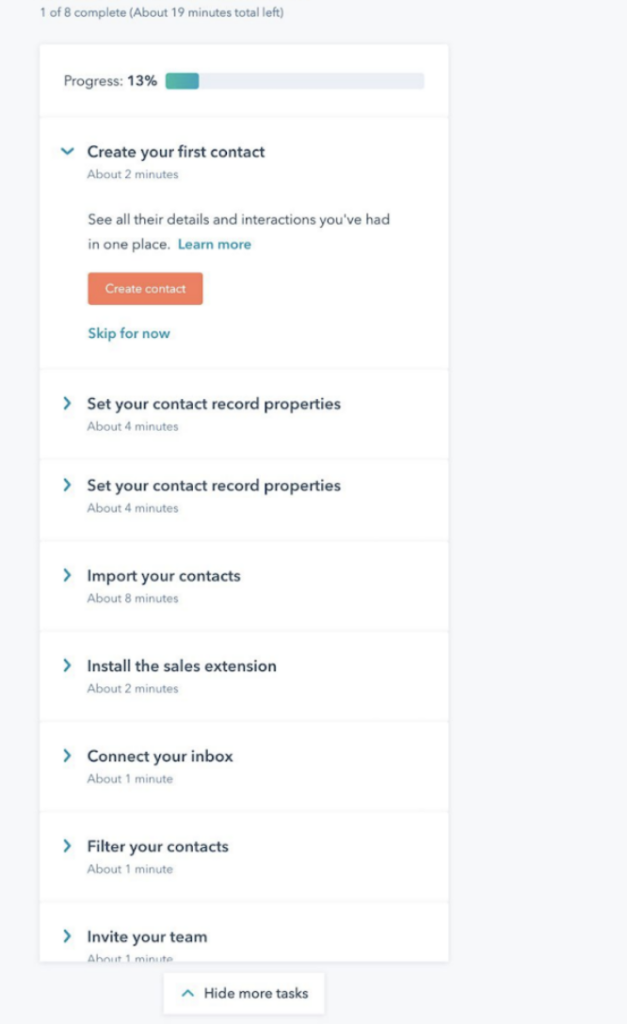
What inspiration can you take from the Hubspot onboarding experience?
Here’s what you could add to the checklist:
- Sequenced guidance
Organize your onboarding checklist into a well-sequenced series of steps. Provide users with a clear roadmap that guides them from initial setup to advanced features in a logical order.
- Feedback mechanism
Consider incorporating feedback mechanisms at various stages to gather insights into user experiences. Understand the user's needs and continuously refine the onboarding process based on real-time feedback.
- Allow users to skip steps
Acknowledge that not all users will want to review every checklist item. Provide the flexibility for users to skip unnecessary steps. Self-serve guidance (triggered voluntarily by the user clicking a hotspot/coach mark) sees a 123% higher completion rate than tours triggered automatically by the product.
So they can tailor the onboarding experience to their needs. This user-centric approach will avoid unnecessary hurdles and create a smoother onboarding journey.
- Contextual guidance
Refine your approach to contextual onboarding guidance by with tooltips designed to provide users with specific information during their platform navigation task-oriented assistance.
7. GetResponse uses a progress bar
GetResponse, an email marketing tool, uses a progress bar to provide users with a visual representation of their journey through the setup. It helps users track their advancement, clearly indicating completed and pending steps. This way, they have a transparent view of their onboarding status.
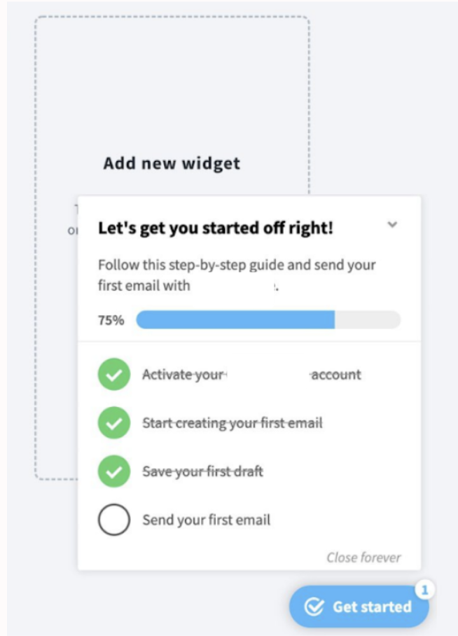
What inspiration can you take from the Getresponse onboarding experience?
- Visual tracking for user engagement
Implement a progress bar in your onboarding strategy to enhance user engagement and offer a visual roadmap. It will help users know their current stage and encourage them to proceed by showcasing their accomplishments.
Fruity tip: Start with the first item checked off (e.g., Sign up). This makes users feel accomplished and one step closer to their goal.
Create onboarding checklists with Product Fruits
Hooray! You've successfully drawn inspiration from leading SaaS brands; now it's time to craft your onboarding experience.
Use powerful tools like Product Fruits to break down intricate software onboarding into clear, step-by-step guides without any coding.
With Product Fruits, you can use user segmentation and custom rules to personalize checklists and track onboarding behavior and completion rates. This allows you to identify satisfied customers who complete every onboarding step or extend support to those who may need a helping hand.


