How a Global Co-Working Platform Converts Trialists and Retains Customers 🚀🔥

In this case study, you will learn how FLOWN:

  • Onboards and converts free trial users into paid customers (in B2C segment)
  • Boosts feature penetration and user retention
  • Customizes Product Fruits elements to seamlessly integrate with the FLOWN UI
  • Enhances customer experience with A/B testing
quotes

For a product like FLOWN, highly personalized in-app communication with our users is crucial to our success. By delivering the right messages and content at the right time to the right users, we’ve significantly enhanced engagement and improved product adoption. Product Fruits has also reduced time to value for new users, helping them quickly recognize the benefits of our platform.

Guy Brockless, Product & Strategy

Director, FLOWN

Flown logo

FLOWN is a global virtual co-working platform for remote workers, offering facilitated sessions, a 24/7 Drop-In room, and member-hosted options. It also provides 1:1 and group coaching, along with educational resources, all available through individual and corporate memberships.

challenges icon

Key Challenges

  • Low user activation and product adoption rates
  • Lack of personalisation in onboarding content
  • Time-consuming onboarding flow preparation and development
  • Lengthy A/B testing and deplomyent cycles
solutions icon

Results

  • Increased feature penetration
  • Greatly improved UX for users seeking support and resources
50%
reduction in onboarding
flow deployment time
2x
more A/B tests per month with
minimal engineering support
Use case #1

Converting Free Trial Users into Paid Customers

FLOWN utilized Product Fruits to create a personalized onboarding experience with Embedded Checklist and Tours, boosting user engagement and session participation.

This conversion process includes two phases:

1.1. Activating Trial Users through Welcome Onboarding

FLOWN aims to quickly guide new users to their activation moment, defined as joining a live co-working session. Users attending 4+ sessions are more likely to convert to paying customers. To facilitate this, FLOWN offers a 30-day free trial and uses Product Fruits for personalized onboarding.

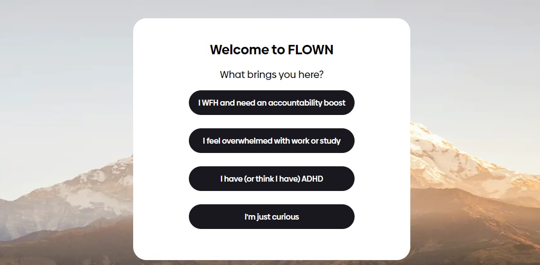
Upon signup, a modal Tour Card asks new users their reason for joining (e.g., ADHD, concentration issues, curiosity, etc.). This helps tailor the user experience by guiding them to relevant sessions and content (videos, articles).

Product tour

Tour card

Post-signup, users see a dashboard with:

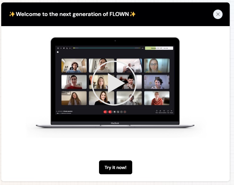
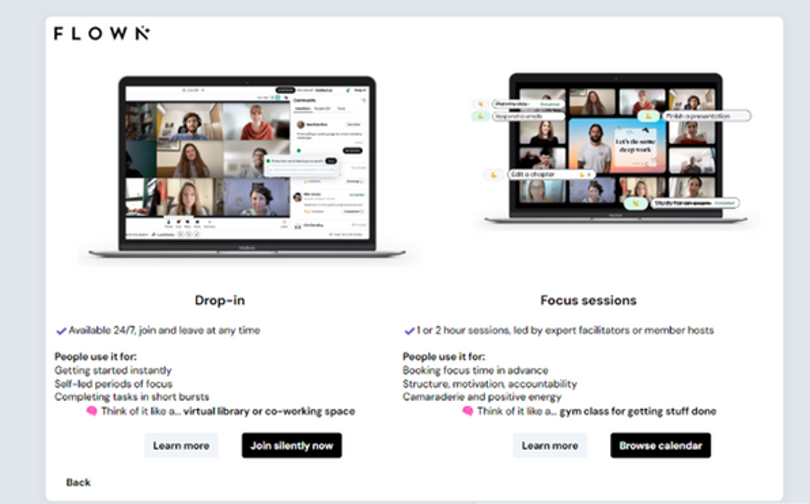
  • a Welcome Tour Card offering options to join a session (leading to a calendar) or watch a video guide.
Welcome cards​

Welcome Tour

Product tour

Life Ring Button with Newsfeed and Feedback widget ​

Life Ring Button with Integrated Product, Feature Tours, and Feedback Widget

Embedded checklist with step-by-step tours targets trial users, directing them to key platform thematic sessions in the calendar overview. ​

FLOWN also opted for a Life Ring Button, Newsfeed, Tooltips and Feedback Widget for 24/7 self-service assistance, which reduces support requests and aids navigation. These elements are available to all users unlike the targeted tours (seen only by trial users, users attending 2+ sessions, etc).

1.2. Converting Free Users into Paid Customers ​

After the 30-day trial, engaging Tour Cards, Announcements banners and freemium Checklist are shown based on segmentation criteria to encourage freemium users to:​

  • Join their first session (if not done during the trial)
  • Participate in thematic webinars and mentoring sessions

Embedded Checklist, similar to the one for free trial users, is a key onboarding element in the freemium flow. ​​

Its personalized content encourages freemium users to engage more actively in themed events and even start hosting their own sessions.​​

Product tour

The customized Life Ring Button (Help Center) icon is displayed in the bottom left corner, the Embedded Checklist is in the center, and the customized Newsfeed (“News”) icon is in the top bar of the platform.

The Newsfeed (Newscenter) is a key in-app communication element that appears twice on the platform: as a personalized "News" icon and within the Life Ring Button (in the “News” section). It’s essential for all users, promoting online events, platform releases, and updates (for example maintenance info, chat hours, and invitations to live sessions or coaching lessons, etc.) The Newsfeed allows users to revisit important information after closing pop-up banners, keeping everything accessible in-app. Best of all, users don’t need to leave the platform to stay informed about the latest announcements.

The newsfeed is displayed twice: first in the top bar with a personalized 'News' icon, and second in the 'News' section of the Life Ring button.

The newsfeed is displayed twice: first in the top bar with a personalized 'News' icon, and second in the 'News' section of the Life Ring button.

quotes

The flexibility of Product Fruits is invaluable. Its no-code setup and customization features allow us to deliver tailored content seamlessly, significantly improving user engagement.​

Guy Brockless, Product & Strategy

Director, FLOWN

Guy Brockless

💡

Fruity Tip: FLOWN employs Product Fruits for A/B testing to refine user flows and maximize conversions. By testing various UX copy and interactions, the team quickly identifies the most effective approaches, allowing for rapid adjustments without involving development resources.

USE CASE #2

Retaining Paid Customers through Engagement Flows

FLOWN actively engages paid users by involving them in shaping the FLOWN+ program. Through Product Fruits in-app elements (Tour Cards, in-app Announcements, Surveys, Support widgets), and Customer.io gamification, FLOWN boosts feature adoption and user engagement.

The FLOWN+ program offers paid add-ons to the core membership, including: ​

  • Join their first session (if not done during the trial)
  • Participate in thematic webinars and mentoring sessions

The FLOWN Product Team uses the following Product Fruits elements to drive user engagement:

The Newsfeed and announcement elements (pop-ups and banners) are significant communication elements in the retention flows as well. The Newsfeed centralizes all types of news, while banners and pop-ups deliver important updates.

Welcome tour

Announcement Banner​

Welcome tour

Pop-up Banner​

Banners are used for regular updates. For example, banners for segmented user group might announce thematic support sessions or productivity coaching, ensuring the content reaches users who are most interested. General updates, like rescheduled sessions or platform maintenance, are delivered without segmentation to keep all users informed.

For significant updates, FLOWN employs large modal Pop-ups to capture user attention. Product Fruits' AI-powered templates help Flown quickly create visually engaging announcements, improving both the speed and quality of communication.

quotes

Segmentation is crucial for personalized user engagement. By targeting specific user groups with relevant announcements, we avoid overwhelming users with unnecessary information, keeping them engaged without overloading them.​

Guy Brockless, Product & Strategy

Director, FLOWN

Engaging Tour Cards are used to encourage attendance at thematic sessions, sign-ups for coaching lessons, and other actions.

Product tour

Tour Card

Life Ring Button with Integrated Product, Feature Tours, and Feedback Widget

Tour Card

Welcome tour

Survey for Paid Users

Surveys are another puzzle piece into regular in-app communication with existing and paid users. For this user segment, the FLOWN team uses surveys to check the optimized time of favorite sessions for paid users or their personal thematic preferences within the FLOWN+ program.

quotes

Product Fruits is vital for staying in tune with our users and conducting product discovery. I make sure our team has regular discovery calls with users, and we can easily target specific segments through Product Fruits’ targeting and tours.​​

Guy Brockless, Product & Strategy

Director, FLOWN

Guy Brockless

💡

Fruity Tip: Using Product Fruits’ "Custom Rules," FLOWN targets specific user segments—such as paid members—with personalized messaging. For instance, feedback surveys are triggered after users attend a session, ensuring the platform continuously gathers relevant insights and improves.​

Conclusion:

FLOWN's strategic use of Product Fruits has significantly transformed its user experience, driving higher product adoption, improving user retention, and enhancing overall customer satisfaction. Through personalized onboarding, user segmentation, gamification, A/B testing, and email marketing automation, FLOWN has streamlined its processes, reduced time-to-value, and successfully converted free users into loyal, paying customers—all while keeping them engaged and active.

Get in touch with us

Would you like to learn how to set up your own user onboarding? Book a call with our adoption expert!

No credit card needed, free 14-day trial.
aicpa soc badgeiso 27001 badgehipaa badgegdpr badge
© Copyright 2024 Product Fruits. Made with ❤️ in Czech Republic, EU
youtubelinkedin