What Lessons Did Video Games Teach Me About Customer Experience for SaaS?


So, what did video games teach me about customer experience for SaaS?
I'd like to share a couple of tricks I've learned over the years (sometimes in a hard way :) ) during my video games career. Each lesson will help you successfully adapt to your SaaS business to boost the trial conversion and user engagement.

Here's a little background...
I have a long history working in the video games industry. I worked as a designer, producer, CEO, and founder of several game development companies.
Video games have taught me a lot about customer experience. Some lessons that I'm happy that I can benefit from with Product Fruits now, where we put a big focus on the customer experience, product adoption, and user engagement.
Are video games even relevant to SaaS?
Oh yes, they are.
A game is a product you don’t really need to use. You really just play games because you enjoy it.
But what about SaaS? You use CRM (Customer Relationship Management) or some project management tool because you need one, right? But is that really all?
Think about how you feel when you enjoy using an app. You're excited to see how much work you’ll accomplish, and thrilled about time-hacking and boosting your productivity. Am I right? Of course I am –– it's fun.
In business, we talk about productivity, priorities, and KPIs, but at the end of the day, we want to do what makes us happy.
Happy in that particular moment. We feel accomplished when we work with CRM, AI-powered tools, or whatever crazy app your CEO "recommends" this week.
And, using SaaS tools is like playing video games. It’s not only about the actual achievement or level in a game your reach (how much work you did). It also very much depends on your user experience with the app, whether you really understand it, like it, and enjoy working with it.
User experience is the key differentiator among apps these days
There are tons of similar apps on the market now. We're saturated with options and choices. And I hate to break it down to you, while you may think that yours is unique –– frankly, it's not.
The difference between winners and losers is not just the feature set, but also the user experience.
Just like games, where many of them are "almost the same", but some of the games are simply more fun than others. The same applies to many Saas with similar feature sets; Some of them are much more fun to work with. And, the fun ones sell better.
The myth of the perfect design
Yes, the design of the app is fundamental, the app must be clear and smooth to use.
But thinking an app that doesn't need any additional explanation is a myth unless the app is very simple and generic (i.e. useless).
If your SaaS app is innovative or complex, you need to implement powerful adoption features, which help you to make your app more understandable, clearer, more engaging, and fun to use.
The best user onboarding takes it all
User onboarding plays a crucial role in the sales process. It usually starts with some form of free trial (every application has a free trial of some sort, despite what some product managers claim). The idea is for users to familiarize themselves with the app and decide if it solves their needs as you have promised in adverts or during persuading demo sessions.
In this moment, where you are converting a free user to a paying client, and if you fail here, you lose all the costs associated with getting that lead into your app. This is the place, where you must show your best engagement skills.
Here are a few video game tricks for user onboarding
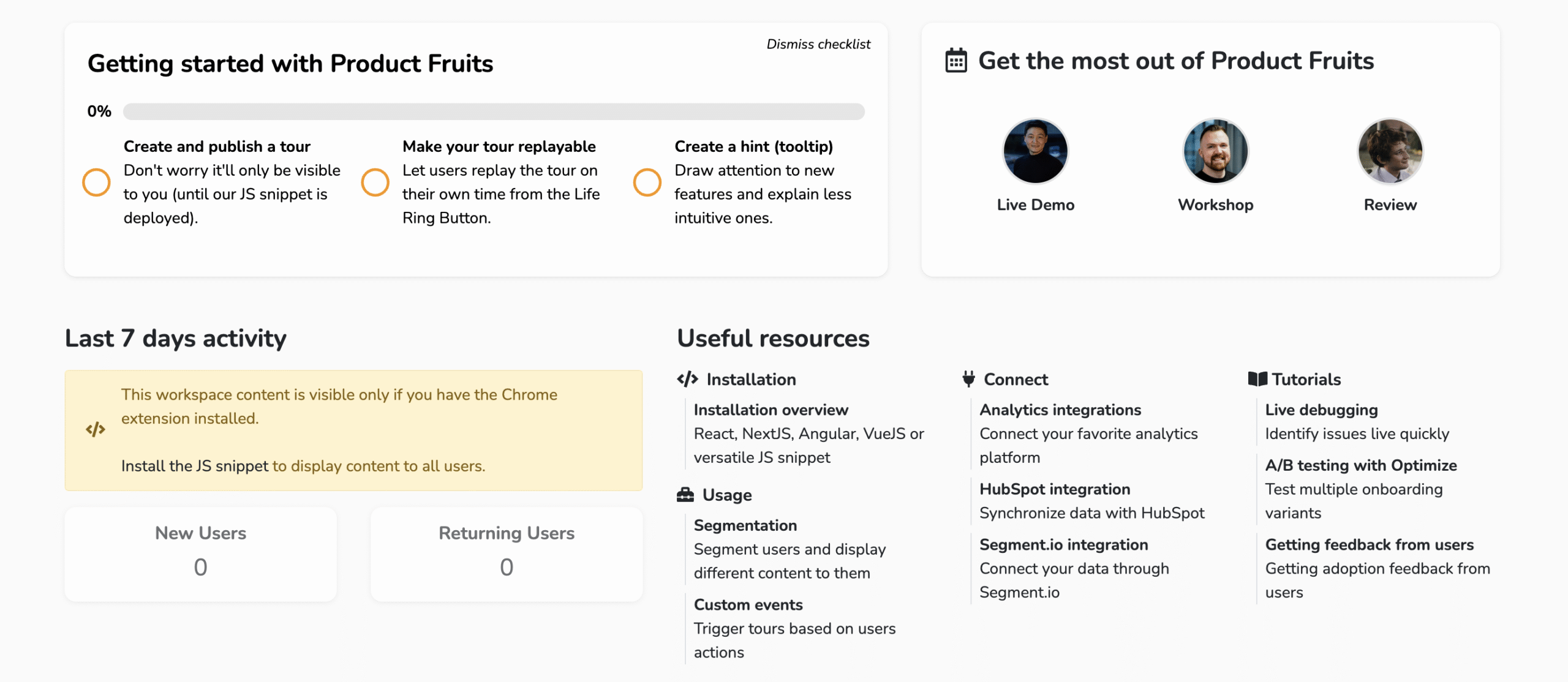
During the in-app onboarding, your user relies on step-by-step tours, tooltips, adoption meters, feedback, and any other tools you provide them with to help them understand and enjoy your app.
Yes, you can board them with a video session, but that's actually just a support (and more or less marketing) tool as an average person tends to forget a lot in one minute after the call ends.

These are the simple rules of video game tutorials:
1. Teach your users how to use the app. Simple as that. Provide tours, tooltips, hints, and checklists as a roadmap to help users fully understand the value of your product.
2. Provide users with Comfort - assuring them they are doing great and on the right track. Videogames can be pretty frantic and players need to some form of comfort zone. The same applies to Saas. Work environment could be stressful so you want to keep in mind that you are helping your users feel more relaxed.
3. Excite the users. Going back to video games comparison, you want to excite the player. This is similar to SaaS, show your customers how cool your app is by making sure you sell your best feature.

Short animated gifs are the best here. They are attention-grabbing and get more reaction. Videos are not bad at all but far from perfect. Especially long videos are not the best when the user is looking for one particular piece of information.

Just like in games, you must be very careful in over-feeding the user with long information that might be difficult to consume. Cut the user onboarding into smaller pieces of inofrmation for better reception.

I don't know about you but my patience is about 6 to 8 seconds when it comes to trying a new product. You definitely want to keep this kind of user in mind in Saas.
By keeping the onboarding information into smaller logical chunks and at the start of each tour tell the user what they will learn and if possible, how long it might take. The best would be to number the cards on your tours.

Fight the "I'm afraid I'm using it wrong, I’m getting nowhere" paranoia. Assure users that they are on the right track.

Video game tutorials are always a natural part of the game. You don’t want to explain something using general data which doesn’t belong to the player. Let them use the data they created as this motivates them.
Steering users to use their real data works better, show them the results and they will be motivated to keep their data in your app.
And remember that we are never presenting, we are ALWAYS SELLING.

If you want to learn more about user engagement, tutorials and boarding tours, I highly recommend playing video games to get the feel.
There is so much to learn and adopt.


