Product Onboarding Best Practice for New Customers


Imagine starting a road-trip without a map: you would miss every landmark worth seeing. The same logic applies to product onboarding best practice for new customers. When users arrive, they need a route that guides them to an early “aha” moment, not a maze of unexplained menus.
What is even more important, market data confirms this works: In Mixpanel’s 2025 Product Benchmarks, teams that surfaced first value inside five minutes retained 42 % more users after 30 days. That single metric frames every recommendation below.
Also, remember that what may seem to be a good enough retention or reasonable monthly customer attrition / churn rate results in much larger figures when projected annually:
- With 3,5 % monthly churn, you have to replace more than 30 % customers over a year period,
- with 5 % monthly churn you are looking at almost 50 % replaced over a year,
- and with 10 % monthly churn you need to replace more than 70 % of your customer base over one year.

A clear plan shortens time-to-value, lowers churn and begins a partnership built on trust. Our guide provides 10 simple to follow steps so you can craft an onboarding journey that delights your customers.
1 · Map the onboarding journey around user goals
You wouldn’t embark on a road trip without a map that highlights the must-stop sites. Without an explicit journey, users quickly feel lost inside your product. Interview newcomers, watch session replays and list each step between first click and core value.
Common pitfalls appear fast: overwhelm from too many options, confusing copy or technical friction. Spot those moments early and design rescue points that move users forward.
- Identify milestones → “first file shared,” “first task created” or “first invite sent.”
- Label drop-offs → screens with high exit rates or repeat errors.
- Attach metrics → activation rate, day-7 retention, NPS at milestone.
Mini-case study: Notion cut its workspace-creation flow from four screens to two in Q1 2025 and lifted day-7 retention by 12 %.
2 · Personalise the very first experience
Today’s users expect tailored journeys. Calm opens with a single question—“Better sleep or less stress?”—and adjusts screens before asking for an email. That micro-personalisation makes people feel seen and speeds them to value.
Personalisation also prevents information overload. By hiding irrelevant steps you keep cognitive load low and confidence high.
- Ask one to three intent questions up front.
- Store answers in a lightweight “onboarding state” object for instant UI changes.
- Branch emails, tours and nudges based on that state.
The future? AI segmentation tools can already predict intent from first-session clicks and can auto-select feature tips within 60 seconds, in future, these will be able to auto-generate custom individual hints, tips or tours for each user.
3 · Create a visual guidance with product tours
Product tours create a visual roadmap. The goal is to familiarise users with layout and key actions, not catalogue every feature. Keep tours short—three to five steps—and always let users dismiss them (and if possible, provide user with option to re-launch a dismissed tour, for example through a checklist).
Different tour types suit different contexts. Step-by-step tours offer self-learning flow and remain the most favoured (81 % approval). Video tours deliver a rapid overview; interactive tours layer contextual clues so users learn by doing.
- Step-by-step tour – ideal for complex dashboards.
- Quick video – great for single-purpose apps.
- Interactive tour – balances guidance and exploration.
Overall step-by step interactive tours drive higher trial-to-setup rate than static video alone, just keep them below 5 steps (so called cards).
4 · Empower users with hints and tooltips
Hints and tooltips deliver just-in-time micro-copy. Mailchimp reveals hidden power features by surfacing tiny text bubbles next to new buttons. These nudges turn small discoveries into delight.
Tooltips also double as feature-adoption engines. By highlighting recently shipped options you keep existing customers engaged without intrusive pop-ups.
- Show hints on hover, focus or first use.
- Limit to one sentence; link deeper docs if needed.
- Suppress a hint after two dismissals to prevent fatigue.
Pair each tooltip with a “Learn more” link to your knowledge base, users. There is data to back this: Zendesk reports Zendesk reports that 67 % of users prefer self‑service options over contacting support agents. And a staggering 91 % say they would use a knowledge base—if it actually solves their problem.
5 · Motivate progress with onboarding checklists & gamification
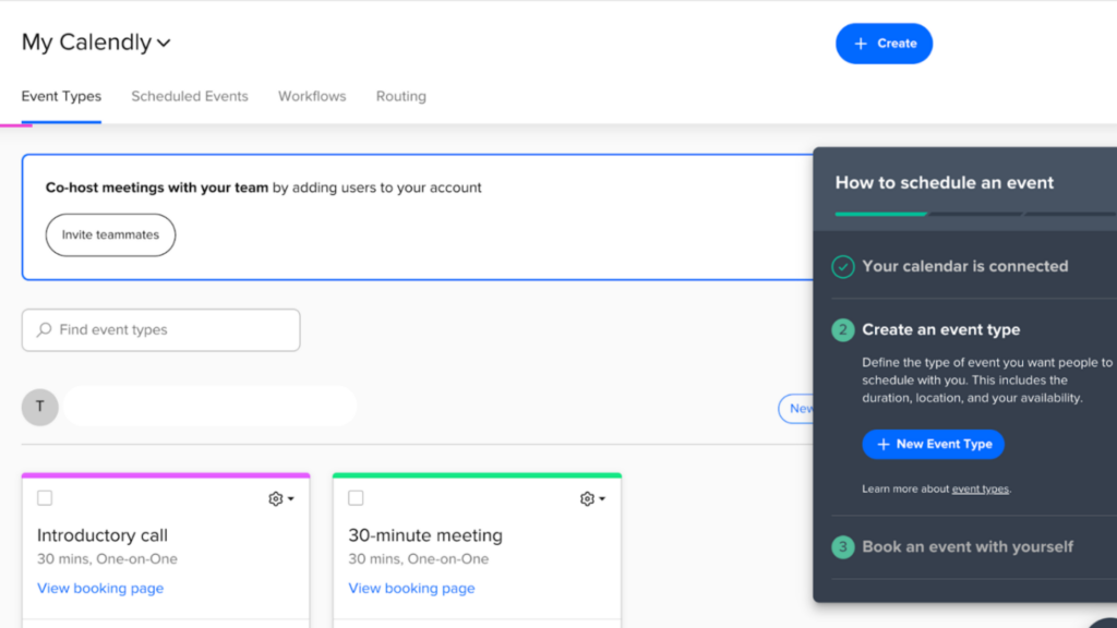
Checklists merge guidance with the dopamine hit of completion. Calendly walks users through creating their first scheduling link, one tick at a time. Each check feels like levelling up.
Gamification extends the effect. Progress bars, points or streaks encourage daily return visits—Duolingo’s approach proves the psychology.
- Limit lists to 3–7 items so every tick moves the bar visibly.
- Reward first completion with lightweight animation or badge.
Heap’s 2024 benchmark report found that adding a visible 25 % progress jump after the first action lifted overall checklist completion by 21 %.
6 · Use surveys to branch and improve
Surveys unlock direct voice-of-customer insight. Squarespace asks new site-builders about their goal and surfaces themes that match. That single question shaves minutes off exploration.
Welcome surveys also fuel ongoing product decisions. Short NPS-style polls at milestones uncover friction invisible to analytics.
- Keep initial surveys under five questions.
- Use branching logic—show follow-ups only on low scores.
- Store answers and feed them into future emails and feature gates.
Tooling tip: connect survey events to your CDP (Customer Data Platform) so marketing and success teams can trigger tailored campaigns automatically.
7 · Provide self-service resources & the life ring button
Relevant resources guarantee an onboarding flow without roadblocks. A floating life-ring opens docs, chat and tutorials. Slab links directly to its knowledge base from the first screen, teaching users to self-serve from day one.
Up-to-date documentation reduces support tickets and empowers independent exploration—an experience 57 % of users already prefer.
- Surface FAQs inside the life ring widget.
- Embed short videos for visual learners.
- Add search so users jump to answers instantly.
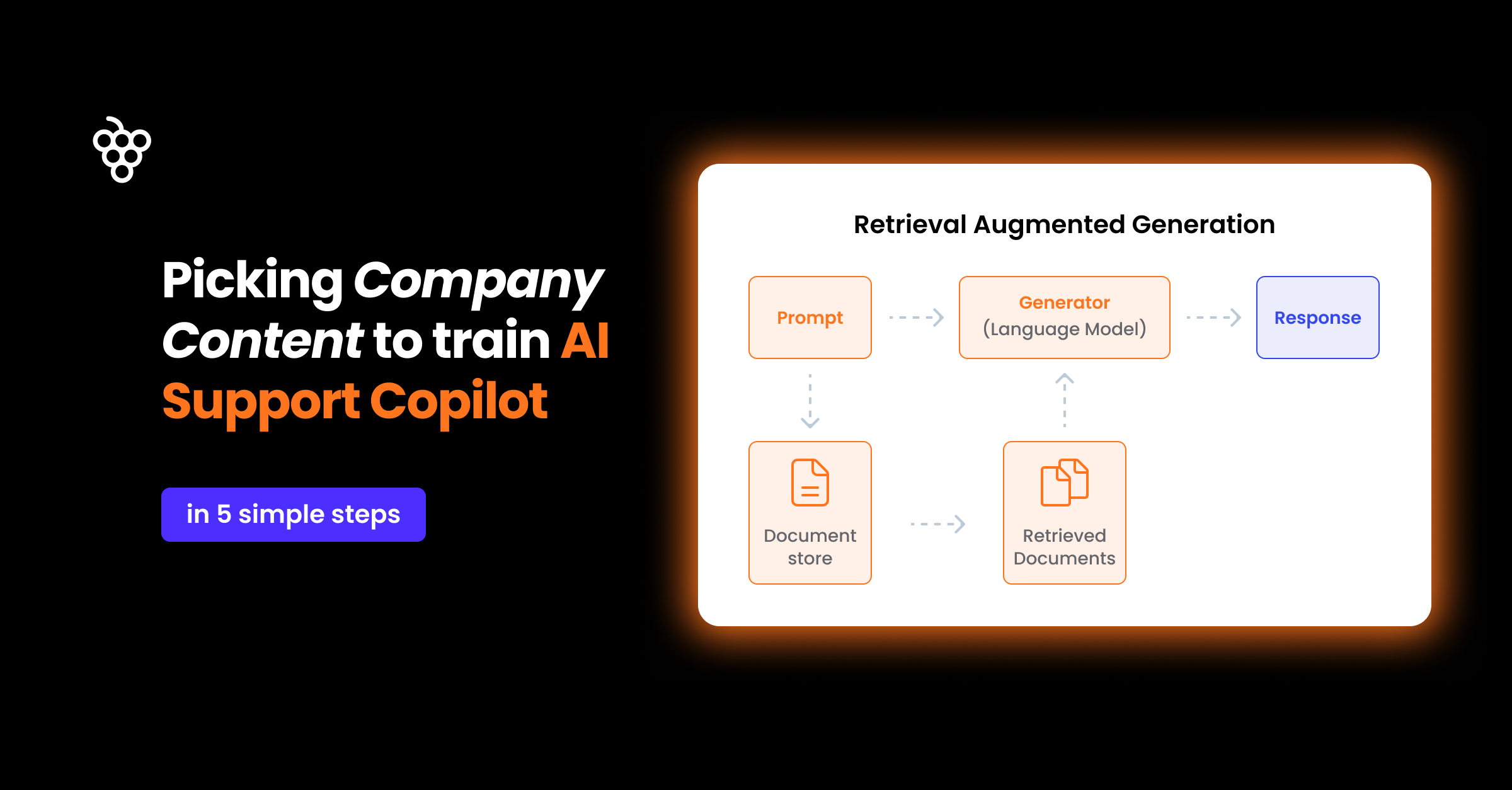
Latest tech: AI chatbots trained on your docs can now resolve 40+ % of first-week queries without human intervention (and for some use cases, can reach up to 60% resolved queries without escalation to live support). Moreover, with techniques like RAG, they minimize hallucinations.
8 · Track user behaviour to identify and remove roadblocks
Data is your diagnostic toolkit. Funnel visualisations reveal where users stall; heat-maps show confusion. Pair quantitative insights with qualitative feedback to see the full picture.
When a step-level drop appears, run an experiment: rewrite copy, shorten a form or pre-fill data. Measure the delta and keep iterating.
- Instrument each milestone event.
- Review activation, retention and engagement weekly.
- Ship one hypothesis per sprint and A/B test.
Case study: After spotting a 38 % drop on its goal-setting screen, a fitness-app cut fields from eight to three and improved completion by 24 % in May 2025.
9 · Add human touch and social proof
Automation scales, but a timely human nudge cements loyalty. A friendly email from customer success after day three can unblock hesitations and make users feel valued.
Social proof—quotes, outcomes, usage stats—adds external credibility. Calm shows a data point that 84 % of users report reduced stress, reassuring newcomers they are on a proven path.
“Don’t ask users to do a zillion things at once. Focus them on the one or two most important actions.” — Daniel Musialek
Zapier doubled trial-to-paid conversions in 2024 by adding a 15-minute “Kick-Start” call offer inside its day-three reminder email.
10 · Keep it short, sweet & straight to value
User onboarding should be a succinct, guided journey to the moment your product’s value peaks. Over-complicated flows overwhelm and degrade trust. Lead users to the “aha” within five actions, then invite deeper exploration.
After that first win, users are motivated to complete profiles, explore settings and share with peers—organic growth unlocked.
- Prioritise earliest value actions.
- Hide advanced features until after activation.
- Celebrate the milestone with lightweight motion.
Figma’s three-step “first design” tutorial delivers value in under two minutes and is cited internally as the driver behind its 60 % month-one retention.
Conclusion: structured yet flexible onboarding wins
Great user onboarding blends structured guidance with freedom to explore. By mapping the onboarding journey, personalising early steps, motivating with gamified progress and learning from data, you’ll craft a living onboarding system that welcomes every new customer—and keeps them coming back.


Weekly newsletter
Get the latest releases, tips, articles, and exclusive interviews delivered to your inbox weekly—no spam!