How to build perfect Product Tours in 2026: Best practice from a century of learning and adoption.


If you want product tours that actually move activation, adoption, and retention, it helps to start with an uncomfortable truth: product tours didn’t begin as UI. They began as learning design—a discipline obsessed with one question that still matters today: How do we help people succeed at a complex task faster, with fewer errors, and less frustration?
Strip away the UI chrome and a “tour” is simply a learning system: break the job into manageable steps, pace the user, show what matters, and help them succeed without turning their day into a training session. Those ideas didn’t start in apps. They started in factories and classrooms—long before anyone clicked Next.
TL;DR
The 10 rules of “perfect” product tours in 2026
- Design for outcomes, not UI (a tour should deliver a “first win”).
- Chunk ruthlessly (one step = one decision/action/result).
- Let actions advance the tour (behavior > “Next” clicks).
- Give micro-feedback (“You did it” reduces confusion and builds momentum).
- Keep guidance in the flow (don’t make users leave the app to learn it).
- Show, don’t tell (visual cues beat paragraphs; localization becomes easier).
- Respect context (bad timing is what makes tours “annoying”).
- Operate tours like product (metrics, A/B tests, retirement, UI freshness checks).
- Optimize for outcome, not completion rate (completion without value is vanity).
- Target relentlessly (right message, right user, right time - then add AI assistance).
We have covered this topic in shorter form in our recent webinar "What Product Tours Should Look Like in 2026", you can watch it below.
#1 The factory floor
Chunking before onboarding had a name
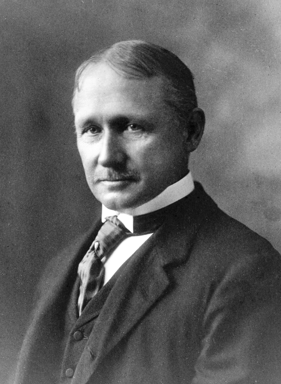
In the early 1900s, industrial thinkers were trying to solve a problem that will sound painfully familiar: how do we help people learn complex processes faster, with fewer mistakes?
One of the answers was chunking—dividing what needs to be learned into smaller, digestible units. The story often references Frederick Winslow Taylor, but the important part is the principle: when learning is broken into steps, it becomes less intimidating and easier to retain.
That’s the first hidden ingredient of product tours. Every “Step 1 of 6” you’ve ever built is basically chunking with better typography.
Tour best-practice takeaway
- Design tours around outcomes, then chunk by decision points.
A tour that says “Click here, then here” isn’t chunking; it’s choreography. Chunking means each step resolves a question: What am I trying to do? What matters next? What can I ignore? - Keep each step atomic. One step → one action → one expected result.
- Progress is a feature. “Step 2 of 5” isn’t decoration; it’s anxiety reduction.
A strong tour is a set of well-chosen chunks that escort a user from uncertainty to competence.
#2 The classroom
Pacing, feedback, and the rise of “one more step”
Fast-forward to the 1950s and you get another foundational idea: pacing—popularized through “teaching machines” that guided students in small increments, asked a question, provided immediate feedback, and only then moved forward.
This is the DNA of modern guided experiences:
- small steps
- instant feedback or reassurance
- progress you can feel
- control over when to continue
Good tours still follow this pattern. Bad tours ignore it—and feel like interruption, not guidance.
Tour best-practice takeaway
- Let user actions advance the tour, not your UI.
The best step trigger is often “user completed the action,” not “user clicked Next.” - Give micro-feedback at the moment of achievement.
“Nice—now you’ve created your first project.” Confirmation isn’t fluff; it’s orientation (and satisfaction). - Offer escape hatches. Always: Skip, Later, and Show me again.
If a tour can’t handle user agency, it’s not guidance—it’s a hostage situation.
#3 Moving “in-app”
Help systems become interaction

Once software arrived, learning systems had to be embedded inside the product experience. In the mid-1970s, IBM popularized the idea of “press PF1 for help” on S370 mainframe computer terminals, which later became the familiar F1 key on PCs. In the 1980s, productivity software such as Lotus 1-2-3 helped cement the shift: help started living alongside the work, not in separate manuals.
This transition redefined the user contract:
Don’t leave the app to learn the app.
That’s still the promise of product tours today.
Tour best-practice takeaway
- Embed help at the point of confusion.
If the user has to open a doc, search, or leave their task, your “tour” becomes homework. - Favor pull over push.
On-demand help (hotspots, checklists, resource center) often outperforms surprise popups over time.
This is the origin of what we now call contextual guidance—the point is simple: keep learning inside the flow of work.
#4 1984
The most charming guided tour you’ve never taken

Here’s a moment that feels almost impossible by today’s standards: one of the first truly complete guided tours of a mainstream computer product—Apple’s original Macintosh.
Except it wasn’t an overlay. It wasn’t a tooltip. It was… an audio cassette.
You’d put the tape into your deck, press play, and get walked through the product—more than an hour long. You can still find it on the Internet Archive, which makes it oddly soothing in a way modern onboarding rarely is.
By today’s standards it’s hilariously unscalable. But conceptually it’s very current: guide users through what matters, in sequence, with minimal friction.
Tour best-practice takeaway
- Start with the “why,” not the UI.
Orient users: what they’ll achieve, how long it takes (“Step 1 of X”), and what success looks like. - Use a “first win” structure.
Prioritize the shortest path to value, not the full feature map.
If users don’t feel momentum, they don’t finish—even if your UI is perfect.
#5 The IKEA effect
Visuals that teach without too many words
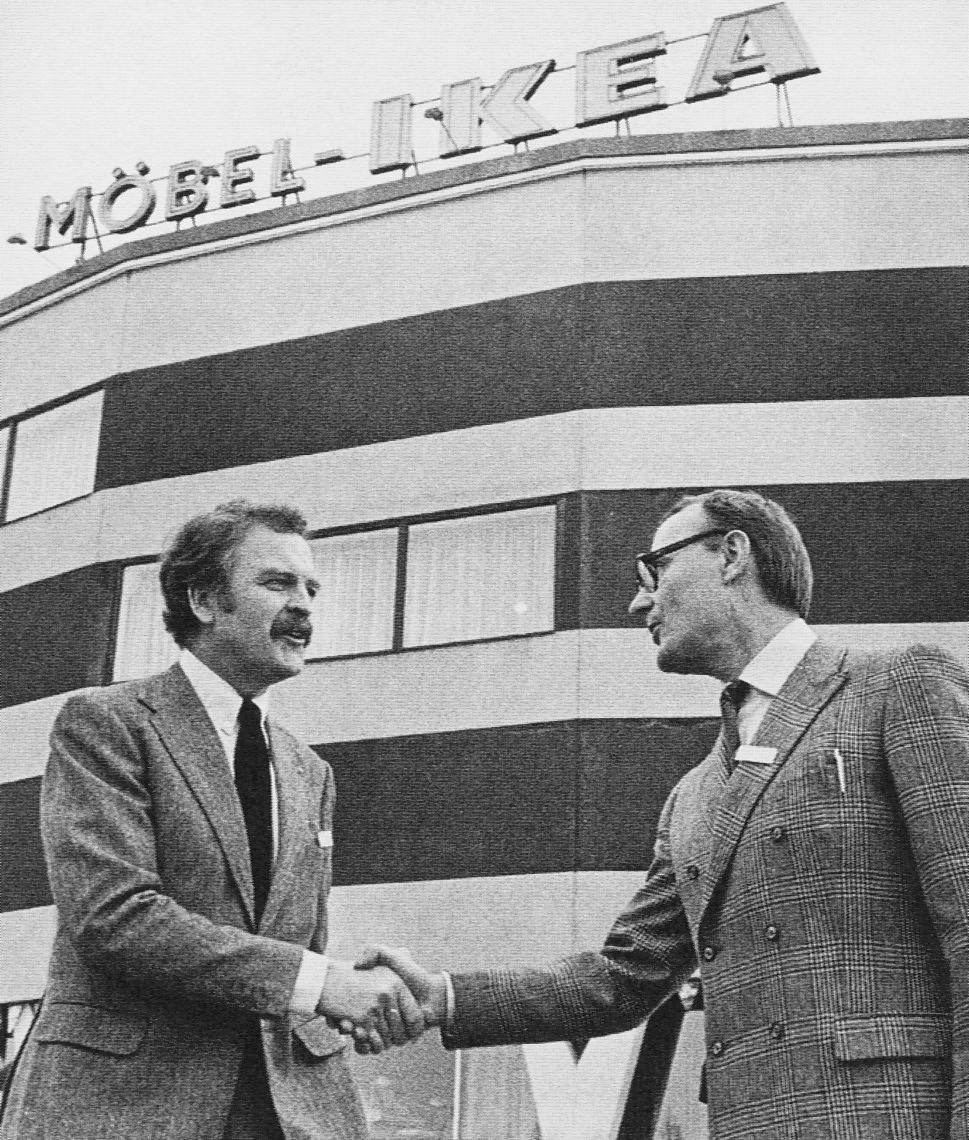
Tours aren’t only about text. They’re also about showing. IKEA is the iconic example: step-by-step visual instruction that reliably gets people from “pile of parts” to “functional outcome.” It took decades to refine, but the lesson is timeless:
Visual guidance reduces cognitive load.
That’s why modern tours lean on highlights, callouts, and “look here” patterns—sometimes with images—because people learn systems faster when the system points to itself.
Tour best-practice takeaway
- Use highlighting and spatial cues. Dim the rest. Spotlight the target. Let the interface teach itself.
- Keep copy minimal. Make the UI do the explaining.
- Design for localization from the start. Fewer words + clear visuals = faster translations and fewer misunderstandings.
If your tour needs paragraphs, it’s usually compensating for unclear UI or poor step design.
#6 Evolution phase
Wizards, assistants, and the first backlash
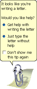
Origins are cute. Evolution is messy. Early in-app guidance often showed up as wizards and assistants built directly into the product. The most famous (and infamous) example is Microsoft’s Clippy, born in the late 1990s.
Clippy is remembered because it was intrusive—interrupting users at the wrong time, with the wrong assumptions. This is where the industry learned a hard rule that still holds:
Guidance that steals attention feels like noise. Guidance that respects context feels like help.
Tour best-practice takeaway
- Trigger tours on intent signals, not pageviews.
Examples: clicked “Create,” hovered near a key control, hit an error, failed a step twice. - Respect cognitive load.
Avoid interrupting task-critical flows (billing, exports, security changes) unless it’s genuinely protective. - Target by role, maturity, and behavior.
New admin ≠ new end user. Power user ≠ evaluator.
Most “annoying tours” aren’t annoying because they exist. They’re annoying because they show up when users didn’t ask—and don’t need them.
#7 SaaS revolution
Tours become editable without shipping the product
For a long time, the limitation was structural: if guidance was baked into software, improving it meant shipping a new release.
Cloud (and the browser) changed that. Around 2012, platforms emerged that worked as a layer in front of your app—meaning you could iterate on guidance independently from product releases.
This wasn’t just tooling. It was a strategic shift: onboarding and tours stopped being a “release artifact” and became a living system you can refine weekly (or daily). No one wants to go back.
Tour best-practice takeaway
- Ship tours independently from—and like—a product:
- define success metrics (activation, time-to-value, feature adoption)
- run A/B tests on copy, sequencing, and triggers
- retire tours that don’t move a metric
- Make ownership cross-functional.
Product owns the “what,” CS owns “where it hurts,” marketing owns evaluation flows, enablement owns internal training—then align via shared metrics. - Audit for freshness.
A tour that references outdated UI is worse than no tour.
If you’re not iterating, your tours slowly become anti-help.
#8 No-code democratization
Adoption becomes a team sport
A year later came another accelerant: no-code. Improving tours stopped being gated by engineering capacity. It became something product, CS, enablement, marketing—anyone close to user pain—could adjust and optimize.
This is still a key piece of the puzzle: onboarding and adoption became a growth lever of their own.
Tour best-practice takeaway
- Build “value tours,” not “feature tours.”
Each tour should answer: what job does the user want done, and what’s the smallest successful completion? - Don’t optimize for completion rate alone.
Optimize for: completed and achieved outcome (created first report, invited teammate, integrated data). - Use progressive disclosure.
One core tour for first value; optional “next step” tours for depth.
PLG tours are less like museum audio guides and more like: “get me to competence, fast.”
#9 PLG recognition
Product tours are serious business now
By 2016, the industry gave this phenomenon a name: product-led growth. Tours became one of the mechanisms by which a product could sell and expand itself—not through hype, but through guided activation, faster time-to-value, and genuine user satisfaction.
Tours are no longer “where the buttons are.” They’re about:
- getting to the first win
- reducing early confusion
- making advanced value discoverable
- enabling expansion without human training
Tour best-practice takeaway
- Design tours that support commercial intent without feeling salesy.
Show the upgrade when it naturally unlocks the next outcome, not as a random prompt. - Use time-boxed access intentionally.
Tours can spotlight temporarily enabled features (trial, demo, freemium) to convert curiosity into value.
In 2026, “tours” aren’t a UX accessory. They’re part of your go-to-market.
#10 Targeting
Right message, right user, right time
Finally: targeting. The idea is simple and powerful—show the right content only to users who need it, rather than blasting the same tour at everyone. This is where tours stop being “a tour” and become a system: adaptive, segmented, and increasingly personalized.
Tour best-practice takeaway
- Segment by:
- persona/role (admin vs end user)
- lifecycle (trial vs activated vs expansion)
- behavior (stuck vs cruising)
- environment (feature flags, plan tier, permissions)
- Personalize the entry point.
The same workflow can start at different steps depending on user state. - Prefer assistive patterns first: checklists, nudges, contextual tooltips, searchable help—then tours when needed.
And increasingly, AI assistance, like copilots and in-app agents (including Elvin AI).
Targeting is what turns “onboarding” into “adaptive guidance.”
What comes next?
AI assistance, copilots, and agents will change how guidance is delivered - but not why it works. The principles above (chunking, pacing, feedback, context, targeting, iteration) are the stable foundation.
Try building a perfect tour, onboarding checklist, or in-app survey with Product Fruits - for free.


Weekly newsletter
Get the latest releases, tips, articles, and exclusive interviews delivered to your inbox weekly—no spam!