When it comes to user onboarding, retention, and upselling, people sometimes fail to clearly differentiate between terms like product tour and an interactive walkthrough. Both are referred as essential tools used to engage users, guide them through a product, and encourage users to try new features, yet they are not interchangeable.
If you’re simply looking for the fundamental difference between these two terms, we’ll get straight to the point:
A product tour is an interactive demonstration of a set of product features or functions through interlinked steps.
An interactive walkthrough consists of interconnected tours and other user onboarding platform tools covering more complex features and user flows.
Understanding these differences can help product and customer success teams to:
- Utilize walkthroughs and tours more effectively to enhance user engagement.
- Ensure that new users become active and proficient users.
- Help experienced users make full use of advanced and new features.
- Increase overall product adoption.
So, how should you use product walkthroughs and product tours and their benefits to better engage users? What are typical use cases, and why have no-code tools become popular in this domain? These are some of the questions we will cover below. Read on.
Try building your first product tour or interactive walkthrough now – with Product Fruits no-code, AI-assisted approach. Start by creating your account.
The interactive walkthrough and tour nomenclature
Providers of user onboarding tools or product adoption platforms use various names and terms to describe what are often very similar tools and processes:
- Guiding new users through a product to explain the interface and show features,
- demonstrating specific individual or new features and functions to users,
- or showing premium functions of product with aim of upselling user of freemium of lower tier version
User onboarding/product adoption platform nomenclature example (Product Fruits):
- Product tour (alternatively an interactive tour or product guide) – interactive demonstration of a set of product features or functions, read more about in another article on our blog.
- Welcome tour – a simple, less interactive product tour that shows an overview of key features and demonstrates overall product value. Can be used as a quick introduction and overview for new users.
- Feature tour – interactive demonstration of specific feature or functionality, placed and activated individually or as part of a set organized into a product tour or interactive walkthrough
- Interactive walkthrough (also a product walkthrough or an interactive flow) – set of product tours, welcome tours, or feature tours, as well as other onboarding platform functions.
As noted above, this is our fruity example, as nomenclature can vary slightly between onboarding and user adoption platform vendors.
Key benefits of product tours and interactive walkthroughs
Both interactive walkthroughs (sometimes also called flows) and product tours (sometimes called product guides) offer measurable benefits that significantly enhance user retention, feature adoption, and upsell success. Companies utilizing these tools often see a marked improvement in the percentage of users transitioning from trial to paid subscriptions, a reduction in churn among existing users, and an increase in upsell figures.
Improving the onboarding process for new users
According to statistics from video creation platform Wyzowl, eight out of ten users say they have deleted an app they were trying because they did not know how to use it. At the same time, 86 % of users claim they would be more likely loyal to a business that invests in welcoming and educating them about their products.

Source: Customer Onboarding Statistics 2020 | Wyzowl
Interactive tours and product walkthroughs are designed to provide just that – onboard new or prospective customers, demonstrate how users can complete first tasks, and educate them in an unobtrusive way about key product features and functions to improve product adoption and minimize the risk of losing customers in the critical early phase of their journey.
Reducing customer churn
Another challenge faced by SaaS vendors, startups, and companies using product-led growth sales models is reducing churn rate – retaining customers longer and maximizing revenue. According to KeyBanc Private SaaS Company Survey, the median annual logo churn (percentage of customer companies/logos lost) for the SaaS segment was 13% in 2023 (annual dollar churn median, or percentage of revenue lost was 12%), which equals about 1,1% monthly churn.
The Paddle.com B2B SaaS index puts the average monthly churn for March 2024 at 1,59%, which is an 18-month low as of July 2024. Many startups often face much higher monthly churn figures between 2% and 5%, which means they need to replace about one-fifth to one-half of their customer logos (or revenue) annually only to offset these losses!

Source: Paddle.com B2B Saas Index
Introducing new features
Guiding users to new valuable features to improve discovery and adoption is another area where you can succeed by setting up interactive walkthroughs or creating product tours. The customer success team or product team should create interactive walkthroughs when new updates and features are launched and notice most users aren’t engaging with them.
Upselling existing customers
The sales team can also use an interactive walkthrough or product tour as an upselling tool showing existing users features and functionalities available in higher product or service tiers and convincing them about the benefits of upgrading.
Try building your first product tour or interactive walkthrough now – with Product Fruits no-code, AI-assisted approach. Start by creating your account.
What is a product tour?
A product tour is a structured and engaging guide designed to introduce new users to the key features of a product, facilitating a smooth user onboarding experience. Companies often create interactive product tours to ensure that new customers can quickly and effectively understand the product’s functionality early in the user journey or to reduce user churn in trial periods. By guiding users through essential features and demonstrating their usage, product tours help transform new users into active users who can confidently navigate and utilize the product.
Show users how to get things done in your application. Image/video: Product Fruits
The main objective of a product tour is to engage users right from the start by providing an immersive and informative experience. Multiple tours are often crafted to highlight the most critical aspects of the product at once, ensuring that users do not miss out on any critical functionalities.
With real-time guidance and contextual instructions, a product tour helps users easily grasp even complex features, thereby enhancing their overall experience and satisfaction. As a result, users are more likely to continue using the product and fully leverage its capabilities.
How FitnessPlayer used feature tours, welcome tours, and other user onboarding platform functions to double its user base and reduce churn
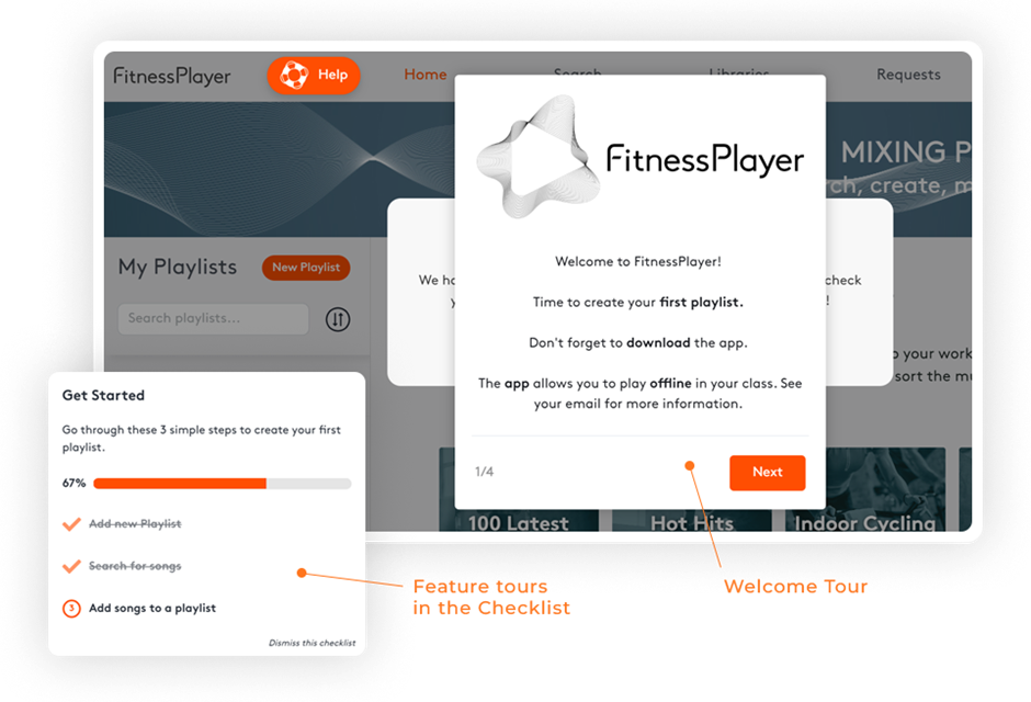
Image: FitnessPlayer / Product Fruits
FitnessPlayer is the ultimate companion for fitness studios and professional trainers in Sweden and the UK. The company faced a high user churn rate and low conversions as users struggled to find their way through the application. This meant the money spent on ads was not generating expected conversions.
FitnessPlayer combined four Product Fruits features:
- Checklists
- Tours (feature, welcome)
- Help Center
- Surveys
Using these functionalities, FitnessPlayer was able to reduce churn from free trials by 70 % and increase conversion of paying customers by 50 %. Learn more about how FitnessPlayer doubled its user base and reduced churn with Product Fruits’ automated onboarding in our case study.
What is an interactive product walkthrough?
An interactive walkthrough is an entire dynamic layer, added easily to your existing SaaS product or online service, designed to facilitate user onboarding by guiding new users through key features. It typically contains multiple product tours combined with other onboarding platform functions such as checklist, hints, tooltips, beacons, and surveys. It aims to cover the entire user onboarding journey for new users or improve user experience even for regular users.
Providing step-by-step tips and tutorials combined with other types of hints and interactions helps to encourage users and better understand how to use the product effectively, ensuring they can quickly grasp its functionality and benefits. This approach shortens the learning curve for new users and significantly enhances their initial experience with the product. Other functions included in interactive product walkthroughs ensure users are never lost, can easily access hints and tips, or re-launch specific tours and provide their feedback.
Make multi-step onboarding process easy to follow. Image / video: Product Fruits
The primary goal of an interactive product walkthrough is to engage users and reduce the complexity of the entire onboarding process by making the onboarding process intuitive and informative. It adapts to user behavior, offering contextual tips, hints, and instructions based on the actions taken by the user. This personalized guidance helps users remove confusion and navigate the entire product efficiently, increasing satisfaction and retention rates.
By highlighting the most critical features and demonstrating their use in real-time and at users’ own pace, interactive product walkthroughs ensure that customers can unlock the full potential of the product from the very beginning.
How IU University of Applied Sciences increased student happiness and reduced student office agenda
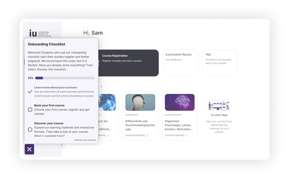
Image: IU University / Product Fruits
IU University of Applied Sciences offers more than 250 prestigious degree programs attended by over 130,000 students worldwide. Their student office faced many repetitive questions, recorded low student activities and drop-off in student accounts in a free trial period.
The university customer experience team has designed the entire flow using multiple Product Fruits elements:
- Welcome tour
- Onboarding checklists with feature tours
- Flashing beacons and tour cards
- Feedback, adoption meter, and In-app surveys
- and Segmentation.
With these features, IU University increased students’ feedback rate by 50% and improved student’s 24/7 access to online support. Read more in the Product Fruits case study How a Renowned University Onboards Its Students Faster.
Try building your first product tour or interactive walkthrough now – with Product Fruits no-code, AI-assisted approach. Start by creating your account.
Should I use interactive walkthroughs or product tours for user onboarding?
The simplest way to approach such a question is to think about interactive walkthroughs (or flows) as a broader parent category that combines various onboarding platform functionalities, including multiple product tours. Walkthroughs and tours are both:
- Valuable approaches that help optimize user onboarding,
- both help new users become active users by providing step-by-step instructions and highlighting essential functionalities,
- and finally, both are developed by customer success teams and product teams to enhance user engagement, reduce churn or drive upsell.
Their main difference lies in scope and depth.
Use product tours when:
- You need to cover onboarding of a very simple tool or product.
- There is only a need to introduce a new specific feature or functionality.
- You want to add it as a new interactive walkthrough or flow component.
- Provide a general overview of the product’s key features.
- Quickly familiarize users with the product interface.
- Onboard users to a straightforward product.
- Showcase a broad range of functionalities without going into too much detail.
Lengthy, detailed, multi-part tours showing multiple features can become almost overwhelming for some users, especially those who prefer to explore the product at their own pace. These users and customers want to ask for help only when they are unsure where to start, what to do next, or how to achieve something.
This can be solved by providing multiple shorter interactive tours and other onboarding platform functions as part of a walkthrough or flow covering the entire user journey or experience – from first steps to everyday use of your product or service.
Create walkthroughs for user onboarding to:
- Introduce new users to complex or feature-rich products without overwhelming them
- Provide a more personalized, contextual, and multifaceted experience based on user behavior.
- Create detailed, real-time, contextual guidance on advanced or complex features.
- Reduce drop-off points by offering personalized assistance combining tours, checklists, hints, help center (life ring button), or knowledge base.
- Gather valuable user feedback through the user journey to improve the product experience.
In summary, product tours are particularly good for giving a comprehensive introduction to new users, ensuring they understand the basic functionalities of a product. On the other hand, interactive product walkthroughs are better suited for guiding users through complex tasks and advanced features, offering a more personalized and engaging experience that adapts to user behavior.
Not all interactive walkthroughs and product tours start when the user logs in for the first time . Activating product tours only for specific users in specific locations within an application or on particular occasions enables tutorials to appear in a clear context.
For example, you would not show new users a product tour of advanced (or new) features. Similarly, only when customers engage with specific features/workflows that trigger one specific mini-guide tour that shows them relevant features or use cases.
Using product tours and walkthroughs to show new features, improve retention, and upsell
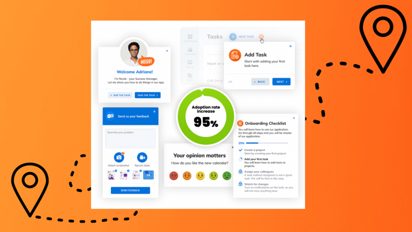
Use interactive walkthrough and product tours for adoption and also for retention and upsell. Image: Product Fruits
Interactive product tours and interactive walkthroughs effectively introduce new features or UI elements to existing customers. By creating a product tour covering these topics, existing users can easily discover and learn their basics, enhancing their overall experience and improving retention.
Consider interactive product tours for the following retention and upsell scenarios:
- A quick introduction to website UI update or overhaul
- Guide users at once through multiple new functionalities.
- Creating a comprehensive overview of premium features.
- Upsell premium features by quickly showing their value.
When deciding if and how to create a product tour for retention, upsell, or conversion from freemium to paid subscription, consider other options – either simpler (and less intrusive) ones or a more complex approach by creating or modifying existing walkthrough/flow. You can design walkthroughs or flows to be less intrusive and yet available to users virtually at any time – for example via life ring button.
Create interactive walkthroughs for these retention and upsell scenarios
- Covering a wider set of new functions or UI changes that are better covered by multiple tours or other onboarding/adoption platform functions.
- Introducing new features and functions contextually, in a less obtrusive way and/or at users own pace.
- Providing contextual help to reduce friction points and support overload.
- Upselling premium features through personalized guidance and advanced analytics.
- Gather valuable user feedback to improve the product experience.
By strategically utilizing product tours and interactive walkthroughs, companies can significantly improve user retention, effectively introduce new features, and successfully upsell premium options to their customers. These tools guide users through their journey and provide invaluable insights into their behavior and preferences, ensuring a continuous cycle of improvement and satisfaction.
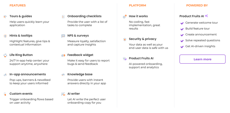
Product tours and walkthroughs can be combined with other functions of the user onboarding/adoption platform. Image: Product Fruits.
Create product tours and interactive walkthroughs with Product Fruits
Our platform allows you to easily create both product tours and interactive walkthroughs as well as other user onboarding and retention features added as an invisible layer to your SaaS product or service using no-code tools and AI-powered onboarding and AI writer to, among other things:
- Improve product activation rate,
- increase conversions,
- lower customer churn,
- improve your NPS score,
- have fewer support tickets.
With Product Fruits, you can take the best of both worlds by segmenting users/customers for product tours and product walkthroughs. You can segment them, trigger them at the right time, and collect user feedback.
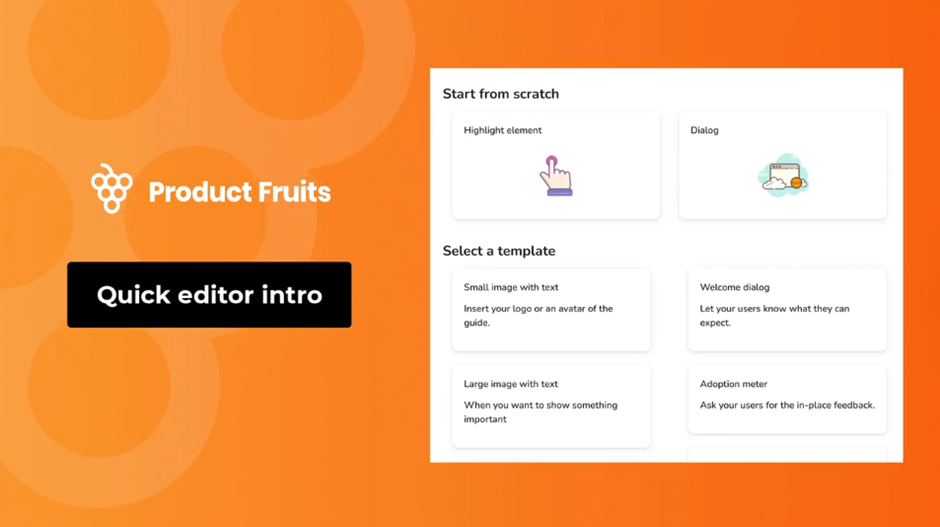
Use Product Fruits to design interactive product tours & guides which:
- Guide users and show them how to get things done in your application.
- Perfectly match your brand style, look, and feel.
- Are available when your users need them most.
- Can be triggered based on user activity.
Boost your user onboarding and product adoption with Product Fruits interactive product walkthroughs that:
- Allow users to use your software effectively and understand it from the start
- Simplify complex onboarding flows by dividing them into simple steps – such as multiple shorter feature tours triggered contextually or from a checklist
- Engage and motivate users to complete the remaining tasks
- Are fully contextual, reaching users when and where they need them
- Provide user feedback with surveys and prompts to optimize walkthroughs, make onboarding more personal, and further reduce churn.
Would you like to know more? Check out the following fruity blog articles:
- Interactive Product Tours: How, What, and Why
- A Simple Guide to Product Walkthroughs
- Maximize your user onboarding: combine Tours and Hints
Try building your first product tour or interactive walkthrough now – with Product Fruits no-code, AI-assisted approach. Start by creating your account.
