A simple guide to Product Walkthroughs


Imagine this: You've invested significant time, effort, resources, and money into creating the perfect platform. However, as soon as your users open the platform, they don't know where to start or what to do, and they may not understand the value of your solution.
This confusing onboarding process can lead to high churn and low retention rates; no business wants to experience this!
So, product walkthroughs are an effective solution for ensuring product success and giving your customers that 'aha moment. '
But first,
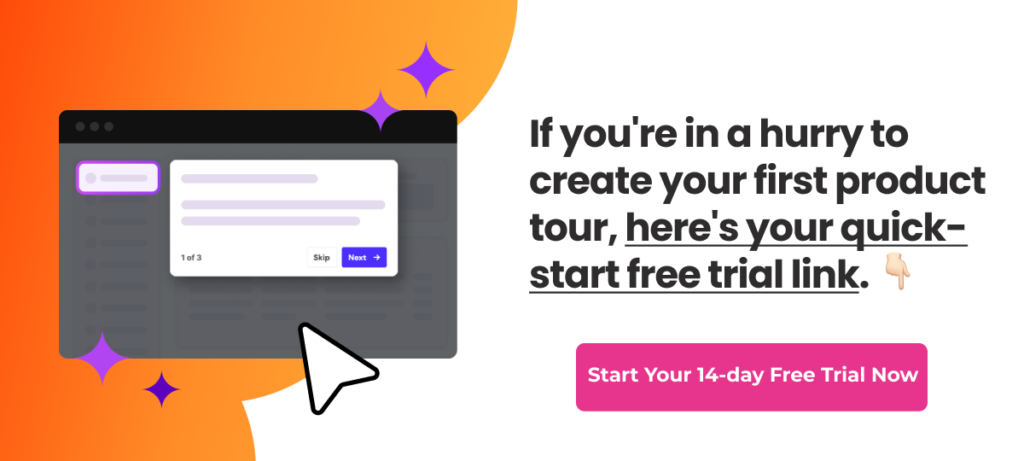
If you’re in a hurry to create your first product walkthrough, here’s your quick-start free trial link. 👈
What exactly are product walkthroughs?
Product walkthroughs are interactive and virtual experiences that help users learn how to use an app, software, or website.
These step-by-step, hands-on guided tours provide users with structured information about application features and help them quickly grasp a product's value and functionality.
Effective product walkthroughs incorporate tooltips, pop-up boxes, beacons, and interactive highlights that draw attention to essential elements.
Walkthroughs typically start when users log into a free trial or navigate the product for the first time. This allows users to quickly learn and become acquainted with the software, leading to a positive user experience.
Why are product walkthroughs important?
According to Gitnux, 76% of customers who report a welcoming onboarding experience will likely continue using a service or product. This statistic underscores the importance of a smooth onboarding experience.
1. Improve feature adoption across existing users
Product walkthroughs are more than just tutorials. They help existing customers by highlighting features they may have missed or misunderstood.
Often, users become accustomed to certain behaviors and miss out on specific processes and shortcuts.
But, you can retain them by actively showing new features and actions that improve their user experience ( thanks to their feedback and continuous improvement).
Think of it this way -- you have a toolbox but have yet to use all the tools. So, walkthroughs introduce these (unused) tools to users to increase their know-how of the product.
Here’s how Keboola introduces three different demos based on user behavior and experience: How Keboola accelerated its user onboarding by 29%
2. Provide a positive user experience
Guided introductions help make sure the user feels welcomed and supported right from sign-up to product use. It improves user retention in the long run. Studies show that customers who receive a positive onboarding experience are 20% less likely to switch providers.
This friendly beginning sets the tone for their onboarding journey and creates a personalized experience that makes users feel valued. In the long run, curated personal experiences build stronger customer relationships that affect LTV.
3. Creates brand advocates
When a product delivers on its promises, users are more likely to become its most loyal fans, often advocating for it within their networks. 84% of B2B buyers rely on advice from peers and colleagues and online reviews when purchasing for their companies.
The same goes for your users. Once they see how your product improves their lives, they will likely recommend it to others.
To turn your users into brand advocates, consider the following practices:
- Consistently exceed user expectations
- Create a strong brand identity
- Actively seek user feedback
- Address user needs promptly
- Show your users that you genuinely value their experience
4.Reduce customer support tickets
By providing users with the tools to troubleshoot and solve common issues independently, walkthroughs can help reduce the number of customer support tickets. It saves time and effort for both the users and the support team.

An example of product walkthroughs for inspiration
Now that you understand the significance of product walkthroughs let's explore an example of how they've made a difference.
Recurpost's strategic approach
RecurPost is a social media scheduling tool for small and medium-sized businesses. It lets you conveniently handle all your social media accounts from a unified dashboard.

Image source: RecurPost
The RecurPost team has dedicated considerable time to building and optimizing the user onboarding flow. They shared a few thoughts about their unique and independent approach to onboarding. They've spent time focusing on user groups and their goals during the onboarding process.
Before implementing the onboarding walkthrough, only 25% of users added their social accounts to RecurPost. However, with the strategic onboarding process, that number has increased to over 50%.
To create a highly targeted product walkthrough, RecurPost segmented its users with a series of questions:
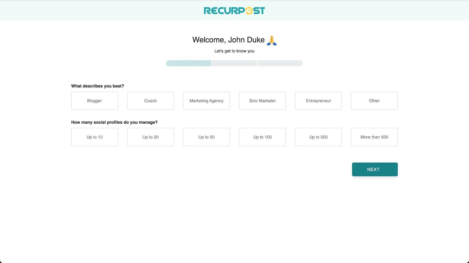
Image source: RecurPost
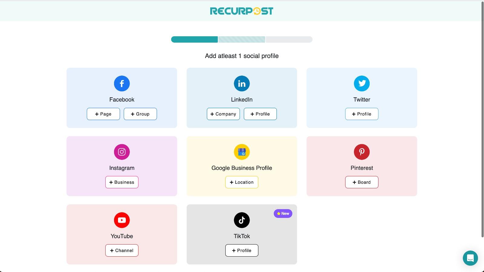
Image source: RecurPost
This enabled them to have better insight into product walkthrough creation for each of their user groups.
Dinesh Agarwal, the Founder of RecurPost, shared insights into their impressive achievements, stating,” We meticulously monitored each phase of the social account integration process. Whenever we spotted a decline in user engagement on a specific page, we initiated A/B tests to optimize its design.
For example, many users click the "Add Facebook Groups" button but don't complete the action. The bottleneck? Users were unclear about how to add our app to their Facebook group—a necessary step. We tripled the success rate for adding groups by redesigning the page for clarity.”
Key takeaway: Monitor user engagement, employ A/B testing, and prioritize clarity in design to boost adoption and overall success.
Five best practices to create interactive product walkthroughs
Crafting product walkthroughs is a simple task (sigh), but ensuring they truly hit the mark by converting and providing value to users is where the real challenge lies.
To get it right, let's look at these five best tips to create interactive product walkthroughs.
1. Create based on your users goals
The users' goal should be the North Star for all onboarding processes. Essentially, "How can I get user X to fulfill their Y goal?" Working backward from the goal most effectively is key to creating a product walkthrough highlighting all the elements for goal completion.
Jamie McDermott, Founder of The User Flow, shares his insights on why keeping user goals during activation is helpful while creating walkthroughs.
"Viewing your product from a user's perspective can help you spot potential problems or areas for improvement. This personal experience enables you to understand your users better and find any roadblocks that might prevent them from using your product."
2. Keep walkthroughs concise
Most products combine multiple small workflows. Product walkthroughs are no different.
Parth Shrivastava, Growth Manager, shares his unique insights on how and why to walkthroughs concisely: ”Optimize the user journey by breaking it into small, manageable workflows. Each workflow should ideally consist of no more than seven steps, as overly complex processes can lead to user disengagement and reduced information retention. Consider implementing interconnected success and follow-up walkthroughs.
For instance, after guiding users through creating an email campaign, the next step could involve adding people to the campaign or exploring performance reports. Use checklists, guided walkthroughs, and videos to create an engaging and gamified user experience.”
3. Make product walkthroughs interesting with media
When learning something new, it's best to do it rather than read, watch, or listen to it. The same rule applies to your users, who learn more about your product when participating.
So, use interactive features, such as tooltips, highlighting, and click-throughs, to engage users in the process.
Draven McConville, CEO and founder of Klipboard shed light on the same:
“They say a picture is worth a thousand words, so add images to your tutorial, such as pictures, videos, and illustrations, to describe key ideas and procedures more effectively. Users value when they’re informed of their progress. Give them the chance to remedy mistakes and receive feedback. It encourages learning and helps collect the necessary information for future development.”
4. Use simple and engaging language
While creating product walkthroughs, the primary focus should be guiding users toward essential actions that help them realize your product's value. Start by identifying your product's key value metric and pinpointing any obstacles hindering users from achieving that value.
Matthew Ramirez, Founder of Rephrasely, strongly emphasizes simplifying the explanation process.
"Use simple language, avoid complex terminology, and refrain from using passive voice." Matthew adds that, by doing so, "the process becomes more personable and relatable, enabling users to retain better the information they have learned. This has a profound effect on user adoption and retention rates. And, the user-friendly and engaging nature of the process is enhanced, making it more accessible and enjoyable for users".
5. Make walkthroughs self-paced
Making walkthroughs self-paced means allowing users to complete them at their own speed. It will enable users to absorb information, complete tasks, and explore features at a pace that suits them.
Leaving the user in the driver's seat proves self-serve tours receive a 123% higher completion rate than tours triggered automatically by the product.
This approach is especially beneficial for accommodating users with different levels of expertise or those who prefer a more leisurely or thorough learning experience.
Joseph Lee, Co-founder and CEO of Supademo, shared his take on why to make walkthroughs self-paced.
"Don't impose a strict rubric or timeline on users. It's best to make your walkthroughs accessible whenever the user is ready to engage and learn."
Ultimately, it helps the product manager by driving up product adoption and activation (vs. users skipping the walkthrough and never revisiting), and the user can learn at their own pace.
Fruity tip: Use triggered product walkthroughs triggered by hints to allow users to pause, rewind, or fast-forward through the walkthrough steps.
Focus on your users
Your product can make or break the deal if users can't grasp its value.
But with the proper product walkthroughs and tours, you can make your users learn more about your product and make them fall all over it.
Now, time for action 👉 Create your first product walkthrough. Here’s your quick-start free trial link. 👈
👀 Take a peek: Interactive Product Tours: How, What, and Why


Weekly newsletter
Get the latest releases, tips, articles, and exclusive interviews delivered to your inbox weekly—no spam!