User churn is like a leaky bucket.
Even if the content of the bucket is a perfect mix of ingredients. User churn slowly drains away revenue, loyalty, and customer satisfaction.
Unfortunately, patching up the bucket with a plaster won’t do the trick. Without understanding the reasons behind why users churn, product managers will never fix the root issue.
By understanding what’s causing customers to leave your business, you can make targeted changes that keep them engaged and coming back for more.
Understanding user churn
The average churn rate for applications in the first 90 days is 75%. Yep, you read that right; three quarters of users abandon an app during the first three months.
That means a good first impression with customers is critical for user retention. You need to show users the value of your applications as fast as possible and support them through their journey to avoid churn.
User churn refers to customers leaving your business, whether that be through cancellations or lack of engagement with your application.
This can affect revenue streams and customer loyalty. That’s why understanding the reasons customers leave, and how to prevent them is important for a successful businesses.
There are two main types of user churn:
• Voluntary Churn: This occurs when customers choose not to renew their subscription or switch providers due to a better offer elsewhere.
• Involuntary Churn: This occurs when external factors such as a failed credit card, relocation, or other external factors cause customers to leave without actively choosing another provider.
As most customers churn in the first three months, it’s directly related to the user’s experience during the onboarding period. We will concentrate on the factors that cause voluntary churn. These reasons will help optimize the onboarding journey to have a stronger impact on retention.
From our experience, here are the reasons users churn. And what you can do to prevent it from happening.
1. Complicated user interface
A complicated user interface makes it hard for users to see the value of an application.
When users open an app, they’re on a mission to solve their problem as quickly as possible. When that application is filled with complex features and hard onboarding flows, it deters users from completing onboarding. In fact, 95% of users admit to deleting an app the same day it’s installed.
An easy and intuitive user face is key to keeping customers on your application. And for that to happen, you need an optimized user onboarding experience that guides users to reach their goals.
For example, Keboola, a data analytics platform, noticed users weren’t completing their free trial. Its platform was too complex and demanded a high learning curve from users.
To avoid users feeling overwhelmed, Keboola offers three different demo tours, each dependent on the user’s current product knowledge. This allows users to slowly understand how to navigate the platform, reach their goals, and not feel lost or overwhelmed.
The result? Keboola managed to improve user onboarding speed by 29%, and increase conversions by 8%.
Fruity Inspiration: How Keboola managed to accelerate user onboarding by 29%.
Solution: Use demos, checklists, and tooltips to guide users through the app.
Use in-app demos to show users how to navigate your platform. Demos show users the immediate value of the app, as well as how to use features. This helps set users on the right track.
Onboarding checklists are an easy way to track user progress. Checklists also show users the order of tasks to complete an action. It helps motivate their efforts and guide them through the next steps.
Tooltips are small pieces of text that appear when users hover over a feature. Tooltips provide context and information so users. These tips can be used to explain more complex features and provide additional information.
2. Lack of customer support
Customer support during the user onboarding period is critical to avoid user churn. It’s no wonder a study by Microsoft found that 96% of users agree customer service is a key factor when choosing loyalty to a brand.
Users need to feel supported as they navigate new platforms and features to reach their goals.
When users are faced with a roadblock while navigating an application, support needs to be instant and available. In fact, 75% of users say a response rate is the most important regarding customer support and retention.
Having knowledgeable customer support available to answer user questions and guide them through the onboarding process can go a long way in ensuring a smooth and successful onboarding experience for users.
Solution: Use life rings and knowledge base to provide instant support
To instantly help users, consider a life ring ( support) button and a dedicated knowledge base filled with resources, tutorials, and easy contact options.
Life Rings: The Life Ring library is a hub of resources that is constantly available. It gives users the freedom to explore your tutorial or resource content whenever they need to.
Chat support: For more instant support, you may want to consider adding an online chat feature to your website. This allows customers to quickly connect with a support technician or representative who can answer their questions in real-time.
Knowledge base: A comprehensive knowledge base can be created to answer frequently asked questions and provide users with quick solutions to their problems. This can be accessed through a searchable database or by clicking on specific topics.
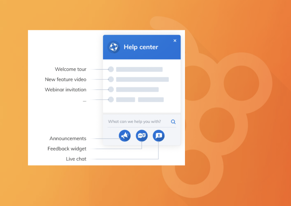
Fruity Tip: Integrate your life support chat with your knowledge base, so users can quickly find help.
3. Lack of motivation
When users don’t feel that their onboarding efforts are leading to any progress, they get discouraged quickly. This is because they see no immediate value in their learning progress or goal achievement.
Gamification can motivate users to complete onboarding steps and tasks. The goal is to keep users active and engaged by rewarding their app actions.
By adding game actions to your onboarding, you can nudge users to complete actions through intrinsic motivation. This tactic pushes users to complete all onboarding tasks and find the value of a platform.
Solution: Include progress bars and rewards
Help users track and visualize their accomplishments so they can feel a sense of accomplishment and progress as they complete tasks. This will help users see how far along they are in a process, how far they have come, and how much futher to continue to earn their achievements.
Here’s an example of how Duolingo uses update notifications to help users stay on track with their goals.

(Image source: Duolingo)
You can also reward them with virtual coins, points, or badges that can be redeemed for rewards within the platform.
4. Missed “Aha” moment
The primary reason users churn is due to lying about product performance. So really, giving users their “aha” moments early should be number one priority. You want to solve users’ problems and delight them with an experience that exceeds their expectations.
When users don’t feel the instant “click” with your product, there’s no value in the product––– and they churn.
When developing and onboarding a flow, it’s important to remove as much friction as possible for users to get to their desired task. That could mean delaying the check-in process, like how AirBnB does it.
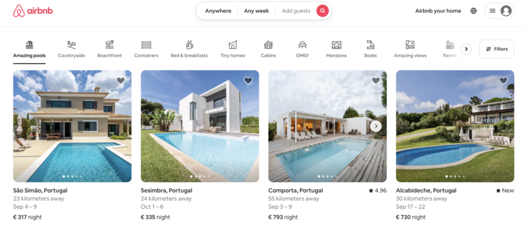
For example, AirBnB shows all their listings and availability before asking users to sign in. That way, users see the value upfront and then proceed with a booking.
Other times, little nudges can make a difference for users to understand the value of features. That’s where tooltips come in handy. They educate the user on the potential of a tool, organically on the app.
Solution: Use checklists and tooltips
To help drive users to their “aha– this app is worth it” moment, use checklists and tooltips.
Asana sets up personalized checklists based on the answers new users provide in their welcome survey. That way, once the app is opened, they have a personalized checklist of things to do to reach a goal.
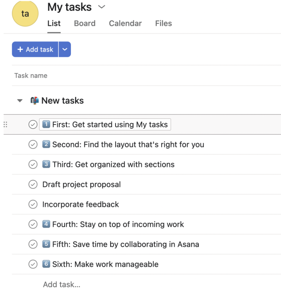
(Image source: Asana)
Other times, little nudges can make a difference for users to understand the value of features. That’s where tooltips come in handy. They educate the user on the potential of a tool, organically on the app.
Here’s an example of how MailChimp includes tooltips in their platform. It’s subtle and allows users to explore features individually at their own time, but without missing the benefit of each tool.

(Image Source: MailChimp)
5. Lack of personalization
Onboarding needs to be personalized to each user. The goals of each user will be different, so it’s important that their onboarding journey kicks off in the right direction to reach their goals.
For users, a personalized onboarding experience means apps solve their problems immediately. And for applications, it improves the user experience by having the right flow created.
This personalization helps users see that their needs have been considered and that the product is easy to use.
For example, a new customer may need detailed information on how to use a particular feature, while an existing customer may just need a refresher on the basics.
For example, Elicit, an AI research platform, onboards its users by asking them a series of questions. Each answer takes the user through a different onboarding journey that is tailored to their situation and goals.
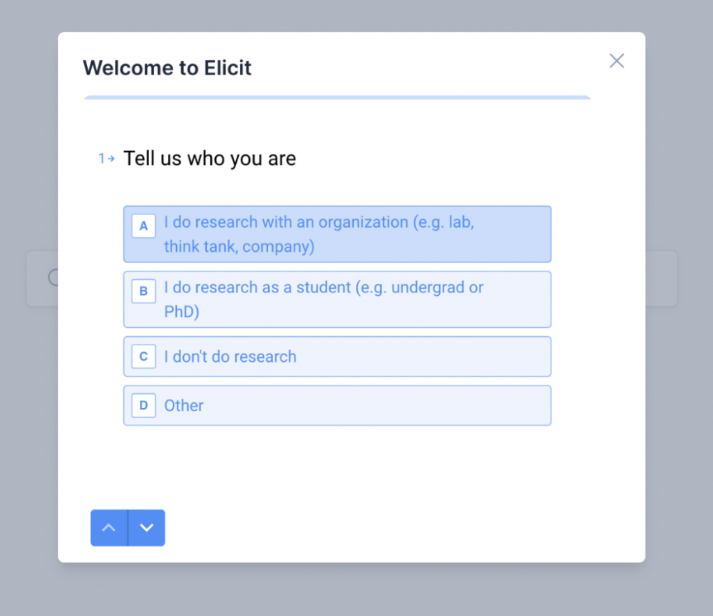
(Image source: Elicit)
Solution: Use Welcome surveys to personalize the experience.
Welcome surveys allow customers to provide the information that is most important to them. This sets up the most relevant onboarding journey for each customer.
And, welcome surveys give companies the opportunity to build relationships with their customers right away, by demonstrating that their needs are taken seriously from the start.
For example, Asana asks users for their goals and work preferences to tailor their recommendations and checklists to each user’s needs.
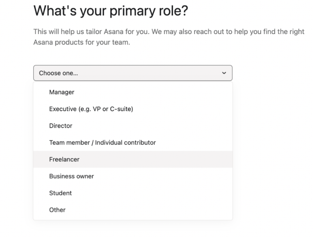
(Image Source: Asana)
Reduce user churn with the right product adoption tool
A surefire way to ensure a great user onboarding experience is to use the correct onboarding functionalities, tools, and experiences. This will guarantee that you are meeting and surpassing the requirements of your users.
Product adoption platforms provide the ideal features to create seamless onboarding experiences. Product Fruits works as an invisible layer on top of your application. This gives you access to tools and features to onboard and improve customer loyalty immediately.
With quick and easy access to onboarding tool, it means you can introduce new features and onboard users immediately. You don’t have to wait for developers to code onboarding flows and tools. You can optimize, customize, and personalize the experience continuously without coding required, saving you time and money.
Try Product Fruits for free today. 14 days free of hassle — No credit card or commitment required.
