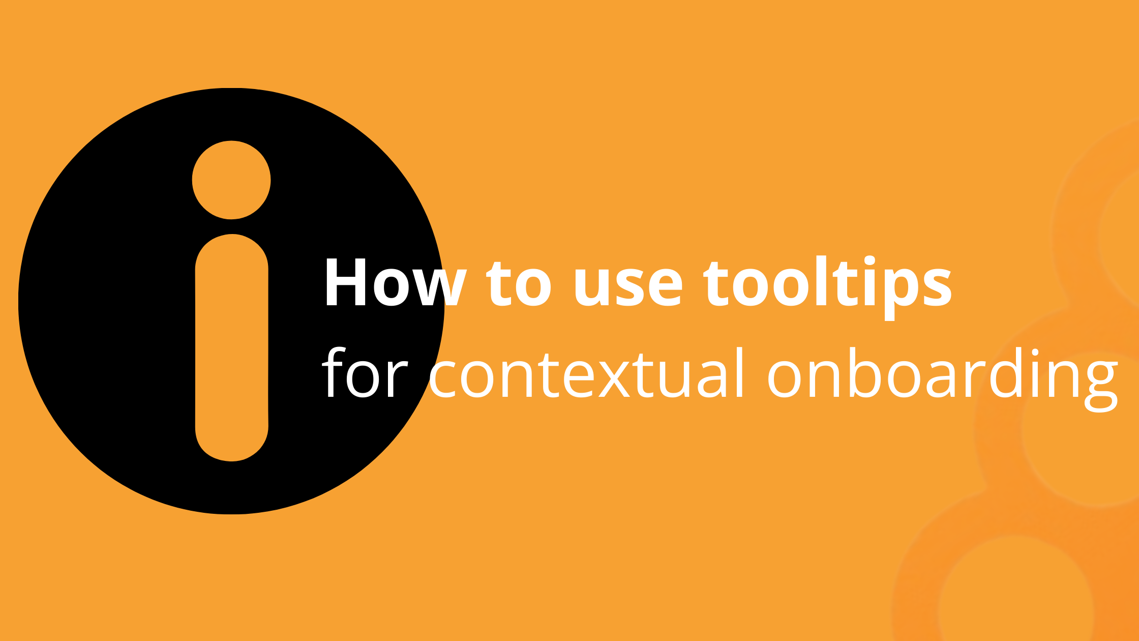
Create self-onboarding experiences with hints & tooltips


Let’s be honest. It's a fact of life - some users will skip your beautiful onboarding tour and start exploring your app independently.
Understanding how to leverage tooltips to educate users will help create an informative onboarding experience.
Let's see how you can leverage UI tooltips and hints to onboard them contextually.
Elevate your user onboarding today and create customized tooltips for free with Product Fruits' 14-day trial!
What are onboarding tooltips?
Onboarding tooltips are a type of user interface element used to provide short, interactive descriptions of a feature or page.
They are typically used to help new users learn how to use a product or application. Tooltips are usually triggered when a user hovers over an element, such as a button or menu item, and briefly describes the feature or page.
Here’s an example of how Mailchimp uses an onboarding tooltip to educate users on their platform’s functionality.

[Image source: Mailchimp]
Users and tooltips -- a love/hate relationship
Each user is unique, but the data tells us there are two groups when it comes to user onboarding.
- Guided onboarded users: Users who want to be guided step-by-step through the platform.
- The rogue users are users who prefer to learn alone and explore the app at their own pace and time.
Onboarding the first group is easy. They’ll follow your product tour, which will help you gauge task completion rates and monitor sentiment through the adoption meter.
On the other hand, rogue users are a bit more tricky. They want to explore the platform independently but need context to gently educate them on app features.
What if users skip the onboarding tour?
Things get more tricky with the second group. If users skip your beautifully crafted product tour and go straight into your UI. If your app is simple, then the harsh truth is that they'll figure it out, but it misses the opportunity of delighting them.
In the case of a more robust app (e.g., CRM, analytics, accounting, or HR software), the chances are they won't. Either they'll reach out to your support, or worse, they'll churn and explore a competitive solution.
Should you try to preempt churn by forcing onboarding tours on them? No, please don't. It disrespects the user’s wants and will likely result in abandoned tours and frustrated users.
Tooltips to the rescue!
Tooltips allow users to explore your platform and self-educate themselves when they’re ready for action.
When users discover an app by themselves, it’s known as contextual onboarding.
Contextual onboarding means users educate themselves by immersing themselves in the platform. As a result, they heavily rely on in-app hints and tooltips.
These inobtrusive graphical elements typically come as a "?" or an "i." Here’s an example of how they appear in the Ahrefs platform, as shown below:

[Image source: Ahrefs]
Users can “unlock” the tooltip information by hovering or clicking. This action will provide the user with an explanation, instructions, or feature description.
You can enrich each tooltip with further tutorial information, screenshots, and examples or even launch a product tour.
If users choose to self-onboard, they’re less likely to skip tooltips as they're asked for more information by clicking on the tooltip icon.
The problem of multi-step flows
A word of caution. The icons "?" or "i" only work well for single-step tasks.
If your flow consists of more than one step, users won't know where to start. This can quickly lead to confusion, frustration, and, ultimately, a lack of understanding of your platform's value.
For example, HubSpot—yes, even one of the world's most popular CRM tools—still faces onboarding challenges. Below, the number of tooltips provides context but not order.

[Image source: HubSpot]
A much better UX would be using numbers to indicate the order of steps.

Small changes have a big impact on user experience.
Fruity Tip: If your tooltips have the same problem, open the Product Fruits editor and change the icon type, as shown in the picture below. Three clicks and you’ve made yourself an onboarding flow users will love.
And while you have the editor open, take the opportunity to fix the position of your tooltips. After all, it's the little details that create your brand experience.
Tooltips are only the “tip” of the onboarding iceberg
Yes. Tooltips are great for little nuggets of information.
But adding a couple of tips alone is not enough to make the onboarding experience smooth, memorable, and delightful.
You need to use tooltips and other features like checklists, hints, tours, in-app announcements, or demos for users to feel confident navigating your app.
Product Fruits is an all-in-one onboarding and product adoption platform that helps translate your app's value to users quickly, with no coding needed. That means users can immediately engage and use your product and convert from trial users to paid customers.
Each tool is 100% customizable. With a few easy clicks, you can choose color, copy, triggers, and placement. Experiment with different approaches and fine-tune your onboarding to your users' needs.
Elevate your user onboarding today and create customized tooltips for free with Product Fruits' 14-day trial!
Happy onboarding!


Weekly newsletter
Get the latest releases, tips, articles, and exclusive interviews delivered to your inbox weekly—no spam!