Are your product tours working the way you imagined and intended them to? Understanding the journey from initial user interest to full product adoption is essential to identifying what’s working well and where there is room for improvement. Without tracking and analyzing the right product tour metrics, you’re left guessing about user behavior and the effectiveness of your onboarding tools.
You’ve already invested money and valuable time in an onboarding or digital adoption platform (DAP). You or your customer success team has started creating product tours, hints, and popups, all designed to help users easily explore, learn, and engage with your SaaS product. Or to encourage them to upgrade from a free to a paid version or a higher tier. But how do you measure the success of these efforts?
You should consider and combine two approaches to evaluate the effectiveness of your product tours and other product onboarding and adoption features.
Do you already use tours for your product? If not, try Product Fruits 🍇 with a 14-day free trial and see how our product tours work.
Direct: Product tour metrics and DAP stats
These metrics clearly show how users or customers interact with your product tours and onboarding features. They reveal what works well in your DAP flows, what users are interested in, what they skip, and where they may spend more time than expected.
Insight into how your product tours are (not) working is also useful when the expected improvements in product/user metrics (onboarding, adoption, retention) are not happening. In short, Product adoption metrics and product tour metrics are related, and they impact each other. When measuring how things work, always remember there are also other ways to find out what does work (or not) and why – simply by asking your users using feedback forms and surveys.
Understanding how your product tours perform is crucial, especially when you don’t see the expected improvements in broader product or user metrics such as onboarding, adoption, or retention. Essentially, these metrics are interconnected: poor results from product and user metrics might indicate that your product tours need refinement. In contrast, the quality of those tours can directly influence whether the desired improvements in product and user metrics are achieved.
Indirect: Product and user metrics
We’ve already described some user onboarding metrics in one of our earlier blog posts, so this time, we will do a quick recap in the form of a shortlist at the end of this blog post.
These metrics don’t reveal specific details about how users interact with product tours and other key features you’ve created in your onboarding platform. Still, they are interlinked – after all, you probably bought Product Fruits or another DAP to improve product onboarding and user adoption metrics. Remember that product and user metrics often determine what you need to focus on with your product tours, checklists, or hints, and the quality of the content in your DAP impacts these metrics.
Product Tour Metrics and DAP stats
When you create interactive product tours, you should bear in mind that they are not the end but the means. Your goal is probably a satisfied user who is familiar with your product, knows how to use all relevant features, and is informed at a suitable time or moment about new features, improvements or relevant upgrade options. The product tour and other digital adoption platform (DAP) metrics are used to verify tour functionality, usage, and user satisfaction with them (and indirectly with your product) and improve the onboarding flow overall.
Most metrics listed below are typically measured by digital adoption or onboarding platforms with built-in analytics. You may need third-party tools or functionality of the SaaS product to measure others, such as goal achievement.
Tip: You can also create variations of a certain tour (i.e., A and B) to validate performance – like an A/B test.
User Engagement with Product Tours
Tracking these product tour metrics to see how users interact with your interactive flows is essential to understanding their effectiveness. Here are key metrics to consider:
1. Tour Completion Rate
The tour completion rate measures the percentage of users who finish the entire tour, partially complete or skip it altogether. A low completion rate may indicate way too extensive a product tour that needs to be shorter or more engaging.
At Product Fruits, we generally recommend limiting tours to around five cards, but this can vary depending on the application and user profile. You can also break longer tours into multiple short ones.
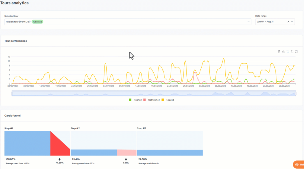
2. Step-by-Step Engagement
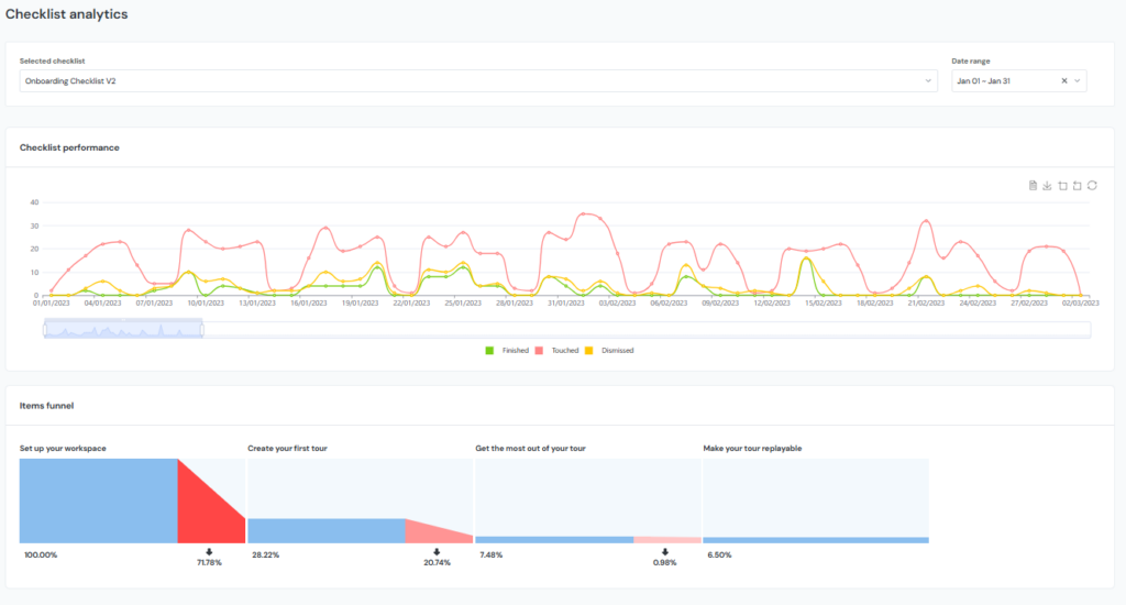
Beyond the completion rate, typical product tour software analytics often allows the monitoring of user interactions at each tour step. You can visualize it in the form of a funnel, showing the drop-off rate between individual steps of the tour (or tour cards) – as already shown in the image above.
This data reveals how many users are interested and where they lose interest. It also provides insight into whether the tour needs to be revised, shortened, or more engaging.
Tip: The fact that most users skip the rest of the tour after a certain card may not be a problem in itself. Some users may already have enough information, while others will benefit from rest of the tour. Consider using feedback or survey to validate quality of tour and user satisfaction.
3. Time Spent on Each Step
Another useful metric tour analytics provides is the time users spend on individual tour elements.
Extremely short times might suggest that the content is obvious, redundant, or unclear, while longer durations could indicate complexity.
Tip: Check the content of the given card. Is it just a short text? Lot of text? Video? How engaging is it? How much time would you spend? Always use your judgment.
4. Goal achievement
Most product tours are built around specific goals, such as completing the onboarding of a new user, guiding an existing user through a redesign or new feature, or reintroducing a feature that has been underused or forgotten.
Completing most (or even all) of the product tour does not guarantee that users will actually reach the desired goal. You should, therefore, look for ways to check and measure – either in the onboarding platform or in the product itself – if the specific goal was achieved.
Tip: While onboarding tools and DAPs typically do not have advanced goal-tracking functionality, you may use other tools, such as custom events in Product Fruits.
5. Task List Completion Metrics
Product onboarding and digital adoption platforms usually offer checklists—lists of tasks to be completed by users, typically after they sign in for the first time (or, for example, after a major UI overhaul).
These checklists often initiate interactions, such as hints and short product tours. This is another opportunity for product onboarding analytics, as you can evaluate how users complete essential tasks.
6. Task List Completion Rate
New users should ideally complete the entire checklist. Therefore, you might consider the completion rate—the percentage of users who complete all suggested tasks during onboarding—as one of the key metrics.
The percentage of users who complete the entire task list might often be relatively low. Therefore, you may look at other data provided by your onboarding platform or DAP, such as the percentage of users who at least “touched” the checklists, the percentage who actively dismissed them, and how these numbers change over time.

7. Checklist Items Drop-Off
Just as with product tours, users interacting with checklists may complete only some items. You can usually measure where (after which item in the list) they stopped following the checklist or actively dismissed it. You can pinpoint which items were completed and which were ignored, especially if the checklist allows completion in any order.
8. Time to Task Completion
You may also want to measure how long it takes users to finish each task in the checklist. This helps identify areas where users might need more guidance or where your product itself might be too complex for some users.
Analytics Beyond Tours
Onboarding platforms can do much more than introducing new users to your product. Many of those functions have some tracking and analytics functionality – sometimes it is best to combine not just them but also their analytical capabilities to paint the whole picture. Below are some additional features you can use and measure for ongoing user education and engagement in Product Fruits:
9. Hints and tooltips
Hints provide quick suggestions or explanations of specific features. Track their views and dismissals to gauge their usefulness and relevance to users. A high dismissal rate sometimes indicates that the tooltip content isn’t necessary or is poorly timed.
10. Feature Announcements
Introduce new features with eye-catching in-app messages using functions like banners, newsfeeds, or pop-ups. These allow you to create customized in-app announcements at the right time and place, with a reasonable degree of “user distraction” within your application. You can, for example, track the number of views for these announcements and their impact on feature adoption.
11. Contextual Help
Offer guidance that matches what users are doing in real-time. You can set triggers that display help content based on specific user actions or page visits. This approach reduces user frustration and speeds up task completion by providing relevant support precisely when needed.
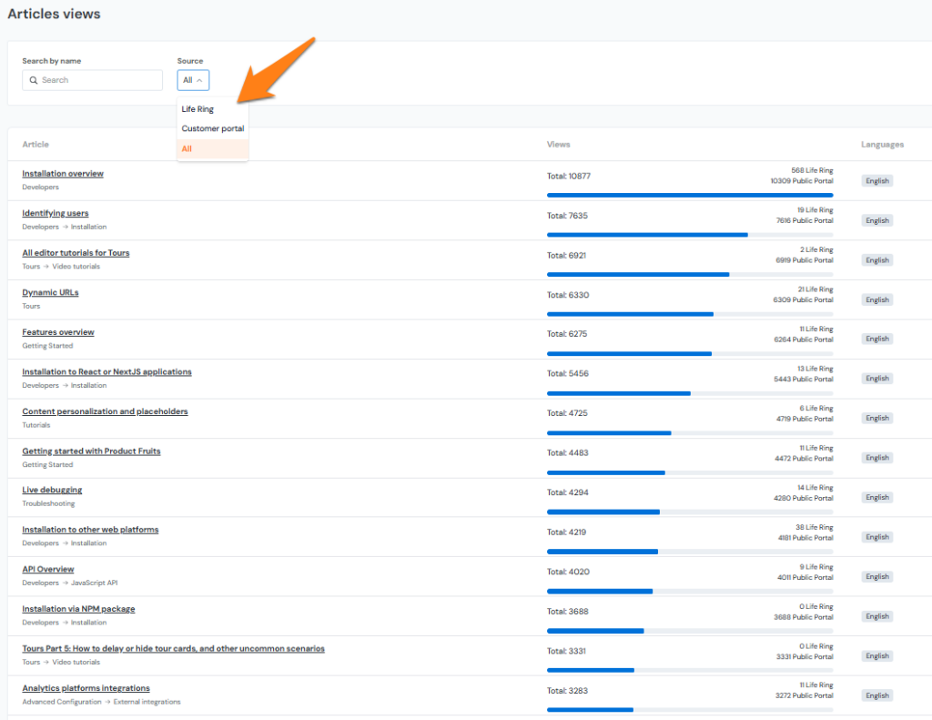
12. Knowledge Base Usage
If you use an onboarding platform’s knowledge base function (e.g., to provide more details on topics covered by product tours or hints), it makes perfect sense to measure which knowledge base (KB) articles are most frequently accessed. This also illustrates what users typically struggle with or need deeper guidance on.
13. Feedback Collection
Gather user opinions through well-timed in-app surveys. Most DAPs and onboarding platforms offer a variety of survey tools that you can deploy at specific points in the user journey. You might ask for feedback in emoticons, NPS, or a numeric scale score after a user completes a task or set of tasks or when using a new feature for a set period.
Analyze response rates and sentiment to identify areas for improvement in both your SaaS product and onboarding process. This direct line to user feedback can guide your product development priorities.
If you are already a Product Fruits user, explore our available tours, Knowledge Base, and other analytics functions. And if you are new to onboarding, see how Product Fruits drives product adoption now (first 14 days on us)!
Product and User Metrics
Product onboarding and adoption metrics clearly show how well new users engage with and derive value from your product. They can also reveal whether your onboarding process will encourage users to explore key features and fully adopt the product. Moreover, you can identify how many users are and where they are stuck, providing ideas on resolving these churn points with onboarding tools like product tour software.
As we already mentioned, while tracking the performance of product tours is always important, a well-crafted set of product tours (and other onboarding/ product adoption interactions) will also impact the broader onboarding metrics listed below. Consider using them to guide your product tour strategy and see if they actually help improve user onboarding, retention, and engagement.
Overview of product and user metrics
- Conversion Rate
- Adoption Rate
- Time-to-Value
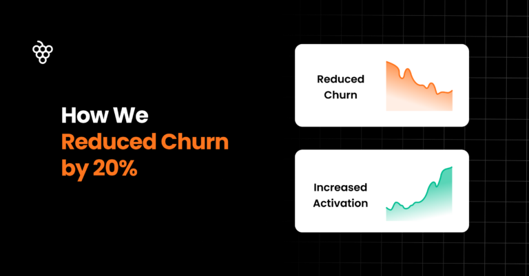
- Activation Rate
- Usage Frequency
- Churn Rate
- Customer Lifetime Value (CLV)
- Average Session Duration
- Upsell Rate
- Net Promoter Score (NPS)
- Customer tickets
You can learn more about some of these metrics in one of our previous blog posts.
What’s Next for Your Product Tour?
Peter Drucker famously said, “You can’t manage what you don’t measure.” While this statement may not be absolute or universal, it applies to product onboarding and its elements, like product tours.
Tracking these product tour metrics and general user onboarding progress can reveal strengths and weaknesses in your product adoption process, tools you have created to improve it, and your product itself. They highlight where users engage the most and where they encounter difficulties. With this knowledge, you can make informed decisions to improve user onboarding, conversion, adoption, and retention. If users are skipping some steps in your tours or spending an excessive amount of time on others, investigate why and adjust accordingly.
Your onboarding and product tours should evolve with your product and user needs. With Product Fruits, you can easily update and test different elements. This ongoing improvement ultimately leads to more satisfied users and better business results.
If you are already a Product Fruits user, explore available tours, Knowledge Base, and other analytics functions. And if you are new to onboarding, see how Product Fruits drives product adoption now (first 14 days on us)!