6 interactive software walkthroughs and what makes them work


TL;DR
- An interactive software walkthrough is step-by-step guidance that runs inside your live product and asks users to complete real actions, not just read about them.
- It works because people learn by doing at the moment they need a feature. Research from Nielsen Norman Group shows up-front tutorials are quickly forgotten, while contextual help lands.
- The best examples (FLOWN, Notion, Canva, Slack, Lucidchart, Figma) start with the user's goal, keep sequences short, show progress and keep help available after the tour ends.
- Linear tours are giving way to behavior-aware walkthroughs that branch based on who the user is and what they do next.
Most users who churn early never fail at your product. They just never get far enough to see why it matters. In a Wyzowl survey, 86% of people said they'd be more likely to stay loyal to a business that invests in onboarding content that welcomes and educates them.
Interactive walkthroughs are how SaaS teams deliver that education inside the product, without a CSM on every account. But a walkthrough can also be the thing users click "Skip" on in two seconds.
This guide breaks down six interactive software walkthroughs, what each does well, and a simple set of criteria you can use to judge (and fix) your own.
What is an interactive software walkthrough?
An interactive software walkthrough is a guided, in-app sequence that teaches users a workflow by having them perform it in the live product. Each step points to a real element, explains why it matters and moves forward when the user takes the action.
That last part is the difference. A walkthrough doesn't narrate your interface. It gets the user to their first result, using their own data.
It also helps to separate three terms that often get lumped together:
Walkthrough or interactive demo? Ask one question: does the user's click need to change something real in their account? If yes, you need an in-app walkthrough. If you only need a prospect to understand the product before signing up, an interactive demo is the lighter option.
What makes a great interactive walkthrough?
A great interactive walkthrough gets one user to one meaningful outcome in as few steps as possible. Everything else is decoration.
Nielsen Norman Group's research on onboarding tutorials found that tutorials shown up front interrupt users, don't necessarily improve task performance and are quickly forgotten. Contextual help, delivered when the user reaches a feature, avoids those pitfalls. The strongest examples below all lean on that principle.
Use these criteria to score any walkthrough, including your own:
6 interactive software walkthrough examples
Here's how six well-known products put those criteria to work. Onboarding changes often, so treat each flow as a pattern to borrow rather than a pixel-perfect template.
1. FLOWN: a personalized walkthrough tied to an activation milestone
FLOWN is a virtual co-working and body-doubling platform that helps remote workers focus through facilitated group sessions, coaching and educational resources. FLOWN builds its onboarding with Product Fruits, and it's a clean example of a walkthrough designed around one measurable outcome.
Step 1 – A survey card that sets the path. New users are asked why they signed up. Their answer routes them to relevant content, such as live sessions, videos or articles.
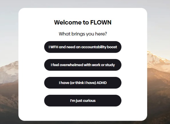
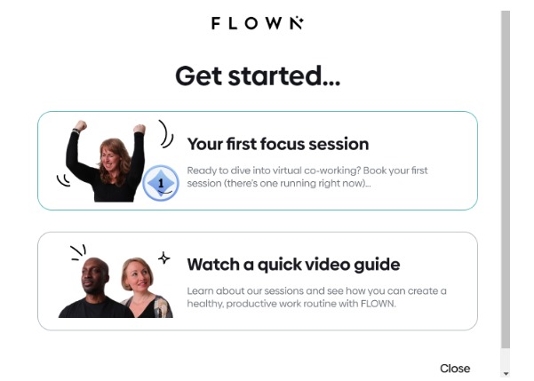
Step 2 – A welcome card with two clear choices. Instead of a long tour, users get two options: book their first focus session or watch a short video guide on building a productive routine.
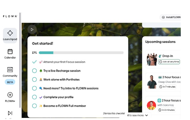
Step 3 – A checklist built around activation. FLOWN defines activation as attending four co-working sessions during the 30-day trial, according to the FLOWN case study. An embedded onboarding checklist with a progress bar keeps that goal visible.
Step 4 – Hints at the moment of need. Contextual hints explain features like the Calendar when users reach them, which keeps cognitive load low in the first session.
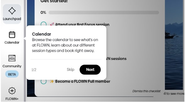
Step 5 – Rewards and on-demand help. After the first session, users earn a badge and get a nudge to book the next one. A help center in the bottom-left corner gives every user self-serve access to guides and support, while segments see targeted tours.
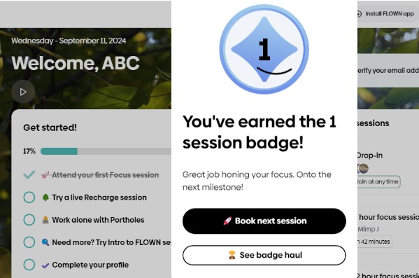
Why it works: every step points at the same milestone. The checklist, the welcome card and the hints all push users toward session number four.
"Product Fruits has also reduced time to value for new users, helping them quickly recognize the benefits of our platform." – Guy Brockless, Product and Strategy Director, FLOWN
2. Notion: the tutorial is the product
Notion combines docs, wikis and project management in one workspace. Its onboarding is a textbook case of learn-by-doing.
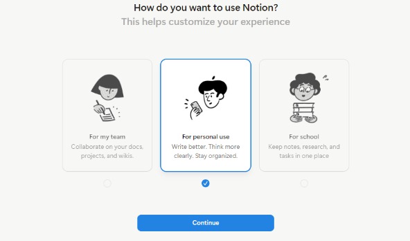
Step 1 – A short setup that shapes the workspace. At signup, Notion asks how you plan to use it, including whether you're working alone or with a team, and uses the answers to set up your starting workspace.
Step 2 – A Getting Started page instead of a tour. New users land on a page that is both the tutorial and a real document. It asks them to type anywhere, try the "/" command and explore content blocks.
Step 3 – Checklist items you complete by editing. Each item is finished by actually doing it, so the user leaves with working knowledge rather than a memory of tooltips. Templates then show what else Notion can do, and Notion's help center covers the basics for anyone who wants more.
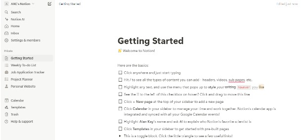
Why it works: there's no separate learning mode. The walkthrough and the product are the same thing.
3. Canva: fast to value, with a lesson in personalization
Canva has grown from a design tool into a broad visual suite, and its onboarding shows both the power and the limits of a single question.
Step 1 – One use-case question. Canva asks, "What will you use Canva for?" with options such as personal, business, education or nonprofit.
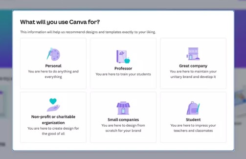
Step 2 – Straight into templates. Users land on templates, the fastest route to Canva's classic aha moment: pick a design, change the text, and you have something that looks professional.
Step 3 – AI as a second door. Canva AI sits in the sidebar and can turn a written brief into draft designs. A 2026 teardown of Canva's onboarding found the AI route produced a publishable post in about 15 clicks, while the manual template route took 23 or more.
Step 4 – Upgrade prompts in context. Pro features show up exactly when a user reaches for them, for example a premium font or background remover, rather than as an up-front paywall.

Why it works (and what to watch): Canva removes almost all friction between signup and a first design. The same teardown notes that the use-case answer didn't visibly change the landing page. The lesson for your product: if you ask a question, make the answer change what the user sees.
4. Slack: learn by sending real messages
Slack is a messaging and collaboration platform, and its onboarding has long been about getting a team talking as fast as possible.
Step 1 – Workspace creation. Slack asks for your company or team name, which gives users instant ownership of their new workspace.
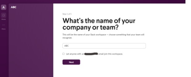
Step 2 – Team setup. A few quick questions cover what the team is working on and who to invite, so the workspace has real channels and real people from day one.
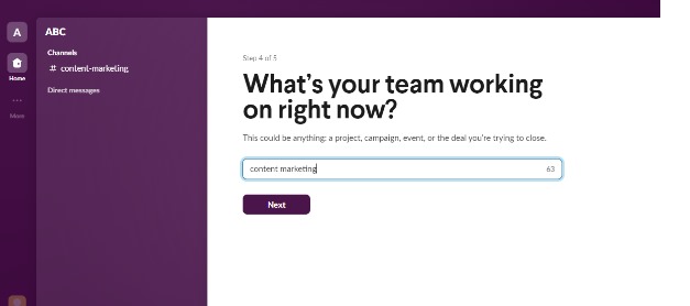
Step 3 – Guidance inside the real workspace. Short prompts and tooltips introduce channels, messages and navigation while users do real work. Each step can be dismissed, so experienced users aren't held hostage.
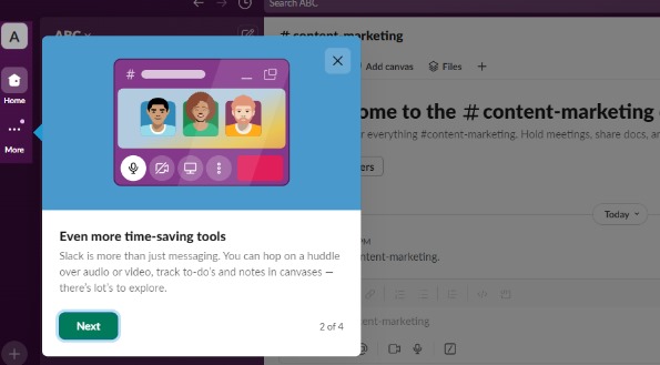
Step 4 – An AI assistant for everything after. Slack now positions Slackbot as a personal AI agent that can summarize conversations, find messages and draft content. For new users, that turns "where do I find…?" into a question they can simply ask.
Why it works: the walkthrough ends in a working channel, not a finished tour. Guided steps get users started, and an assistant catches the questions a linear walkthrough can't predict.
5. Lucidchart: role-based paths into templates
Lucidchart is a diagramming tool for everything from flowcharts to org charts.
Step 1 – User profiling. Lucidchart asks about the user's role and how experienced they are with diagramming, from novice to proficient.

Step 2 – Collaboration early. Users are invited to add coworkers or share a link, which pulls the whole team in before the first diagram exists.
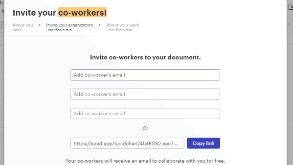
Step 3 – Use case, then template. Users pick their first task, such as a flowchart, roadmap or org chart, and get matching templates as a head start.
Step 4 – Help that never goes away. A short tutorial overlay guides the first diagram. After that, the Help icon in the workspace footer opens a learning center with tutorial videos and interactive walkthroughs, according to Lucid's help center.
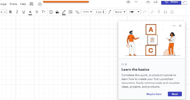
Why it works: the first walkthrough is short, and deeper guidance is always one click away when the user is ready for it.
6. Figma: practice files and on-demand tours
Figma has grown from a design tool into a family of products, including Figma Design, FigJam, Figma Slides and Figma Make.
Step 1 – Identify the user. Figma asks what kind of work you do, with options spanning design, product management, development, research, education and more.
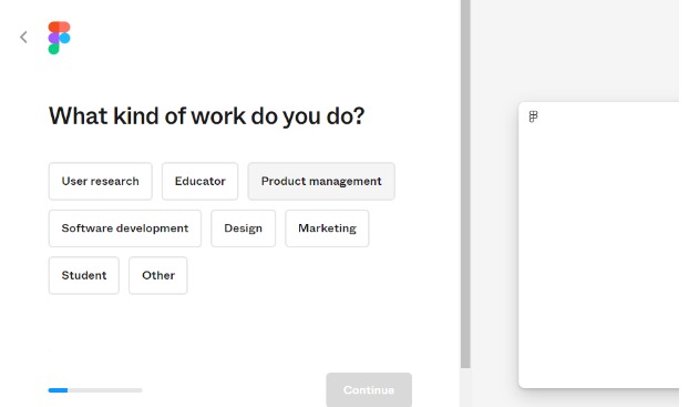
Step 2 – Pick a starting point. Users choose what they want to do first, such as design, whiteboard or present, so the first session lands in the right product.
Step 3 – A guided first action. Inside the editor, a tooltip explains a foundational concept, like creating a frame.
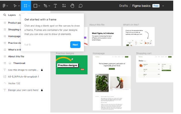
Step 4 – Practice files and starter projects. Sample files invite users to edit real designs, and Figma's help center offers navigation tours and bite-sized starter projects for learning by doing.
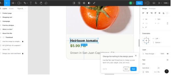
Why it works: Figma never asks users to memorize the interface. It gives them something safe to break.
What these examples have in common
Put the six side by side and three patterns stand out:
- One question, one path. Each asks a single question about role or intent. The best ones (FLOWN, Figma) use the answer to change the next screen.
- Real work over explanation. Notion's page, Slack's channels and Figma's practice files all teach by letting users produce something.
- Help that outlives the tour. FLOWN's help center, Lucid's learning center and Slackbot all keep guidance available after the first session, which is when most real questions show up.
The emerging fourth pattern is behavior awareness. Instead of one linear tour for everyone, walkthroughs increasingly branch based on who the user is and what they've already done, and hand off to an AI assistant when the user needs something the walkthrough didn't anticipate.
How to choose interactive walkthrough software
The right tool is the one that lets your team ship and update walkthroughs without a developer sprint for every change. Use this checklist when you compare options:
- Goals first. Decide whether you're solving activation, feature adoption or support volume. Each needs different building blocks.
- Learn-by-doing steps. Check whether steps can advance on a real click or input, not just a "Next" button.
- Targeting and branching. Look for segments, user properties, events and URL rules, plus the ability to send different users down different paths.
- Editing speed. Non-technical teammates should be able to build, preview and publish on top of your real UI.
- On-demand help. Guidance should be replayable, with a self-serve help center or AI assistant in the app.
- Localization. If you serve multiple markets, check how translations are managed.
- Analytics. You need completions and drop-off by step, plus a way to connect walkthroughs to activation.
- Real reviews. Compare ratings on independent sites like G2 and ask for a demo using your own use case.
For a deeper comparison, see our guide to choosing product tour software.
How to build interactive software walkthroughs with Product Fruits
Product Fruits is a no-code product adoption platform for web apps. It gives you two ways to build walkthroughs, depending on how much the journey needs to adapt.
Flows for adaptive, multi-step journeys. Flows are built on a visual canvas. A flow can wait for the user to click a specific element or type into a field before moving on, so users learn by doing. Condition steps split the journey by segment, user properties, events or the state of another flow. A new admin and an invited teammate can get two different walkthroughs from one flow.
Record with Elvin to build faster. Instead of starting from a blank canvas, you can click through your own product with the recording toolbar. Each element you click becomes a step, and Elvin, Product Fruits' AI, drafts the card copy from the page content and any context you add. You then edit everything. Existing tours can also be migrated into Flows.
Tours, hints and checklists for the essentials. Product tours handle short, linear introductions. Hints stay available on the page for just-in-time explanations. Checklists launch tours, show progress and celebrate completion, just like FLOWN's activation checklist.
Help that outlives the walkthrough. The Elvin widget gives users one place to replay tours, browse articles and videos, read the newsfeed, send feedback and ask Elvin questions, answered from the content sources you approve. A flow can even open the Elvin chat or a specific widget tab at the exact point users tend to get stuck.
Measure and improve. Tour analytics show views, completions and drop-off by step. With the Product Fruits MCP connection, you can connect an AI assistant such as Claude, Cursor or Codex to read your flow analytics and find where users drop off. The connection is read-only and uses OAuth sign-in.
Tours vs. Flows: a tour shows every user the same sequence. A flow reacts to what each user does – it waits for the real action, branches by role or behavior and hands off to Elvin when a user needs open-ended help. Branching and Elvin steps are available on the Pro and Business plans.
Teams notice the difference. Product Fruits holds a 4.6/5 rating from 254 reviews on G2 and 4.8/5 on Capterra. One senior instructional designer wrote on G2 in August 2026 that "the new Flows feature with advanced branching logic is very powerful and allows us to design guided experiences that adapt to different paths and scenarios."
FAQ
What is an interactive software walkthrough?
An interactive software walkthrough is in-app guidance that teaches a workflow by having users perform each step in the live product. Steps point to real interface elements, explain why they matter and advance when the user takes the action. The goal is to get a user to a meaningful result, such as a first project or first report, rather than to explain every feature.
What's the difference between an interactive walkthrough and a product tour?
A product tour usually shows a fixed sequence of cards that users click through with a "Next" button. An interactive walkthrough asks users to complete real actions and often adapts to their role or behavior. In practice, many teams use short tours for orientation and walkthroughs for activation tasks that need hands-on practice.
Interactive walkthrough vs. interactive demo: which do I need?
Use an interactive walkthrough when users need to complete a task in their own account, like onboarding or feature adoption. Use an interactive demo when prospects need to understand the product before signing up. Demos run on a captured copy of the product, so they're ideal for marketing pages and sales follow-ups but can't change real data.
How many steps should an interactive walkthrough have?
Keep each sequence short, typically three to five steps, and split longer journeys into smaller walkthroughs triggered when they become relevant. Product Fruits' own tour guidance notes that users are more likely to engage with tours of four to five cards. Every step should move the user closer to a single outcome.
How do I measure whether a walkthrough is working?
Track two layers. First, walkthrough metrics: how many users start, where they drop off and how many finish. Second, the outcome it supports, such as activation, feature usage or fewer support tickets. A walkthrough with high completion but no change in activation is teaching the wrong thing.
Can I build interactive walkthroughs without coding?
Yes. Tools like Product Fruits let product and customer success teams build walkthroughs visually on top of the live product after a one-time code snippet install. You can create tours, hints, checklists and adaptive Flows, target them to segments and update them without developer help. Record with Elvin can draft a flow as you click through your app.
How is AI changing software walkthroughs?
AI is changing both how walkthroughs are built and how users get help. Builders can record a path through the product and have AI draft the copy. Inside the product, AI assistants like Elvin answer open-ended questions a linear walkthrough can't predict. Walkthroughs are also becoming behavior-aware, branching based on what each user actually does.
Conclusion
The best interactive software walkthroughs don't explain your product. They get one user to one real result, then stay available for the next question. FLOWN ties every step to an activation milestone, Notion turns the tutorial into the product, and Figma gives users a safe place to practice.
You can build the same kind of experience without engineering sprints. With Product Fruits Flows, your walkthroughs react to what users do, branch by role and behavior, and hand off to Elvin when users need more help.
Book a demo to or try Product Fruits for free to see how Flows and Elvin can turn your onboarding into a walkthrough users actually finish.


Weekly newsletter
Get the latest releases, tips, articles, and exclusive interviews delivered to your inbox weekly—no spam!