You wouldn’t embark on a road trip without a map that highlights all the must-stop sites along the drive to your destination –– you’d be missing out on all the action.
The same applies to your platform. Without the proper onboarding, you can’t expect users to understand what to do on your platform.
The goal of user onboarding goes above teaching users how to navigate your platform — it’s guiding them to reach their “aha” moment.
It’s the start of an ongoing partnership between the user, and the solution your platform provides.
By understanding the how to improve user onboarding, with the best practices that guarantee a smooth and helpful user onboarding experience, you ensure users are engaged and find value in your product.
Common reasons users abandon onboarding
When users first open a platform, many variables contribute to the overall experience. Without the necessary support and clarity for a smooth onboarding, users can quickly feel lost and may choose to abandon the app.
Some reasons users abandon an app are:
- Overwhelm: When there’s too much info thrown at the user all at once, it’s easy to feel overwhelmed. Users might think, “Whoa, this is too complex. I don’t have time for this.”
- Poor explanation: If your product features are not clearly explained, users can get confused. They might not understand how your platform benefits them, or how to use it.
- Technical difficulties: Nothing sends a user packing faster than a buggy platform or a crashing app.
- Lack of personalization: Today’s users expect a tailored experience. If your onboarding feels too generalized, they might lose interest.
- No clear value proposition: Users need to understand what’s in it for them, and fast. If they don’t perceive value, they won’t stay.
- Time-consuming process: In today’s fast-paced world, users value their time highly. If your onboarding process feels like it’s dragging on forever, users might abandon it in favor of something less time-consuming.
Lucky, for you, we’ve got a list of practices to improve your user onboarding.
1. Personalize the user onboarding experience
User onboarding personalization is the practice of tailoring the onboarding experience to suit the individual needs, preferences, and goals of your users. It’s like giving a customized tour to every newcomer instead of pointing them toward a one-size-fits-all instruction manual.
Personalization can make users feel seen and understood; it communicates that their specific requirements or goals matter.
Take a look at how Calm, an app for mediation personalized the onboarding experience to understand their user’s needs. New users can customize the app’s onboarding process depending on their needs– before filling out any personal information.
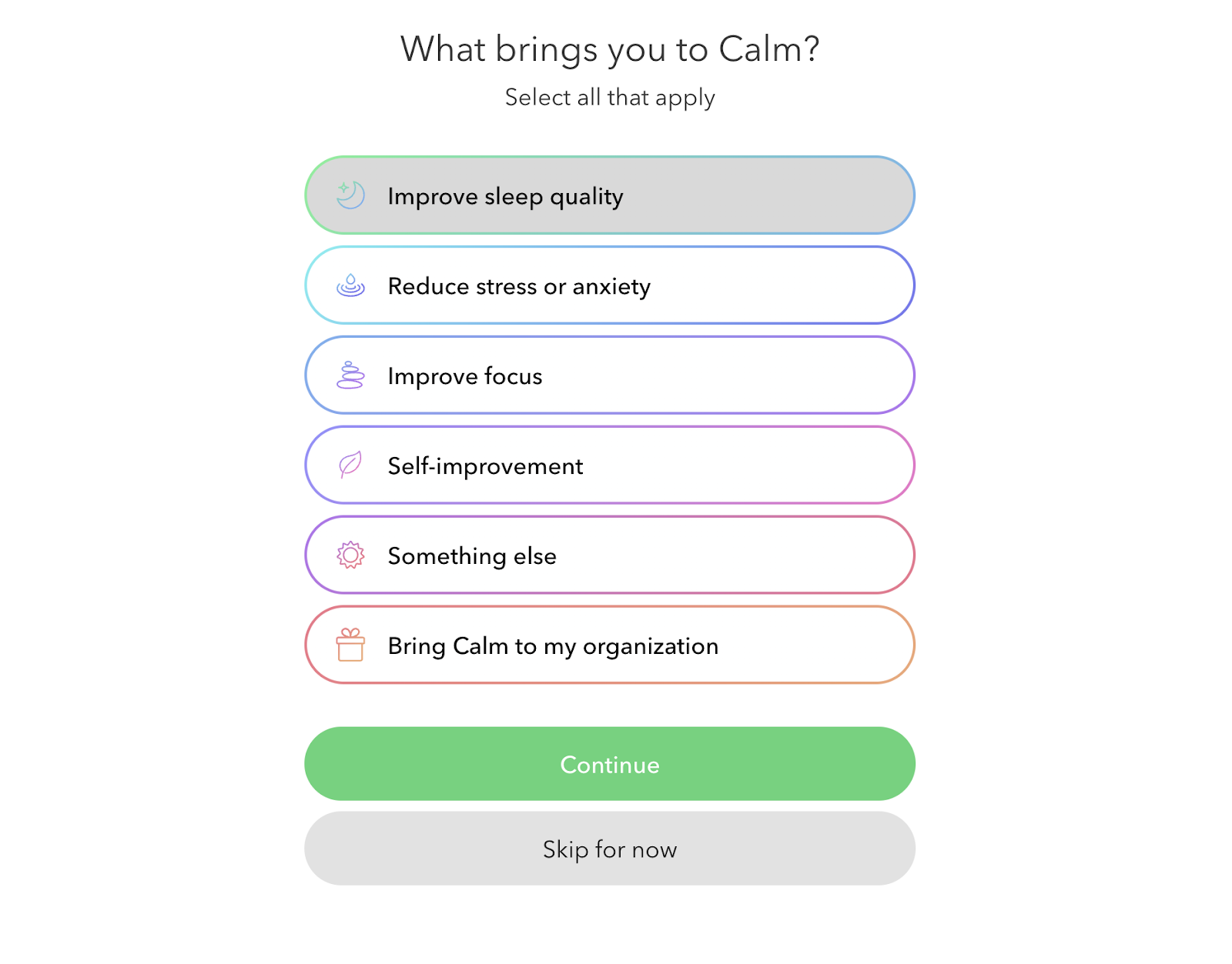
( Image source: Calm)
This allows the onboarding process to target the user’s pain point directly, in this case; improve sleep quality.
By personalizing the onboarding flow based on user responses, you can tailor the process to highlight features that address each user’s unique needs.
2. Gamify the process with quick wins
Gamification motivates users to reuse apps and complete onboarding, studies have found. This is because injecting some fun into the process via gamification can do wonders for user motivation.
Gamification in user onboarding involves leveraging game design elements in non-gaming contexts. Think of it as turning the onboarding process into a game, where users can earn points, unlock achievements, or level up.
Why does this work? This same psychology works for user onboarding too. By adding gamification elements, we make the process more stimulating and engaging for the user, which drives them to complete the onboarding and explore the platform further.
Duolingo uses gamification to motivate users to continue learning a language through their app. This makes users feel like they are progressing further down the onboarding journey.

(Image source: Duolingo)
For users, completing their onboarding is like unlocking an achievement and gaining points. Motivated by their success, they’re encouraged to take the next lesson, and the next, turning what could’ve been a mundane onboarding process into an exciting challenge.
3. Empower users to take control with self-service onboarding
Self-service onboarding puts the user in the driver’s seat. It’s like giving them a map and letting them navigate through the platform at their own pace. This approach helps users not be overwhelmed by a barrage of information all at once.
Self-service onboarding typically involves a combination of guided tours, contextual hints, video tutorials, and comprehensive help centers. These resources allow users to learn about the platform in a hands-on manner, reinforcing their understanding and retention of the material.
For example, Keboola, an advanced data management platform realized their platform was far too complex to onboard users with only one demo. Due to the heavy amount of features, Keboola found a way to support its users with helpful hints and tips throughout the app. That way, users can explore the features without feeling lost or confused.
Fruity Inspiration: How Keboola improved onboarding speed by 29%
But the real magic of self-service lies in its ability to foster user engagement. When users independently interact with your platform, they’re more likely to find value and form a deeper connection with your product.
4. Track user behavior to identify roadblocks
Understanding user behavior through data is critical in ironing out any roadblocks in your onboarding process. Data gives a holistic view of where users struggle, abandon, or leave the app, providing invaluable insights that can drive significant improvements.
Consider this: A user starts the onboarding process, progresses smoothly, but suddenly abandons the app at the goal-setting stage – a clear red flag that there’s a potential issue at this point. Without the help of user data, this problem might remain unnoticed, leading to higher churn rates.
And, onboarding metrics and data can help identify patterns in user behavior. It shows you which steps are most engaging, which features users interact with first, or what kind of content prompts users to take the next step.
These insights can inform the fine-tuning of the onboarding experience, making it more intuitive, and engaging to the user.
5. Keep it short, sweet, and straight to the “aha” moment
User onboarding needs to be a succinct, clear, and guided journey that leads users to the “aha” moment as quickly as possible. This is the moment when users truly understand the value your app brings to their life.
Overcomplicated or lengthy onboarding can overwhelm users, causing them to abandon the process and potentially, the platform.
Consider a fitness-tracking app. The goal is to get users tracking their first workout ASAP. A long-winded process asking users to fill out detailed profiles, set long-term goals, and explore every feature of the app might seem thorough, but it’s likely to demotivate and exhaust users.
Once users have experienced the platform’s value firsthand, they’ll be more motivated to explore other features and customize their profiles. By keeping the onboarding process brief and leading users swiftly to the “aha” moment, you can ensure a more engaging and effective user experience.
6. Add a little human touch to the experience
Incorporate human interaction into the onboarding process to significantly boost engagement. A well-timed nudge from a customer success agent can both help users overcome initial barriers and also make them feel valued and supported. These interactions should be subtle and unintrusive, designed to guide rather than dictate.
Take for instance a scenario where a new user has downloaded the app, but hasn’t tracked their first workout within the first three days. A customer success agent could send a friendly, message like; “Hey there! Noticed you haven’t logged your first workout yet. Remember, no matter how short or simple, every step counts towards your fitness journey. Let’s get started!”
This form of communication can come in the form of live chats, or through emails. For example, when users sign up to use our product, we send out personal emails to show them the importance of finishing their onboarding.
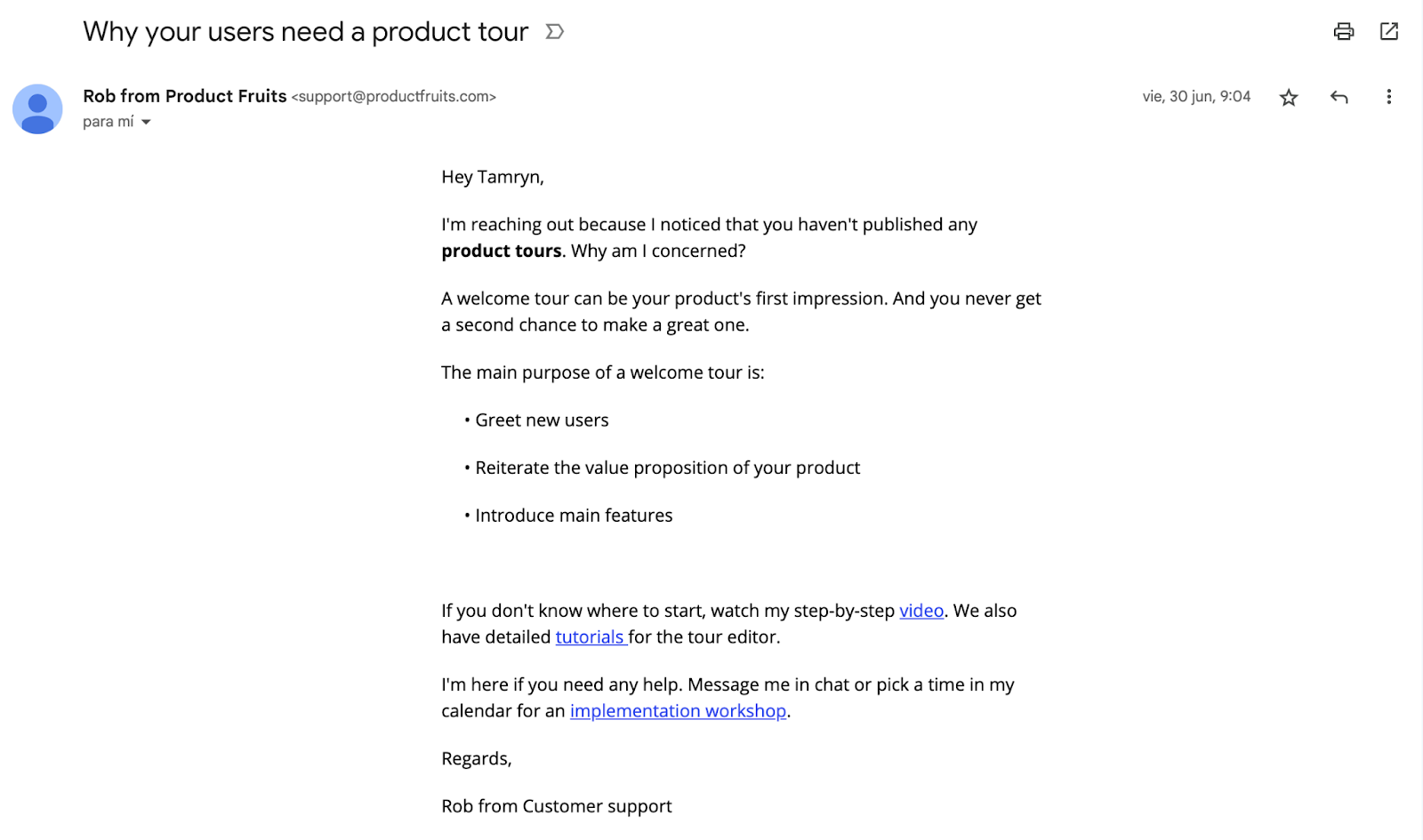
( Image source: Product Fruits)
This kind of personalized, human touch can reinforce the user’s motivation to engage with the app and remind them of the value your product offers. It’s the balance between automated efficiency and human connection that can make all the difference in successful customer onboarding.
7. Add social proof
Add a touch of social proof in the form of quotes, data, or stories during the onboarding process.
It helps build trust with users, showing them that others in their situation have found a solution in the platform they are currently investing time in. It also helps to show users that the app they are signing up for is backed by reliable data.
For example, during the onboarding process, Calm includes a social proof statistic to show users that by using their app they will improve their mental health.
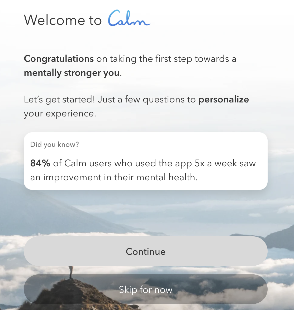
( Image source: Calm)
8. Ask for feedback, and take action
One of the most effective ways to understand user needs and enhance your product is to solicit direct feedback. Surveys provide a platform for users to voice their opinions, share their experiences, and suggest improvements.
When designing surveys, key considerations include brevity, relevancy, and timing. Keep them short and to the point to respect users’ time. Ask questions that are pertinent to the user’s interaction with the product to garner valuable, actionable insights.
(Image source: Product Fruits)
For instance, after a user completes their first week using your app, you could send a quick survey asking for their initial impressions and any difficulties they encountered. Questions such as, “Were you able to track your workouts easily?” or “Did you find any feature challenging to use?” can provide valuable insights.
Once you’ve collected this feedback, it’s time to take action. Analyze the responses, identify trends, and use the insights to inform your product development strategy.
9. Keep help and resources only a click away
Confusion and frustration are a surefire way to make users abandon an app. When users can’t understand features or reach their goal, they’re more likely to look for a solution elsewhere.
The solution is to keep helpful resources and support accessible at all times. This could be in the form of support chats, resource centers, or hints for each feature.
Here’s an example of how Product Fruits keeps our life ring button ready for action.
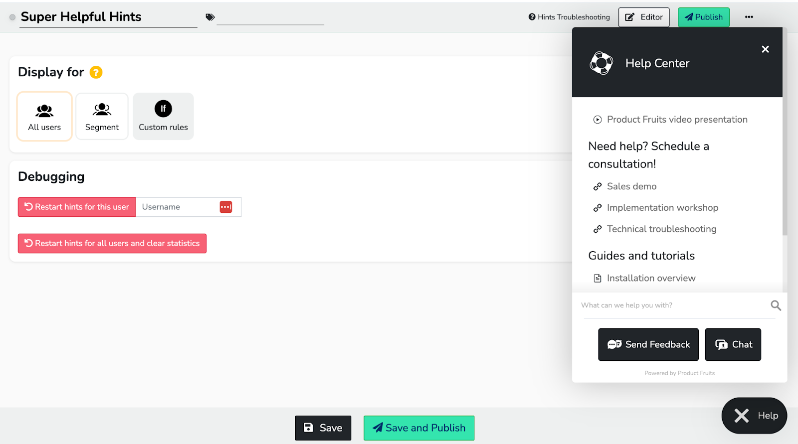
(Image source: Product Fruits)
It’s also good practice to put information like customer service contact, frequently asked questions (FAQs), or tutorials in a visible location on the product page or app—ideally an area users can easily access without searching for it.
For example, we keep our help information accessible on the homepage of our app (We like to practice what we preach). Here’s how Product Fruits’ homepage provides resources with one click away.
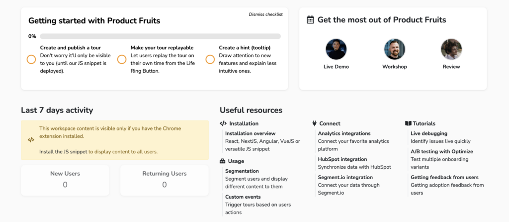
(Image source: Product Fruits)
That way, if users ever encounter any difficulties, they can quickly find what they need to resolve their problems.
10. Use checklists to guide your user’s next steps
Checklists serve as a roadmap for users to understand what action items are next. It gives them an overall understanding of the process and helps them complete all the onboarding tasks.
Checklists also provide users with a sense of accomplishment. When they tick off each element, it increases their user experience and makes them feel appreciated.
For example, here’s how Product Fruits uses checklists to guide our users step-by-step through onboarding:
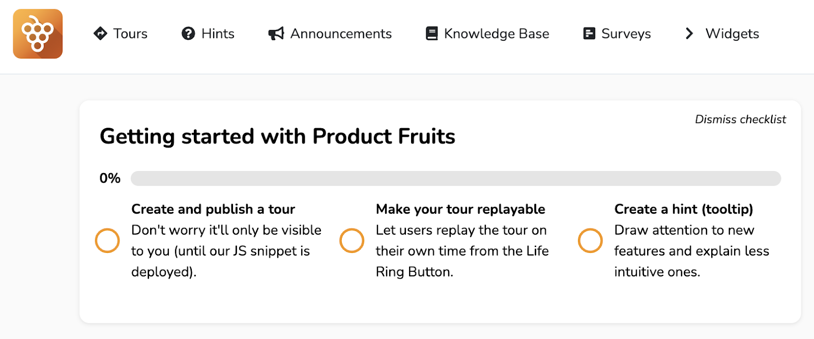
(Image source: Product Fruits)
The best onboarding is flexible, customizable, and created to help your users.
Seamless user onboarding is a critical part of creating an enjoyable user experience. From making resources readily available, to utilizing checklists for clarity and task completion, every step you take to improve this journey can drastically impact user adoption and retention.
Product Fruits makes creating onboarding features and tours easy. It acts as an invisible layer over your platform. This allows you to add hints, support, surveys, demos, and tours easily. No coding is required.
Our platform practices what we preach, with support and guidance just a click away, and a checklist system that guides users step-by-step, ensuring a smooth onboarding experience.
With Product Fruits, you don’t just onboard your users, you set them up for success.
Try it for yourself. No credit card required.