In SaaS, your customers are the only voice that matters.
Their opinions, thoughts, and experiences are the only things that matter for your platform’s success.
That’s where surveys step in. They are the informational bridge between the user and the product team.
But, B2B brands get responses from around 4.5% to 39.3%. So, to hit the higher end of this range, you need a fantastic clear survey.
This blog will discuss eleven survey design best practices tips to make sure your surveys pack a punch and deliver practical insights.
The best survey design focuses on the little details that make completing them– just that bit easier.
Let’s look at survey design best practices that ensure optimal user experiences.
Before you make a survey, understand what you want to learn from it.
Set clear goals for your surveys to ask the right questions. For example, do you need to understand if your new product features are useful? Why do users churn? Or maybe if your onboarding was helpful.
Each goal must be specific. Without a clear focus, your survey risks going in different directions and losing meaning.
Here’s a more practical example.
Let’s say I have a project management tool and want to create a survey about customer experience. Instead of a broad goal such as, “I want to know if businesses like our services,” I opt for a more specific goal, like; “I want to understand why some business clients discontinue using our SaaS platform shortly after onboarding.” This refined goal allows me to shape the survey questions to collect insights that directly pinpoint the factors contributing to rapid turnover among our business clientele.
Embed images, videos, or other multimedia elements to increase engagement and provide visual clarity. Adding media will make the survey more personalized and create a more interactive experience for participants.
And, media is a great way to catch the attention of app browsers.
Timing refers to the strategic selection of when to administer a survey to achieve the most accurate and representative responses.
The right timing is based on the context, the target audience’s availability, and potential external influences that can contribute to the effectiveness of your survey.
For example, if you’re collecting feedback on a new product, it’s best to conduct the survey shortly after the product launch when users have had sufficient time to experience it. Immediate feedback might capture initial impressions, while delayed feedback may provide insights into long-term satisfaction.
Fruity tip: If you want to understand immediate reactions or make quick decisions based on fresh insights, immediate feedback is preferable. Delayed feedback is more appropriate if you aim to evaluate long-term satisfaction, gather more thoughtful responses, or assess the sustained impact of an event or product.
Right timing should also consider seasonal factors. For example, if your survey is related to seasonal topics (e.g., holiday shopping habits), plan the survey to coincide with relevant times of the year. It assures that responses accurately reflect behaviors and preferences during those specific periods.
Take a cue from Stripe—they nailed this strategy. Right after I linked my account with their API, they presented a concise survey with closed-end questions. What’s neat is, if you want to share more details, there’s an open-ended box, too. This approach is spot-on because it captures feedback when the experience is fresh, allowing users to express their thoughts precisely. This enhances brand strength during onboarding.

Jumping into A/B testing is an excellent idea to improve the response rates. A trial-and-error buddy that tells you what works and what doesn’t.

When you experiment with different survey versions, you become more confident in improving your approach based on real user responses. It’s about testing your ideas and learning from the insights you get.
Play with subject lines, word counts, color schemes, and media choices. Stick with what earns the highest open rates until you find something better.
Once you’ve identified the winning elements, keep refining. It’s an iterative process where you learn, adapt, and enhance your surveys over time.
Maintain a balance between the number and types of questions to avoid survey fatigue.
Too many questions can overwhelm respondents, which leads to incomplete or rushed answers.
Apart from avoiding long surveys, it’s also good practice to choose between open-ended and closed-ended questions.
Closed-ended questions are practical for gathering specific, quantitative data points efficiently. They include multiple-choice or rating scale questions, providing structured data that is easy to analyze.
You can use closed-ended questions to quantify responses or obtain information about preferences, making the analysis more precise.
This approach is evident in Veed.io’s survey design after tool usage. Respondents can share specific feedback with just one click. It’s super quick and enhances the depth of insights.
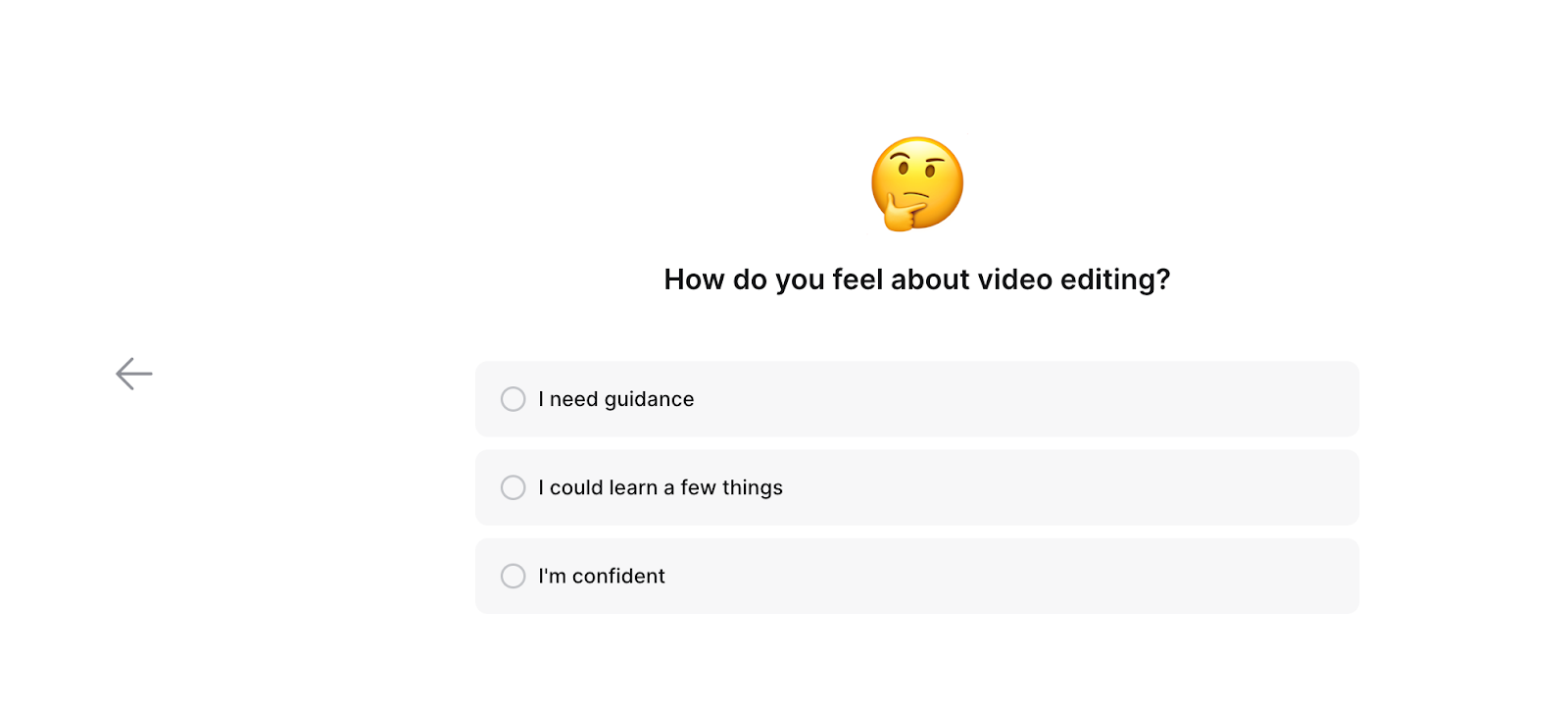
Open-ended questions are key when you need detailed, qualitative insights. They allow respondents to express opinions and provide nuanced responses beyond predefined options.
You can use closed-ended questions to quantify responses or obtain information about preferences, which makes the analysis process more straightforward.
Take, for instance, my experience with Monday.com, a project management tool I recently started using. Intrigued by its continuous improvement approach, I explored the “All updates” section and discovered a “Send feedback” option. Clicking on it opened a form with thoughtful questions. This allowed me to share specific feedback about my experience, providing nuanced insights beyond predefined options.
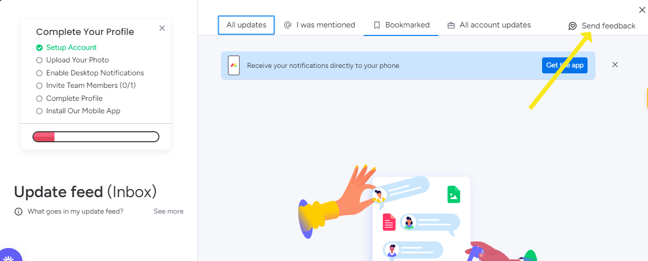
Source: Monday.com,
Incentives can help boost your response rates. Think of incentives as a way to say “thanks” to respondents for their time. It could be entering them into a sweepstakes or rewarding them with a gift card if they answer all your questions.
We know incentives can sometimes lead to inaccurate data because people might respond just for the reward. But incentives can be a helpful nudge if you’ve tried different engagement strategies and still have low response rates.
Your incentive doesn’t have to be grand, but it should be something the user finds valuable. It could vary from a helpful ebook, an extended trial period, or even free credits – whatever makes taking the survey more rewarding for participants.
Changelogs, which highlight recent updates or modifications to a product, allow users to share their thoughts and experiences directly related to the changes.
It offers a real-time understanding of how users respond to updates or new features. This direct connection between changelog updates and user feedback provides a dynamic and responsive approach to product development.
You can consider these critical design practices to optimize the user experience.
The idea here is to design short and to-the-point surveys. Respondents are more likely to complete surveys with focused questions when they are concise.
Long and complex surveys can lead to fatigue, causing users to abandon the study before finishing.
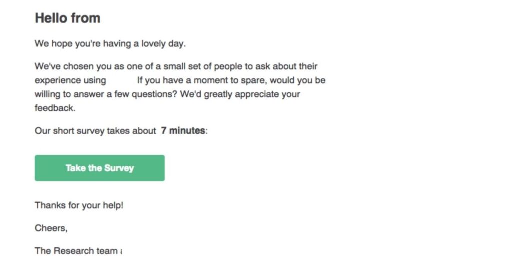
Slack sets a prime example of keeping surveys concise. They clarify that you’re among the chosen few for a survey and even specify the estimated time needed to complete it. This upfront communication respects the user’s time and sets expectations, making the survey process more inviting.
Question wording and instructions have a direct influence on respondents’ interpretation and response.
The words you choose in survey questions can significantly impact the quality of responses. Avoid absolute terms like ‘always’ or ‘never’ as they force participants into extreme choices, potentially leading to inaccurate or hesitant responses.
Consider this: “Do you always use our premium service?” Such a question may not account for users who occasionally opt for the premium service. Instead, replace ‘always’ with a scale offering options like ‘sometimes’ and ‘rarely’ to gather more nuanced and accurate insights.
Another pitfall to avoid is the double-barreled question, where two distinct sentiments are combined. For instance, asking, “What features do you like about our mobile app and website?” may cause respondents to provide general feedback, making it challenging to pinpoint their specific preferences.
Precision in language is essential to ensure that each question elicits focused and valuable insights, ultimately enhancing the quality of your survey data.
Keeping the language simple in your surveys is a fundamental principle for effective communication. This means using easily understandable words and sentences.
The goal is to minimize confusion for respondents to comprehend survey questions without ambiguity.
Miro excels in this area with its clear and captivating copy. The headline is engaging and attention-grabbing, setting the tone for the rest of the content. The subsequent text is easy to read and provides actionable information.

The final and most crucial step in the creation process is thoroughly previewing the survey before sending it out to respondents. This step involves reviewing the entire survey to ensure accuracy, clarity, and user-friendliness.
Previewing allows you to identify and rectify potential issues, creating a smooth survey-taking experience.
Fruity tip: Before sending it to your user base, take a moment to preview the survey.
Confirm that each question makes sense, answer options are comprehensive, and the overall flow feels logical.
Pat yourself on the back. You’ve now learned the best practices for survey design. Now, let’s delve into the nitty-gritty details. Take a closer look at your participants – did everyone complete the survey, or were there some who skipped questions? This scrutiny ensures the integrity of your results.
Once you’ve gathered the needed data, the next step is to present it effectively. Send your surveys both in-app and in emails. This dual approach will ensure a broader reach and richer insights.
You don’t need to be a coding expert or spend endless hours on development. Product Fruits is here to simplify the process. Whether you are a seasoned designer or just starting, you can create beautiful UX with our editor without long development time.
Don’t believe us? Play around and try it for yourself — 14 free days on us.