You’ve shed blood, sweat, and your developer team’s tears to create beautiful product tours. However, users are canceling onboarding tours.
Now, your analytics show users leave your app before they can even experience how you solve their problems.
Don’t panic. Read this blog post instead.
Understanding what tours drive action or abandonment is key to understanding how to optimize the user onboarding journey.
Do you already use tours for your product? If not, try Product Fruits 🍇 with a 14-day free trial and see how our product tours work.
Why do users cancel onboarding tours?
Users spend an average of 12 seconds on a product tour. That’s not enough time to convince them your product can solve all problems.
In our experience, there are usually two reasons users cancel onboarding tours. Usually, they fall into one of these categories:
- Eager beavers: Users want to jump straight to the features and use the app
- Bored and overwhelmed users: Onboarding tours are far too long and cover too many features for one user to remember everything possibly.
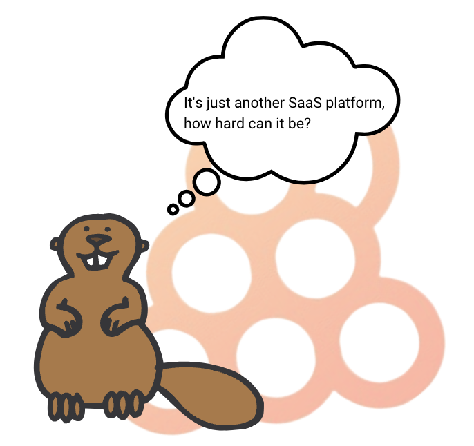
At first glance, one would think that if users don’t complete the tour, it’s failed. But is that the truth? Maybe these users followed the entire tour but just didn’t make it to the very last card.
💡 In 90% of cases, the reason for canceling a tour is, that it is too long.
3 ways to stop users from abandoning onboarding tours
Keeping users engaged with product onboarding tours ensures they understand how to use the app, explore more features, and avoid confusion which inevitably leads to product abandonment.
Here are three ways to improve user onboarding.
1. Use minitours to cut down the length of your product tours
Some platforms are more complex than others. So naturally, the length of tours depends on how many steps users need to take to complete an action, or how many features a platform offers.
Instead of having long tours, where let’s face it; users won’t remember everything –– opt for shorter chunks that form a logical sequence. We call these chunks “minitours”.
A minitour typically consists of no more than four “cards” or information sequences. If a user cancels a minitour, they can still continue with the next one. In fact, a study by Chameleon found that after four tour cards, user attention drops from 46% to 23%. Yikes.
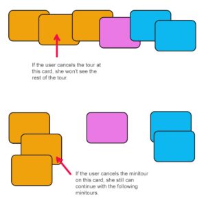
And with shorter tours, your analytics provide better visibility to engagement, as each minitour is monitored separately.
Here’s an example of what it would look like:
Fruity Inspiration: Keboola increased its tour completion rate and user onboarding speed by introducing customized mini demo tours to its complex platform. Read the full case study here.
2. Offer additional resources for curious users
Keep onboarding tours straight and to the point. Tours should use the least amount of steps to reach the moment where users experience the value of your platform.
However, some features require additional explanations or implementation tutorials. For example, when platforms require additional coding or integrations. Instead of having one tour that goes into every detail, you could leverage links to help centers and tutorial resources.
This only applies to users who’d like a deeper understanding of the platform. If they don’t need it, they can move on with the tour and use your product as normal.
For example, we use a quick demo tour at the start of our platform to help our own users create their product tours. As soon as the tour starts, we provide an additional video resource so users can see the whole process upfront and enquire about the finer details like editing and segmentation.
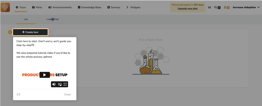
( Source: Product Fruits )
3. Include progress bars to motivate users
Motivating users during a tour can be achieved in various ways. One of the most effective tools is a progress bar that shows users how far they have gone and how much is left to do.
It’s especially useful for tours with multiple steps, as it gives users an idea of what lies ahead. A progress bar also helps users understand the overall structure of the tour and how it’s linked to their goal.
For example, here at Product Fruits we use checklists with progress bars to show users how much they have accomplished.
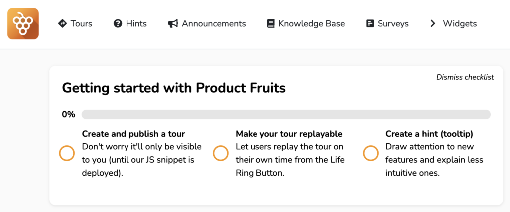
With progress bars, users have full visibility of how far they’ve come in a tour. It helps them understand their progress while also motivating them to complete it. It’s an effective way of helping them go all the way and reach the endpoint.
Create, customize, and introduce product onboarding tours that actually engage users
Now you know the practices that make onboarding tours both engaging and helpful for users.
The next step is to make those tours happen. It might seem daunting, but you don’t need to rely on endless hours of coding, testing, and editing tours. Instead, you can leverage a user onboarding platform that specializes in all the features to onboard new users and convert customers.
With Product Fruits, your platform stays the same. But, you gain an invisible onboarding layer that teaches your users how to interact with features and find the value in your solution. Which leads to user engagement, which leads to conversion, which leads to profit. And that’s a winning scenario.
Create your own tour for free, no credit card or coding required. We’re confident our tours can help onboard happy users.
