Tools for Creating Product Tours in Software Applications: how to choose the right product tours software


A great product isn’t enough—new users need timely, in-app guidance. That’s where product tours software shines: it turns your app into a teacher, shortening time-to-value, reducing support load, and increasing feature adoption. In 2025 the category has evolved beyond simple step-by-step walkthroughs. Modern platforms blend tours, checklists, hotspots, and in-app resource centers with AI Copilots that answer questions, generate tours from your UI and docs, and provide on-demand support inside the product.
How product tours are changing?
What was only recently considered a norm - a complex introductory product or feature tour with many cards - is not the state of the art today. Recent research and surveys show that onboarding that is heavily "tutorial-based" may be too lengthy, intrusive, and does not reliably improve task performance, as Nielsen Norman Group found out.
This does not mean the product tour era is over - but that you should use these tools for brief onboarding supported by ongoing contextual help, hints, mini tours and in general pull type of adoption support, rather than push.
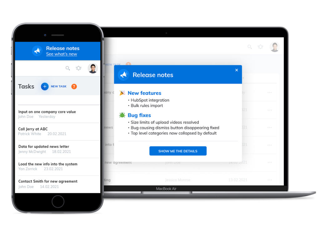
This is why many product tour solutions offer broader set of features and tools - from product tours, hints and onboarding cheklists, through in-app communication with users (banners, newsfeed, annoucements), tools for improved feedback and surveys and in-app help center connected to knowledge base, live support and in some cases even an AI support Copilot or Agent which allows users to get as much self-help as possible - which is actually preferred by both users and product owners.
A recent NBER (National Bureau of Economic Research) study showed, that AI assitance measurably increases productivity by 14 % on average and by as much as 34 % for new users.

What “Great” looks like today
- No-/low-code authoring: Design and ship tours, tooltips, and checklists without engineering. Look for visual editors, reusable templates, and environment targeting (dev/stage/prod). More advanced tools can even automate this with AI - drafting tour cards or entire tours, surveys, and other onboarding content for you.
- Smart targeting & triggers: Launch guidance based on events, segments, and intent (e.g., “first time on page + hasn’t completed setup” or "entered section XY for first time"). Suppress tours when users are already proficient, and add more when new or updated features are introduced.
- AI-powered onboarding & adoption: The new game in town is the AI Copilot chatbot that can answer user questions from your knowledge base, release notes, and help center, and even launch tours or escalate to human support and open a ticket when needed. Many solutions today offer search for a knowledge base or other more rudimentary functions of an in-app help center.
- Experimentation & analytics: Track exposure → activation → repeat usage, not just tour completions. Run A/B tests on copy, steps, and timing. Measure downstream effects (feature usage, support deflection, retention).
- Integrations & data portability: Bi-directional sync with analytics (Amplitude/Mixpanel), CRMs (HubSpot/Salesforce), CDPs, and help desks. Events in, results out—so you can build a complete journey view.
- Performance, accessibility, and localization: Lightweight snippets, no layout shift, WCAG-compliant UI, RTL support, and translation workflows with per-locale targeting.
- Governance & security: Roles/permissions, audit trails, SSO/SCIM, PII controls, and regional data hosting to meet GDPR/ SOC-2 expectations.
- Pricing that scales: Transparent tiers by MAUs or assisted interactions (for Copilots). Watch for caps on audiences, steps, or domains; ensure costs remain predictable as usage grows.
How to evaluate product tours software (quick playbook)
- Map moments that matter: List 3–5 key milestones (first project set up, first integration, invite a teammate, design and implement a tour). Your tool should target each milestone and offer relevant metrics where applicable).
- Bring your content: Import docs/FAQs and test how well the AI answers real user questions. Check grounding sources, citation quality, and safe-fail behavior.
- Prototype a journey in hours rather than days or weeks: Create a checklist + two tours + a resource center. If you can’t do this quickly without devs, keep looking.
- Prove impact, not just clicks: Define success metrics (setup completion, feature activation, support deflection). Require experiment support and funnel analytics.
- Consider edge cases: Single-page apps, iFrames, complex permissions, mobile/web hybrids, and performance under load. If any of those apply to your product, make sure it is supported.
- Plan ownership: Decide who builds (PM, UX writer, CS), who approves (legal/compliance), and how changes are versioned and rolled back. Ensure different roles/rights are supported.
- Forecast total cost: Include seats, MAUs, environments, add-ons (AI interactions or resolutions), and professional services. Align pricing to your growth model.
When to look for advanced AI features
While some AI features for drafting of onboarding content on the back-end are relevant to everyone, some of those that will face your users, such as AI Copilot chatbot, are useful mainly when you have:
- A knowledge base or other good source materials (manuals, blog),
- need to cover many “how do I…?” questions in support,
- or have a multi-feature product where generic tours can’t cover every path.
The best product tours software implementations blend product tours for proactive guidance with an AI Copilot for reactive, contextual help—both measured in one analytics layer.
Up next: a curated list of the best tools on the market and how they compare for different team sizes, stacks, and budgets.
9 Top Tools for Creating Product Tours in Software Applications
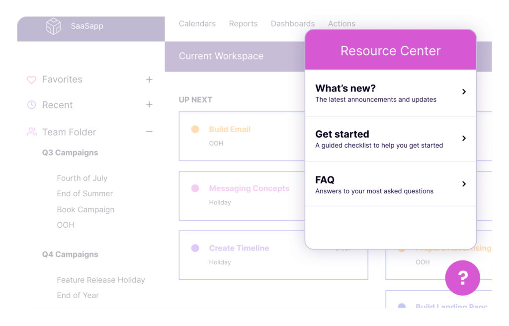
#1 Product Fruits
Summary: Product Fruits wraps the essentials—tours, checklists, hotspots, surveys, release notes, and a resource center—into a single, easy-to-own layer that lives inside your app. Non-technical teams can spin up onboarding quickly with AI-generated tours, surveys, and more, while the AI Copilot taps into your knowledge resources to answer “how do I…?” questions on the spot and deflect tickets. It feels practical rather than over-engineered: build, ship, learn, iterate.
Strengths
- All-in-one onboarding + in-app support layer (tours + resource center + AI Copilot which adds broader user adoption and support features)
- Fast to implement, AI tour and survey generation, excellent support rating, non-technical teams can own changes.
- Transparent, SMB-friendly pricing.
Limitations
- Smaller partner ecosystem vs. legacy enterprise DAPs.
- Advanced governance is available (SSO/SCIM, granular approvals), but may require review in very large orgs.
Best for: Teams that want a sensible, full-stack onboarding layer with AI help—without embarking on a months-long platform rollout. Great for SMBsand scale-ups/scale-ups as well as many medium-sized enterprises that need fast activation and support deflection, and prefer straightforward pricing.
Product Fruits plans start at very friendly $96 per month (when billed annually). AI Copilot is billed at $0.69 per resolution (with 20 or more resolutions included in the monthly plan).
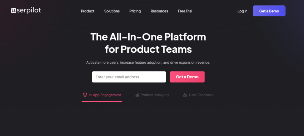
#2 Userpilot
Summary: Userpilot brings together in-app experiences, analytics, and feedback so product teams can design journeys, watch outcomes, and optimize quickly. Its growing set of AI helpers reduces authoring time and keeps copy consistent. The vibe is “measure twice, experiment often”—a good fit if you care about seeing a clear line from tours to activation to adoption.
Strengths
- Well-balanced toolkit for activation/adoption with built-in analytics.
- Solid segmentation and personalization options.
- Good for iterative, experiment-driven onboarding.
Limitations
- Not a full support platform; pair with your help desk/Copilot.
- Enterprise-grade governance and complex permissions vary by plan.
Best for: Product-led teams that want tours plus “good enough” analytics in one place, and who iterate constantly. Ideal when you want more insight than lightweight tools but less complexity than heavy enterprise suites.
Pricing is steeper, as the cheapest plan starts at $299 per month (when billed annually).
#3 Pendo
Summary: Pendo starts from analytics and layers on in-app guides, a resource center, and AI-assisted capabilities—so you’re designing guidance with a deep view of real usage. It’s opinionated about measurement (in a good way), and that makes it attractive for organizations standardizing on a single source of truth for product data and in-app messaging.
Strengths
- Deep product analytics + in-app guidance in one system.
- Mature NPS/feedback and cross-journey reporting.
- Scales well for multi-product environments.
Limitations
- Heavier implementation and typically custom pricing.
- Can be more than you need for simple onboarding.
Best for: Mid-market and enterprise companies that want to unify analytics, feedback, and guidance—especially across multiple products or segments—and are ready to invest in a platform approach.
Pendo has no public pricing listed, which indicates the rates are aimed towards enterprise clients.
#4 Whatfix
Summary: Whatfix is a full digital adoption platform geared toward complex rollouts and regulated environments—think employee tools, multi-app ecosystems, and global scale. Its GenAI features accelerate content creation while its governance and analytics support change management and compliance. It’s built for the long game where training, standardization, and consistency matter.
Strengths
- Strong change-management, training, and compliance features.
- Works across many internal tools and complex stacks.
- Robust analytics and governance options.
Limitations
- Setup and enablement effort are higher than SMB tools.
- Pricing and scope fit best at enterprise scale.
Best for: Large organizations orchestrating adoption across many internal and external apps, with strict security and compliance needs and a formal enablement function.
Just as Pendo, Whatfix does not list pricing, which indicates higher tier "corporate" price lists.
#5 UserGuiding
Summary: UserGuiding focuses on approachability: quick set-up, clear UI, and just-enough analytics and segmentation. Recent AI assistance helps speed up creation and multilingual help, making it easy to get credible onboarding in place even with a small team. It’s the kind of tool you can hand to CS or PMs and see results within days.
Strengths
- Easy to launch; approachable UI for non-technical teams.
- Competitive pricing for startups/SMBs.
- Core segmentation and basic analytics included.
Limitations
- Experimentation/analytics depth trails analytics-heavy suites.
- Governance and SSO/SCIM options are more limited.
Best for: Startups and SMBs that need to get high-impact tours and checklists live fast, keep costs predictable, and don’t require deep enterprise bells and whistles.
UserGuiding pricing starts at $174 per month with annual invoicing.
#6 Appcues
Summary: Appcues built its reputation on beautiful, no-code in-app experiences. Editors and templates make it easy to deliver on-brand messaging without dragging design or engineering into every change. With growing AI helpers, teams can move faster while preserving polish. Many customers pair it with their favorite analytics for a flexible, best-of-breed stack.

Strengths
- Excellent UX/design fidelity; non-technical authorship.
- Rich library of patterns (modals, tooltips, checklists).
- Plays nicely with popular analytics stacks.
Limitations
- For deeper product analytics you’ll likely use external tools.
- Pricing can scale with MAUs; check growth path.
Best for: Teams that prize on-brand quality and a friendly authoring experience, and are happy to keep analytics separate (Amplitude/Mixpanel/etc.) for deeper insight.
Appcues rates start at $300 monthly (with annual billing).
#7 Chameleon
Summary: Chameleon is for teams who want product guidance to feel truly native. Its styling depth and segmentation give granular control over look, timing, and audience. New AI helpers shorten build time, but its superpower remains customization—ideal if you’re picky about details and want tours that blend seamlessly into complex UIs.
Strengths
- Pixel-perfect control; strong theming and CSS flexibility.
- Precise targeting/segmentation and on-brand experiences.
- Good A/B testing for in-app UX.
Limitations
- Often paired with separate analytics and support tools.
- More styling control can mean more setup time.
Best for: Design-sensitive product teams that need high fidelity and granular targeting—particularly in sophisticated web apps where generic tours feel out of place.
Chameleon pricing starts at $279 per month, there is a free plan, but it does not cover tours and other popular onboardin and adoption content.
#8 Intercom
Summary: If Intercom is already your support backbone, adding Product Tours keeps onboarding and help in the same place as chat, help center, and the Fin AI support bot. The onboarding features in Intercom, however, do feel like an add-on to user support-oriented product. This means you won’t get the deepest tour feature set—but you will centralize messaging, support, and lightweight guidance under one roof, which can be an operational win. However, note that other players, like Product Fruits, approach the market from the other end, adding AI-based user support Copilot and self-help functionalities to what has originally been a user onboarding and adoption solution, achieving a similar effect but with greater emphasis on onboarding.
Strengths
- Single hub for support messaging + basic tours.
- Fin AI and knowledge base integration streamline deflection.
- Smooth if you already run Intercom.
Limitations
- Tours are simpler than dedicated onboarding suites.
- Add-on/usage pricing; evaluate costs as adoption grows.
Best for: Teams standardized on Intercom that want “good-enough” tours integrated with support, and prefer fewer vendors over maximum tour sophistication. Intercom pricing follows support platform model so it is $29 per seat per month (with annual billing) and per resolution for Fin AI Agent.
#9 Userflow

Summary: Userflow is a fast, lightweight builder that embraces simplicity: create tours, checklists, and surveys quickly, keep ownership in the product/CS team, and pair with your existing analytics. It’s a great way to ship guidance without introducing a heavy platform or reworking your stack.
Strengths
- Very quick to implement and iterate.
- Clean editor; easy ownership by PM/CS.
- Works well alongside your existing analytics.
Limitations
- Fewer enterprise features (approvals, complex roles).
- Lean stance on AI/Copilot compared to all-in-one suites.
Best for: Startup/scale-up SaaS teams that want speed and control, prefer a lean toolset, and plan to rely on their current analytics for deeper reporting.
Userflow pricing starts at $240 monthly (annual billing).
Quick selection tip fro Product Tours Software
- All-in-one with AI Copilot & resource center:
Product Fruits (balanced onboarding, surveys, tours analytics, AI tour and survey creator, AI Copilot for user questions/support), Pendo (unified analytics + guides with AI roadmap), UserGuiding (approachable price and AI assist).
Pick these if you want proactive tours and reactive AI help under one umbrella. - Analytics-first / unified data + guidance:
Pendo.
Best when you need strong product analytics, feedback, and in-app guides tied together—especially across multiple products. - Enterprise DAP, governance & change management:
Whatfix.
Choose this for large, regulated, or multi-app environments where training, compliance, and formal enablement are non-negotiable. - Design fidelity & native feel:
Appcues (polish, templates) and Chameleon (deep customization).
Ideal when on-brand visuals and precise control over styling/targeting matter most. - Intercom-centric stacks:
Intercom Product Tours + Fin AI.
If you already live in Intercom, this centralizes support, messaging, and simple tours with minimal added complexity. - Lean & fast builder:
Userflow.
Great for teams that want to ship quickly, keep ownership with PM/CS, and plug into an existing analytics stack.


Weekly newsletter
Get the latest releases, tips, articles, and exclusive interviews delivered to your inbox weekly—no spam!