Which Tools Actually Increase Product Adoption Rates in 2025


Imagine this scenario - You spend months building a feature. Your team pours heart and soul into the perfect solution. You hit launch...and crickets.
Less than 7% of users ever touch it. According to recent benchmarks, the median feature adoption rate hovers around 6.4%, which means that only about 6 out of every 100 features you ship actually drive meaningful usage.
That's not a feature problem. It's an adoption problem.
Nearly 30,000 new products hit the market each year, but 95% of them fail. The difference between products that thrive and those that die isn't usually the quality of the feature itself - it's whether users actually discover, understand, and integrate it into their workflow.
Think of product adoption like teaching someone to drive. You wouldn't just toss them the keys and say "figure it out." You'd guide them through each step, watch where they struggle, adjust your approach, and celebrate when they nail a parallel park. That's exactly what adoption tools do for your product—they guide, diagnose, adjust, and optimize the path from "new user" to "power user."
In this guide, we'll break down the exact tools that measurably lift adoption. No fluff, no generic listicles - just the tools that actually move the needle.
TLDR: Which tool should you use to boost your product adoption rates?
Choose Product Fruits if: You’re a startup or mid-sized SaaS looking for the most cost-effective, all-in-one solution It offers AI-powered tours, onboarding checklists, feedback widgets, announcements, and an integrated knowledge base—no code required. Rated 4.7 on G2 for exceptional support and best value-for-money in the market.
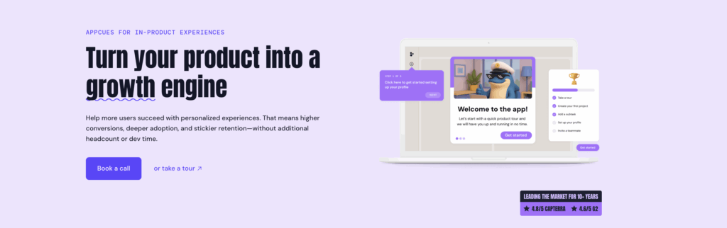
Choose Appcues if: You want a mobile-first onboarding platform with a clean drag-and-drop builder and ready-to-use UI templates. Ideal for product teams prioritizing intuitive UX and quick deployment.
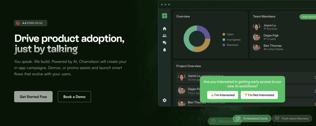
Choose Chameleon if: You need visually polished, hyper-customized tours and tooltips ($279+/month) with full on-brand control and advanced targeting rules.
Choose UserGuiding if: You want fast setup, pre-built templates, and simple pricing ($174+/month). Build checklists, tooltips, and modals without developers.
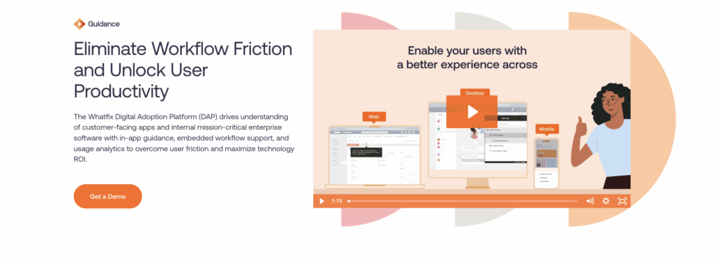
Choose Whatfix if: You’re an enterprise seeking localization, governance, and analytics at scale. Works across multiple web apps with strong change management support.
Choose Userflow if: You need fast deployment, high customization, and lightweight SDK performance. Setup can take under a day, ideal for agile teams.
What is the difference between product adoption and activation?
Before we dive into tools, let's get clear on what we're actually trying to improve.
Product adoption isn't just activation. Product adoption is the process by which people learn about your product and start using it to accomplish their goals—the "aha moment" when users start using your product for what you built it to do.
Here's the distinction that matters:
- Activation = Single event (completing a "core action" that shows initial value)
- Engagement = Ongoing usage depth and frequency
- Retention = Coming back over time
- Adoption = Fully integrating your product as the habitual solution to their problem
User Activation is when users hit a milestone and experience value. Adoption happens when they completely embrace your product as their habitual solution.
What is product adoption and how should I measure it?
To successfully measure your product adoption, here are the key metrics you should track to understand your product adoption:
The ratio of users who complete a specific set of actions or reach a predefined engagement level that signals they "get" your product. Calculate it as:
Activation Rate = (Users who hit activation milestone / Total signups) × 100
The percentage of your user base actually using specific features. Remember that brutal 6.4% median? This is where you see if you're beating it or drowning in it.
Feature Adoption Rate = (Users who engaged with feature / Total active users) × 100
- Time-to-value (TTV)
The timeframe users take to derive maximum value from the product after initial interaction—essentially the timeline between signup and activation. The shorter, the stickier.
The DAU/MAU ratio —daily active users divided by monthly active users. A sticky product means users return habitually, not just occasionally.
A composite metric combining adoption, stickiness (DAU/WAU/MAU ratio), and growth to give you a single north-star view of product health.
Which tools increase product adoption and when should you use each?
Not all adoption tools are created equal. Each category solves a different piece of the puzzle. Think of them as different instruments in an orchestra—you need the right mix at the right time.
1. Digital Adoption Platforms (DAPs) – Your in-app tour guide
DAPs like Product Fruits are software layers integrated on top of applications to guide users through tasks and functions, helping businesses onboard new users with in-app guidance and tutorials.
Think tours, checklists, tooltips, in-app announcements, and resource centers—all created without writing a line of code.
So when do you use DAPs? Use DAPs when:
- You need targeted, contextual guidance fast (no dev cycles)
- Users are dropping off during onboarding
- You're launching features and want to drive discovery immediately
- You need role-based or segmented experiences (enterprise buyer vs. end user)
Imagine a SaaS product where only 15% of users complete setup. You add a checklist DAP that walks users through three must-do steps. Suddenly, 40% complete setup because they're not lost in the UI wilderness.
2. Product analytics – Your adoption diagnostic engine
A Product Analytics tool like Amplitude tracks user behavior to understand exactly which behaviors correlate with adoption revealing drop-off points, feature usage patterns, and paths to value.
So when do you use Product Analytics tools? Use them when:
- Before you build anything new (diagnose friction first)
- To quantify the impact of changes
- To build cohorts for targeted messaging or experiments
- When you need retroactive analysis of user behavior without pre-set tags
Adoption is a better predictor of long-term metrics (like LTV or retention) than acquisition, because you can acquire thousands of customers, but if they never use the product, you'll never meet long-term goals.
You wouldn't perform surgery without an X-ray. Don't deploy in-app guidance without analytics showing you where users struggle.
3. Lifecycle & in-app messaging – Your nudge engine
These tools deliver contextual nudges across in-app modals, email, and push notifications based on user behavior or cohort membership.
So when should you use a lifecycle and in-app messaging platform?
- To drive next-best actions ("You set up your profile—now invite your team!")
- Re-engage stalled users outside the product
- Announce new features to segments most likely to care
In-app messages crush email for immediate context. If someone's staring at a feature they haven't used, a tooltip right there beats a "Check out this feature!" email three days later. Tools like Product Fruits are great for doing this.
4. Feature flags & experimentation – Your safety net + proof machine
Use these tools to control feature rollouts using flags or toggles, gradually releasing updates to small user segments to ensure stability and minimize risks.
So when should you use a lifecycle and in-app messaging platform?
- Launching new features (progressive rollout to 5%, then 25%, then 100%)
- Proving adoption lift with A/B tests (new onboarding flow vs. old)
- Protecting your app with guardrail metrics (auto-rollback if error rates spike)
Feature flag tools enable teams to deploy features safely and efficiently while minimizing risks by decoupling code deployment from feature releases. Translation: Ship code hidden behind a flag, flip it on for a test group, measure impact, and roll back instantly if things break. No drama, no emergency hotfixes at 2 AM.
5. Session replay & UX diagnostics – Your "why did they rage-quit?" answer
Show the performance of live in-app guidance and detect product optimization opportunities by recording user sessions, highlighting frustration signals (rage clicks, dead clicks), and surfacing console errors.
So when should you use a session replay and UX diagnostics?
- After analytics flags a drop-off (now you see why)
- To validate UX hypotheses
- When support tickets spike around a specific flow
Data tells you 60% abandon the checkout page. Replay shows you they're clicking a disabled "Submit" button 11 times before giving up. Suddenly, you know exactly what to fix.
6. Voice-of-customer / in-app feedback – Your assumption killer
In-app feedback captures in-app micro-surveys, NPS, and feature requests at the moment of friction, then trigger follow-up guides or route responses to your roadmap.
So when should you use an in-app feedback tool?
- To close the loop on "Why didn't you adopt this?"
- Segment detractors for targeted re-engagement
- Prioritize roadmap based on real user pain, not HiPPO opinions
User rates NPS as 4. Your DAP instantly shows them a guide to the feature they're missing. Two weeks later, they're a promoter. The best way to go about this is finding a tool that combines the power of in-app feedback with your DAP. So tools like Product Fruits are great for doing this if you want all that user data and interactions in one place.
What are the best tools that help increase product adoption rates?
Let's get specific. Here are the tools that will actually help you increase product adoption, with honest takes on who they're best for.
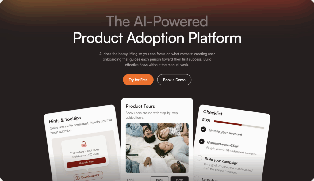
Product Fruits – AI-assisted onboarding for SMB & mid-market
When should you choose Product Fruits?
Product Fruits stands out with AI-assisted onboarding that can auto-generate flows and improve microcopy. If you're a lean team that needs professional tours without a full-time onboarding designer, this is your pick.
- No-code tours, checklists, tooltips, announcements
- Strong fit for SMB to mid-market SaaS
- Fast time-to-first-guide
Who is Product Fruits Best for: Teams who want to ship onboarding fast, don't have dev resources, and value AI speed boosts.
Learn more about Product Fruits →
Whatfix – Enterprise-grade DAP with localization & governance
Whatfix includes in-app walkthroughs, tooltips, task lists, nudges, and resource centers (13 Best Digital Adoption Platforms (DAPs) in 2025) and is built for global, complex enterprises.
When should you use Whatfix?
- Enterprise breadth: works across multiple apps
- Robust localization and role-based targeting
- Analytics + guidance in one platform
Who is Whatfix Best for: Enterprise-wide digital adoption, transformation, and change management (13 Best Digital Adoption Platforms (DAPs) in 2025) where you need SSO, approvals, and multi-language support.
Chameleon – Highly customizable for PLG teams
Chameleon offers unique strengths in advanced analytics, ease of use, and personalized onboarding experiences (5 Best Digital Adoption Platforms I'd Pick for Faster Onboarding).
When should you choose Chameleon?
- Flexible, highly customizable in-app UX (tours, tooltips, surveys)
- Granular on-page triggers and display rules
- Solid fit for product-led growth teams
Best for: PLG SaaS companies that want design control and behavior-based targeting without compromise.
Appcues – Mature templates & public pricing
Appcues began as a product analytics platform and added in-app guidance for onboarding and engagement, popular with SaaS companies prioritizing product usage and customer feedback (13 Best Digital Adoption Platforms (DAPs) in 2025).
When should you choose Appcues?
- Mature onboarding flow templates
- Public pricing tiers (rare in this space)
- Good for product-led teams wanting fast setup
Best for: Mid-market SaaS teams who value transparency and pre-built patterns.
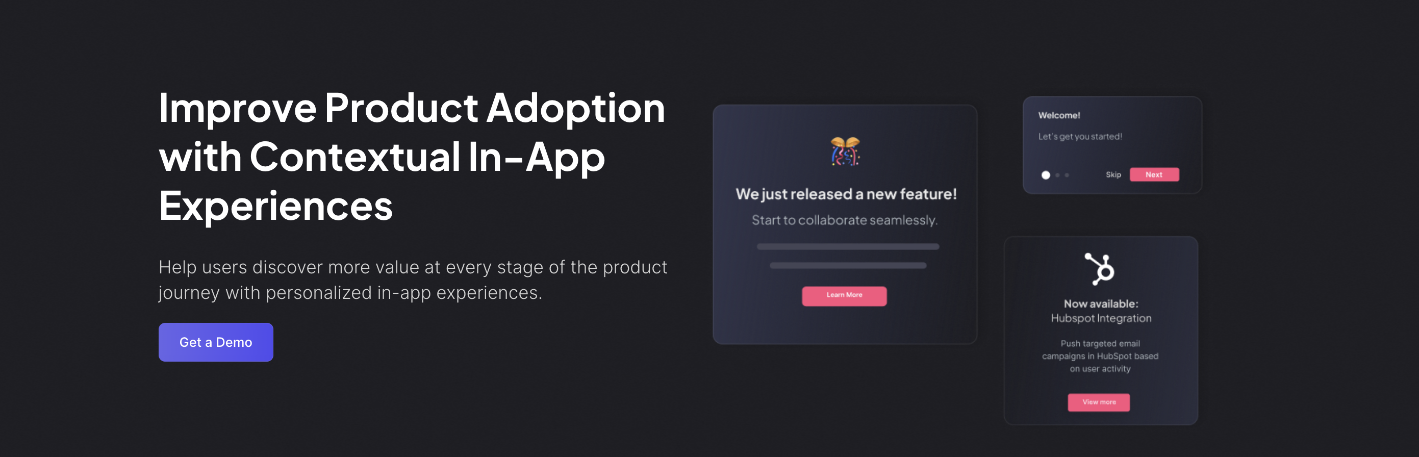
Userpilot – Flows + surveys for growth-stage SaaS
Userpilot is best for product growth and digital adoption across web and mobile.
When should you choose Userpilot?
- Checklists, walkthroughs, in-app surveys
- Analytics + flows + NPS in one UI
- Popular with growth-stage SaaS
Best for: Series A–C companies scaling onboarding and feature adoption.
Userflow – Rapid deployment & strong customization
Userflow is best for implementing a straightforward digital adoption process.
When should you choose Uerflow?
- Fast setup of guides and checklists
- Strong theming and customization
- Great for product teams that own onboarding
Best for: Lean teams who need guides live this week, not next quarter.

Feature/PlatformProduct FruitsWhatfixChameleonAppcuesUserpilotUserflowTarget AudienceSMB to mid-market SaaSGlobal enterprisesPLG SaaS companiesMid-market SaaS teamsGrowth-stage SaaSLean teams needing rapid deploymentKey FeaturesAI-assisted onboarding, no-code tours, checklists, tooltips, announcementsIn-app walkthroughs, localization, analyticsHighly customizable UX (tours, tooltips, surveys)Mature onboarding flow templates, public pricingFlows, checklists, in-app surveys, NPSFast setup of guides and checklists, strong themingBest ForTeams needing fast onboarding without dev resourcesEnterprise-wide digital adoption and change managementDesign control and behavior-based targetingTransparency and pre-built patternsScaling onboarding and feature adoptionImmediate deployment without delayCustomization FlexibilityModerateModerateHighLowModerateHighTime-to-First-GuideFastModerateModerateFastFastVery FastLocalization SupportLimitedStrongModerateLimitedModerateLimitedAnalytics IntegrationBasicYes (analytics + guidance combined)AdvancedYesYesLimite
How do you choose, evaluate and compare adoption tools before you buy?
Don't buy on hype.
Look for:
- Segmentation depth: Can you target by role, account, behavior, and page?
- Localization: Do you support multiple languages and regions?
- Analytics quality: Can you see completion rates, drop-offs, and A/B test variants?
- Governance: Versioning, approval workflows, audit trails (especially for enterprise)
- Performance: SDK weight, mobile support, accessibility (WCAG compliance)
Use this checklist.
Must-have evaluation criteria
1. Outcomes & measurement
Can the tool track and move feature adoption, time-to-value, and PES tied to your core events?
2. Targeting & personalization
- Role-based, account-based, behavior-based segmentation?
- On-page triggers, scheduling, dynamic content?
3. Data strategy
- Cohort exports to messaging tools?
- Warehouse exports for BI and data ops?
- Event governance (Taxonomy, approvals, data quality)?
4. Safety & governance
Effective feature management mitigates risks (The best feature management and experimentation software 2025 - LeadDev) through:
- Rollbacks, guardrails, auto-halt on metric regression
- Versioning, approval workflows, audit trails
- Data privacy (PII handling, SOC 2, SSO)
5. Performance, SDKs, localization, accessibility
- SDK weight (especially mobile—9kb vs. 20kb matters)
- Multi-language, multi-region support
- Accessibility (WCAG compliance, keyboard nav, screen reader support)
6. Effort & time-to-first-value
- How fast can you ship your first guide or experiment?
- No-code depth? Admin/publishing workflow complexity?
Pro tip: Run a proof-of-concept focused on your core events. Don't just trust demos—measure lift on real users.
TL;DR: Features don’t fail because they’re weak. They fail because users never reach value. If you want growth, optimize adoption, not just launches.
The fastest path is a layered stack:
- Guide with a DAP (e.g., Product Fruits) for tours, checklists, and in-app nudges.
- Diagnose with product analytics to find friction and quantify lift.
- Prove with flags/experiments and guardrails.
- Understand the “why” with session replay and in-app feedback.
- Automate the routine with AI agents; keep humans for high-touch moments.
Do this well and you’ll shrink time-to-value, raise feature adoption, and turn new users into power users.
FAQs
1) What’s the difference between adoption and activation?
Activation is a one-time milestone that proves initial value (e.g., first integration). Adoption is ongoing, habitual use where the feature becomes part of the workflow. Aim to optimize both, in that order.
2) What is a “good” feature adoption rate?
Benchmarks hover around ~6–7% median for most products. “Good” is beating your own baseline by segment and steadily compounding: new feature → 14/30/60-day adoption → retained usage.
3) How do I increase feature adoption without shipping more features?
Reduce friction to first value. Use a DAP to add checklists, targeted tours, and tooltips; pair with analytics to remove blockers; nudge next-best actions with in-app messages; validate with experiments.
4) When should I use a Digital Adoption Platform vs. analytics?
Use a DAP to guide users (tours, checklists, nudges) right now. Use analytics to find where and why users drop off, then measure whether the guidance worked. They’re complementary, not substitutes.
5) How do AI agents help with adoption?
AI agents personalize onboarding, detect hesitation in real time, and offer context-aware help. They answer routine questions, route complex ones to humans, and learn which guidance drives completion and retention.
6) Where does Product Fruits help with product adoption?
Product Fruits is a no-code DAP with AI-assisted onboarding, checklists, tooltips, announcements, and surveys. It’s ideal for SMB–mid-market teams that need to ship guidance fast and iterate without dev cycles.
7) How do I measure success after adding a DAP or AI agent?
Track: Activation Rate, Feature Adoption Rate, Time-to-Value (TTV), Stickiness (DAU/MAU), PES, and support ticket volume. Report lift vs. control cohorts and watch 14/30/60-day retention.
8) What’s the minimum viable onboarding I should ship?
A 3-step checklist to first value, one targeted tour per must-do action, tooltips on tricky UI, and an in-app help hub with FAQs. Add a micro-survey at the biggest drop-off to capture “why.”
9) How do I prove ROI to stakeholders?
Run an experiment: expose 50% to the new onboarding. Show Δ TTV, Δ feature adoption, Δ retention, and ticket reduction. Convert gains to revenue (expansion + churn saved) minus tool cost.
10) What are common mistakes that kill product adoption?
Shipping tours without analytics, one-size-fits-all onboarding, long autoplay tours, no experiments, ignoring feedback, and treating adoption as a launch task instead of a weekly operating cadence.
11) How long should implementation take?
With a no-code DAP, your first live guide/checklist can ship in days. Full coverage is iterative: start with the must-do path, then expand by segment and feature.
12) How do I handle enterprise needs (security, localization, governance)?
Look for SSO, audit logs, approvals, WCAG accessibility, SDK performance, and localization. If you’re global or regulated, prioritize these in your vendor short-list.


Weekly newsletter
Get the latest releases, tips, articles, and exclusive interviews delivered to your inbox weekly—no spam!