A study by Wyzowl reveals that 90% of customers think that companies could “do better” when it comes to user onboarding.
Crafting an exceptional product is just the beginning of the story –the real challenge lies in user onboarding.
Your product’s onboarding process can either pave the way for customers to reach that coveted “aha!” moment or, risk causing them to disengage.
A smoothly executed and meticulously devised onboarding process leaves a positive impression from the outset, but also sets the stage for lasting customer engagement.
By carefully guiding users through their initial interactions with your product, you can significantly increase their chances of understanding its value and becoming loyal, long-term customers. A user onboarding checklist helps you structure your onboarding process to ensure your product’s initial promise translates into a lasting relationship with your users.
In this article, we’ll delve into practical tips and tricks that will simplify your onboarding process and boost long-term customer engagement
What is a User Onboarding Checklist?
A user onboarding checklist is a list of tasks that help users understand your product better. This product understanding can be driven using product tours, interactive walkthroughs, knowledge repositories, communication mechanisms, and product descriptions.
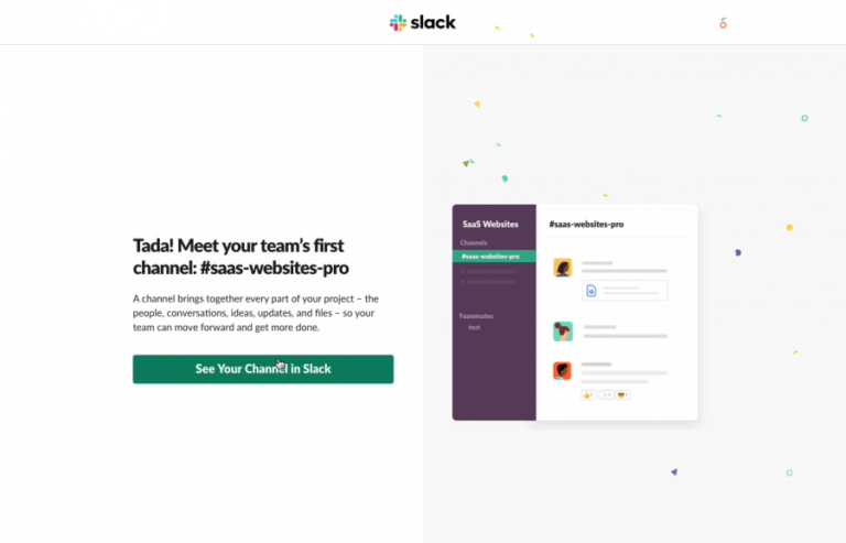
A classic example of an effective user onboarding is Slack, a direct messaging app for colleagues within a team. Slack helps new users learn by displaying pop-up messages that guide users through the tool step by step. The tooltips displayed have a good UX and a brief yet effective copy. Additionally, users have an option to end the product tour whenever they want to.
5 Common user onboarding challenges product managers face
User onboarding requires the alignment from both the product and marketing side. This cooperation allows for onboarding flow to highlight the most important features, whilst also providing a seamless and delightful onboarding experience.
1. Poor understanding of the product or service
An onboarding process directly affects user attrition and leads to subpar retention rates. If the onboarding procedure fails to guide users in recognizing the product’s inherent value, they are more inclined to abandon it.
Research shows that nearly one in four individuals discontinue using mobile apps after just one use, a scenario that often unfolds when users fail to experience their “aha!” moment while interacting with the product.
A thorough onboarding checklist helps solve this problem, by including all the important steps and elements needed for a smooth and intuitive onboarding process.
2. Lack of clear instructions
Clear and actionable onboarding instructions help new users navigate platforms with confidence. Informative instructions play an impactful role in determining the quality of user onboarding experience.
Complicated product guides, grand design elements, and technical vocabulary are likely to confuse the user. Make instructions simple and easy to understand for a better product onboarding experience.
3. Absence of a feedback mechanism
Emplifi found that 61% of consumers are willing to pay at least 5% extra when they are assured of receiving a positive customer experience. Effective communication with customers and a deep understanding of their concerns are crucial aspects of both user onboarding and retention processes.
It’s good practice to establish an efficient feedback system, which offers 24/7 customer support. This requires a support team that maintains a comprehensive knowledge base for both technical and non-technical users, to create a seamless onboarding experience and long-term user retention.
4. Complicated onboarding design and messaging
Busy and intricately detailed design elements and complicated copy are likely to confuse your user.
To avoid confusion, include simple designs with short, crisp copies to make the onboarding process as seamless as possible. And, for more complex features consider adding media to help users visualize the process. For example, add a video product tour, descriptions, links to tutorials, animated gifs, and hints.
5. Technical Issues
Beyond the common challenges where users struggle to grasp how a feature operates, technical issues pose a significant headache for product teams.
Dealing with technical glitches requires a meticulous process of identification, testing to rule out client-side variables. Not to mention the extensive journey from product conception to engineering development and final testing.
To save time, test your product thoroughly before sharing it with customers. After all, technical issues can leave users with the impression that the product is faulty or complicated, which leads to churn.
8 Essential user onboarding checklist features
Here are eight onboarding practice you need to tick off to achieve a smooth onbaording experience.
1. Deliver product value immediately
The “Aha! Moment” marks that pivotal instant when a user grasps the inherent value of your product. The onboarding process becomes the catalyst that guides users toward this enlightening moment.
To effectively lead users to recognize your product’s value requires a strategic approach.
Usually, this involves a warm welcome to users, complemented by a comprehensive presentation of the Unique Selling Points (USPs) of your product.
This effect can be accomplished with a captivating welcome video that provides a glimpse of the product’s benefits, compelling testimonials from satisfied users, strategically placed Calls to Action (CTAs) that prompt users to explore further, and informative cards that offer bite-sized insights into key features.
Download the Product Fruits User Onboarding Checklist to learn more about how you can deliver product value immediately and lead your users to their “aha” moment.
2. Understand the user personas and map out the user journey
One of the most important tasks to create a strong user onboarding process is identifying the ideal customer persona (ICP). “Who are you selling to? Who are you actually onboarding?” is an important question to ask before you lay out your onboarding process.
The onboarding process varies depending on the ICP. For example, what features should be highlighted first depending on the user’s goal, or how technical it should be depending on technical or non-technical users.
User journeys should be mapped after having a good understanding of the customer personas being targeted. After all, you want the user journey to match their needs and identify features that boost engagement.
User journey mapping helps identify bottlenecks and gives product managers key insights on user behavior, product issues, and customer pain points.
3. Provide in-app context using product tours
In-app context and product tours help users of all technical proficiency levels navigate through the product seamlessly.
An interactive UI helps users clearly understand the features of a product without going through formal training. Video product tours and interactive elements in the onboarding UX make the onboarding experience smooth, efficient and easy to comprehend.
Product tours offer users clarity in terms of how to use the product. This decreases the time spent on formal product training and increases the accessibility of the product.
A few good examples of interactive UI elements are hints, tooltips, product tour videos and task lists.
4. Identify the “aha!” moment
The “aha!” moment takes place when the customer understands the value of the product and how the product can be beneficial to the user. In the user journey map, it is important to focus all onboarding efforts to reach the “aha!” moment as fast as possible.
The “aha!” moment is not equivalent to user activation, it is a precursor to it. It is not a singular event, but it’s divided into three key stages:
- Moment of value perception
- Moment of value realization
- Moment of value adoption
These stages define the value path of the user.
Let’s take Slack as an example. The moment of value perception is when a user understands that it can communicate with the team efficiently using Slack.
The value experience moment takes place when the user sends its first message using Slack. Finally, the moment of value adoption comes into play after a user has properly utilized Slack for communication and knowledge sharing and has sent and received thousands of messages on Slack.
5. Use simple yet compelling onboarding UX design and copy
Simplicity is the key to a perfect onboarding UX design. Avoid complex or busy designs that confuse users.
Onboarding UX design should be as clear and interactive as possible. Intuitive UX design and instructions improve customer retention rate and reduce the risk of user drop-off due to miscommunication or frustration.
Below is the welcome screen of Airtable. Notice how they have used a very simple design and instruction for the user. The language is slightly informal, easy to understand and conveys the message clearly to the user. Additionally, there is also an option to skip the onboarding process.
(Image source: Airtable)
6. Combine user actions with their persona to deliver personalized communications
Personalized communication based on the ICP, stage of user journey, and goals makes a difference to the relevance and value of your messaging.
Personalized communications serve as a navigational guide for diverse user personas during their product onboarding. It’s important to consider the timing and placement of messaging, for it to be as relevant to users as possible.
For example, Duolingo combines user agenda and user proficiency in the language to define their onboarding journey. User lessons are customized based on the learning motivation and agenda of the user along with the level of proficiency in the language.
(Image source: Duolingo)
Personalized messages make the platform quick, painless and fun to use for the user. Additionally, the users only receive the information and service that they are actually looking for.
7. Create a smart knowledge repository
A knowledge repository serves as a helpful resource for users to find answers to their queries whenever the need arises. Help centers should be readily accessible, user-friendly, and comprehensive, to avoid users getting frustrated spending time trying to find solutions.
A helpful resource center should:
- Store help documents and FAQs
- Be up to date on all features and processes
- Include video tutorials for complex features
- Contact information
The ultimate goal is to have a dynamic knowledge base where users can immediately find resources to their problems at all times.
A smart knowledge repository is a game changer. Canva, for example, has created a knowledge base that answers all frequently asked questions by users. Additionally, it has a search bar that helps users extract information without having to manually find relevant information in the knowledge base.
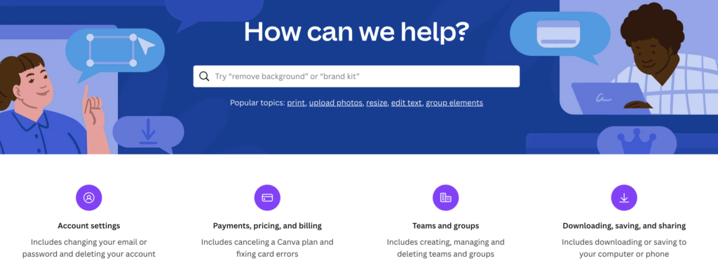
(Image source: Canva)
8. Collect feedback and communicate with the user
User feedback is the North Star when it comes to improving product value and growth. It’s important that your platform offers an easy path to sending and receiving feedback at all times.
It’s essential to engage with users during the initial 30, 60, and 90 days to ensure they are using your product as intended. This proactive approach not only fosters trust with customers but also allows for tailoring their product experience to their specific needs.
For example, Hubspot communicates with the user when they complete fifty percent of their onboarding journey. It asks the user to rate their experience by clicking on one of three smiley faces.
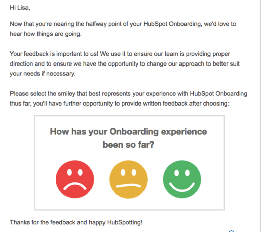
(Image source: HubSpot)
It’s essential to stay connected with the user and understand their roadblocks and problems via regular feedback. The communication mechanism should be seamless and should encourage the user to share their honest feedback.
The best user onboarding is achieved when you continuously optimize the process to meet your users’ needs
The best onboarding journeys are those that meet and exceed your users’ expectations. And for that, you need an onboarding solution that is flexible and customizable that allows you to tweak the process without spending hours in development.
Product Fruits act as an invisible layer to your platform. It allows you to add, edit, and customize onboarding features that improve the user’s journey — no coding required.
Take a peek at our user onboarding checklist to set you up for success!
If you want to improve conversion and retention rates, schedule a 30-minute call with our user onboarding specialists today. We can talk about your current business needs, goals, and provide helpful tips to get your users onboarded immediately!
