Do you remember your first day of middle school?
Chances are, you were given a tour of the school and a fun (awkward) round of icebreakers to meet your new classmates before starting class.
Interactive product tours are the same — except digital.
Gaining insight into the influence of product tours on user conversion will help you optimize the onboarding process and get more customers.
Do you already use tours for your product? If not, try Product Fruits 🍇 with a 14-day free trial and see how our product tours work.
What is an interactive product tour?
A product tour is a guided flow that takes users through a product’s features and functions. They’re designed to familiarize users with a product’s features and capabilities. Tours shows users how to navigate the product to achieve a desired outcome.
More specifically, an interactive product tour allows users to learn and explore a platform at their own speed. This allows users to slowly learn by interacting with each feature. Instead of providing a massive amount of information in a single video or manual.
The goal of an interactive product tour is to gently guide users to quickly understand a platform, its functionality, and how it helps them reach their goals.
For example, here’s how Microsoft introduces new users to their platform with interactive cursors.
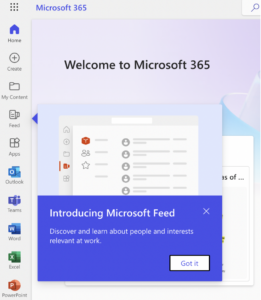
(Image source: Microsoft)
The more a user understands how your product helps them reach their goals, the more likely they’ll remain engaged. And in turn, an engaged user that continuously uses your product, is more likely to remain loyal.
Characteristics of an interactive product tour
An interactive product tour is a powerful tool that helps businesses create an engaging user experience. It requires the user to interact with a product or service while guided by visual and audio cues such as animations, videos, and images.
Usually, product tours depend on:
- Step-by-step instructions
- Visual and audio cues
- Animations and videos
- Images to explain product features
- Interactive tooltips and help texts
- User feedback and analytics
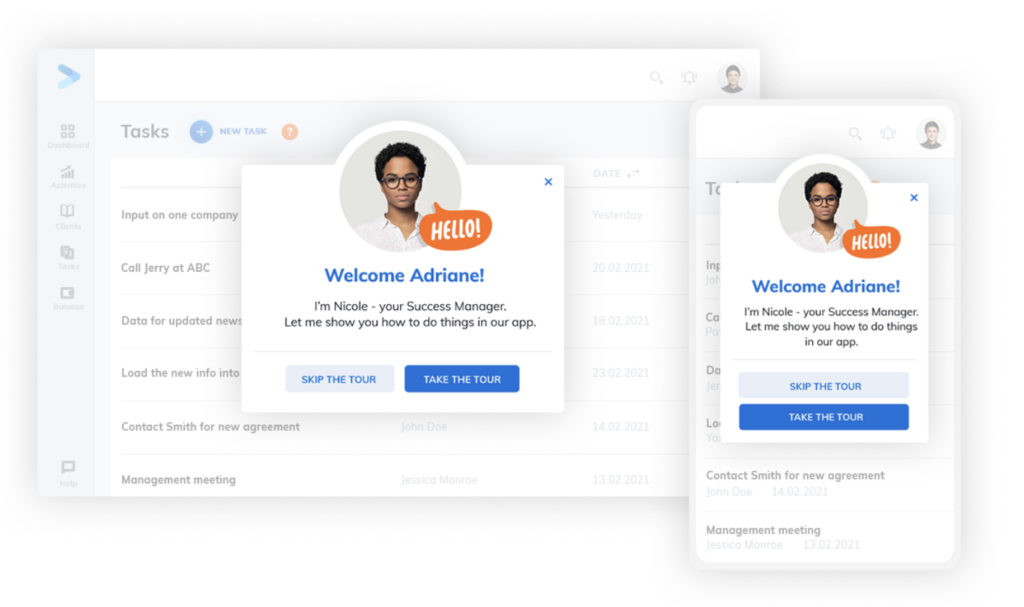
(Image source: Product Fruits)
Fruity Tip: Tours typically feature mini bites of information, to avoid overwhelming users with too much at once.
Why are product tours important?
Product tours help users quickly understand the features and functions of a product. They also alert users when new updates are available, recognize the value of the product, and learn how to use it, as well as become quickly onboarded as new users.
Interactive product tours supply an immersive experience that is both stimulating and informative.
They offer organizations an opportunity to showcase their products in an in-depth manner without overwhelming users.
Interactive product tours:
- Improve engagement: Our clients notice a double in user conversion.
- Reduce support team load: Our clients report a 70% decrease in support queries.
- Improve time to value: Our clients report users complete onboarding 29% faster.
Product tours allow clients to pick up intricate processes, quickly, reducing customer service costs while fostering brand recognition at the same time.
4 Steps to create an interactive product tour
The placement of features, information, timing, and order will have an impact on the onboarding journey. The goal is to make the onboarding experience as smooth and frictionless as possible.
To create a strong and effective product tour, follow these steps.
Step one: Map your user journey
Start by identifying the user’s end goal. Once the goals are identified, work backwards from there.
That means, taking a look at all the steps and routes the user will need to take to reach their objective. By understanding the user’s context and goals, you can create a product tour that is tailored to the user’s individual needs and experiences.
Step two: Highlight important features
Map out the features and aspects of your product that will help users reach their goals. You want to showcase these in your feature tour and choose a design layout that best highlights them.
For example, if an icon provides a feature that isn’t super-intuitive, it might be worth highlighting what it does.
👀 Take a peek: 5 Essential Elements for Superior User Onboarding
Step three: Include visual elements
When creating an interactive product tour, it is important to create an engaging experience for users by including visuals and animations that are relevant and easy-to-follow.
Animations can help break up text sections so users don’t feel overwhelmed with too much information at once.
Consider including some screenshot GIFs to show the functionality of a button. Or, opt for some video tutorials to explain complex features.
Step four: Provide clear next steps
Information on product tours provides context. But it can be tricky when multiple steps are involved.
Consider sharing a practical next-step suggestion to guide users on their flow.
I can simply highlight the next button, or recommend the next action.
It is also important to provide clear call-to-actions at each step in order for users to gain clarity on what they need to do next during their journey through the tour.
5 best practices to create interactive product tours
Self-guided interactive tours increase completion by 123%. This is a great reason to include interactive product tours that are native to a platform and inform users to accomplish high engagement and completion rates.
But, it’s not enough to create a product tour and cross your fingers that it’ll work.
You need to make interactive product features both engaging and informative.
Here are some tips to help create engaging product tours that will elevate the user onboarding experience.
1. Personalize the product tour to each user’s needs
Use the information gathered during users’ onboarding to personalize their experience. That way they can find the feature that most serves their needs and interests as fast as possible.
For example, imagine you are creating a product tour for a grocery delivery app. You could quickly highlight the location feature to users or the delivery tracking feature to users who tend to order their groceries in bulk.
2. Keep it short
Yes. Interactive product tours are self-guided and by definition should be shorter than normal product tours. After all, that’s why users have selected that option.
But, sometimes longer tours are required — depending on the product.
Even so, keep interactive tours no longer than three steps. Studies have shown that a three-step tour is 38% more likely to be completed, compared to a six-step tour.
So keep each bite of information actionable and to the point. Users can always come back and explore new features later.
3. Maintain brand tone and consistency
Make your platform personable and unique by flowing your brand tone and style into the product tour.
This could be by including media to explain features that follow your company’s unique graphics. Or it could be to emphasize your product’s brand language.
For example, here at Product Fruits, we want you to feel supported every step of the way. And the message we share with our users communicates that through our tone.
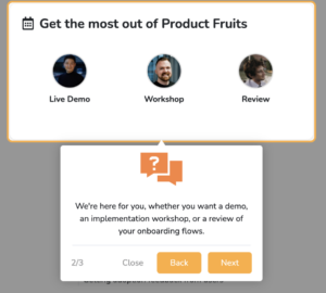
( Image Source: Product Fruits)
4. Add media to keep it visual
When video media is included in product tours, users increase their time by 9%. Add visual elements like videos, photos, GIFs, and screenshots to help users grasp features faster.
By adding media you avoid product tours being boring, monotonous, or text-heavy introductions.
Media can help draw attention to key features being showcased on the tour. Additionally, colorful fonts and attractive colors can improve the visual appeal.
5. Make it repeatable
Over 95% of users agree they value being able to replay product tours and hints.
The reason is, that sometimes users are in a hurry and don’t have time to complete a new feature tour. That doesn’t mean they aren’t interested — and that’s an important distinction. Tour dismissal and abandonment reveal two completely different things.
All-in-one product tour platform
To create a delightful onboarding experience with comprehensive product tour features — you need a solution that offers you customization, onboarding features, and analytics.
👀 Take a peek: A Guide to Choosing the Right Product Tour Software
Product Fruits act as an invisible layer on top of your platform. That means you can add, tailor, customize, and include product tour features without any coding required.
From tooltips, personalized demos, checklists, hints, announcements, and more, Product Fruits gives you control of how you onboard users. This means you can learn from your users and continuously optimize their onboarding experience.
Try Product Fruits for free and create beautiful product tours that your users will love.
