Ring, ring, ring — no answer.
Luckily, long gone are the days of calling the support center and listening to some rendition of elevator music whilst being left on hold — for seemingly, forever.
Tap, click, complete.
Now, enter the new phase of support– where answers are a few clicks away.
The right help widget can reduce the burden on your support team. That’s why it’s important to look for the right features offered and how they will integrate with your platform.
Here’s a quick summary of this article:
- Proactive help widgets anticipate user needs based on their current URL page
- Help widgets should integrate with feedback widgets, knowledge base, and live in-app chats
- Help widgets should provide easy access to a knowledge base with a search bar
- Easy customization options allow help widgets to match the platform’s branding
What is a help widget?
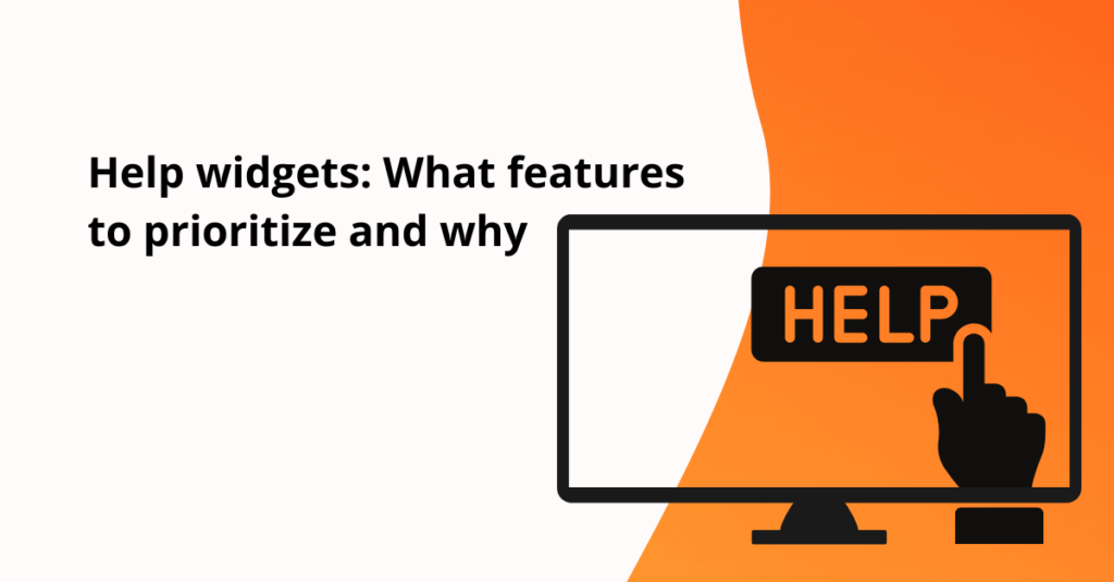
A help widget, or Life Ring Button, is a platform feature that centralizes helpful resources and links to support users.
Usually, they appear as small, interactive windows that appear on a website or app to provide users with immediate assistance without having to leave the page.
Think of a help center like the information desk at a busy airport. It serves as a resource to troubleshoot challenges, respond to common queries, and connect users to solutions quickly.
From the consumer side, a help widget is a quick and efficient channel to alleviate queries by user self-service.
On the business side, a help widget reduces the burden on your support team, because users find resources quickly and independently.
They are typically used to offer self-service support options such as FAQs, tutorials, and live chat.

Fruity Tip: Apart from self-service, help widgets can also collect user feedback and provide analytics on user behavior. This information can be used to improve the overall user experience and identify areas where additional support is needed.
How to choose your help widget? 6 Features to consider:
The right help widget is the perfect balance between resource functionality and the ability to look native to your platform.
Here are some features that will help reduce the burden on your support team, facilitate easy access to user support, and improve the overall user experience.
1. Proactive support through URL-specific resources
Users want support, and they want it fast. It’s no longer enough to offer a help widget—your widget needs to be proactive.
A proactive help widget anticipates user needs by analyzing their current URL page.
For example, if a user is on the billing page, the help widget will automatically prepare and offer the most common questions and troubleshoot for billing. If the same user navigated to an integrations page, it would be already prepared with resources around integrations.
The faster users can find their resources, the less likely they get frustrated or leave to look for answers elsewhere.

2. Quick and easy access to your knowledge base
Look for help widgets that can compartmentalize help resources and provide a clear layout. This will help users in their self-service and navigation.
A search bar is a great tool to catalyze access to research. By entering keywords, users can easily locate resources containing those specific terms.
This allows users to access help with a single click, without the need to search through multiple pages.
Fruity Tip: Link your help widget to your knowledge base. Not only will users find resources through different mediums (help articles, video tutorials, or screenshots). But, it will also provide your platform with keyword analytics. Which allows you to see which keywords and articles are most viewed. Which is a key insight to optimize the onboarding flow.
3. Direct contact option
Although the majority of users ( 57%) prefer a mix of human and self-help for support, there are still about 75% of users who prefer some type of human support.
For you, that means you need to have your support team easily accessible. Users want to easily access the help of platform specialists when they find themselves in a pickle.
Your help widget should offer multiple options for contacting support. This may include live chat, email, and phone support. This allows users to get help in the way that is most convenient for them.

Which brings us to the next point…
4. Broad range of Integrations to fit your business needs
At a minimum, your help center needs to integrate with three points: Feedback widgets, knowledge base, and live in-app chats.
For customer support/ success teams, the latter is the most important. You need to ensure that your selected chat platform can integrate with your help widget.
This allows you to maintain the same ticket prioritization system, channel of communication, and organization.
Users can obtain prompt and tailored assistance without navigating through multiple platforms, enhancing overall customer satisfaction.
5. Easy customization options
Help widgets need to blend in with the overlook and feel of your platform. it’s important you can customize the feature to your brand’s personality– without hours of coding.
Choose an option where customization through colors, size, font, and layout is available to make your own.
Product Fruits offers easy no-code solutions, so you can reinforce your brand identity in every feature.
6. Smooth setup process
An easy-to-integrate help widget does wonders for the amount of customization, customer rules, and content you can add to your help center.
It’s important to take into account the user interface and experience of adding a help widget to your platform.
Look for a no-code tool, that allows your team to set up, create, and publish with ease. Without requiring developers or complex code. This will save you time in both the short term with the initial setup, and also when your optimization and updates are required.

Now you know what to look for, here are some back-pocket benefits to motivate your ongoing search for a help widget.
What’s the benefit of adding a help widget to your app?
Yep, help centers are now the new norm for support. And with over 80% of American users agreeing that speed and knowledgeable help are key to a positive customer experience, you need to be sure you give them exactly that.
Here are some benefits of adding a help center to your tech stack:
- Convenience: Help widgets are always available, 24/7, so users can get help when they need it, without having to wait for open business hours
- Quick response time: Help widgets can provide immediate assistance, so users don’t have to wait on hold or send an email and then wait for a response
- Easy to use: They are designed to be user-friendly, so even users who are not tech-savvy can easily find the help they need
- Cost-effective: Help widgets can be a cost-effective way to provide support, as they can reduce the need for live support agents.
Help widgets don’t work in silo– it’s part of an onboarding ecosystem
Yes. help widgets are a valuable tool for providing immediate assistance and convenience to users.
But… it is important to remember that they are just one piece of the larger onboarding puzzle.
To actually create a smooth and successful onboarding experience, you need to incorporate a variety of onboarding tools and resources that work together to guide users through the platform.
Features like product tours, onboarding checklists, contextual tips with hints and tooltips, and welcome surveys, all make a difference in how much your users will rely on support.
With onboarding ecosystems, companies can reduce the reliance on support and empower users to become more self-sufficient, loyal, and engaged customers.
Want to put your help center into action? See it for yourself and try Product Fruits for free, today.
