In-app announcements are like catching a glimpse of a shiny $50 bill on the pavement during your usual daily walk. They break routines and offer new benefits or information.
Understanding the best practices to make an impact with in-app announcements will improve engagement and adoption rates for new features.
In-app announcements are messages sent to users within an app or website. Thanks to their disruptive and dynamic nature, they are an effective way to catch user attention and communicate news.
They are helpful in communicating news with users, such as; information about new features or services, upcoming events, promotional offers, or other important notifications.
These little banners are key for feature adoption and platform exploration. They help break a user’s pattern of behavior and offer new user journeys that delight users.
In-app announcements can also be used to direct users to other parts of the app or website, such as a new product page or registration process.
In-app announcements provide companies with a powerful tool for getting their message across to users in an efficient and effective way.
With in-app announcements, you can:
By using promotions or discounts via these messages companies can motivate people into taking action which leads directly to increased sales numbers.
In-app announcements share different types of information, like webinars, new features, software updates, and even product offers, so it’s important to distinguish which type of in-app announcement best suits your informational goal.
There are three types of in-app announcements: in-app modal notifications, banners and toasts, and newsfeeds.
Understanding when and how to use each in-app announcement will help improve the impact of communication.
In-app modal notifications are short messages that appear on a users’ device when they navigate a platform. They can appear when users open an app or later during a session.
Modal notifications help attract users to new features. They serve as both an announcement and an information carrier, as they can share new feature updates and give context around its functionality.
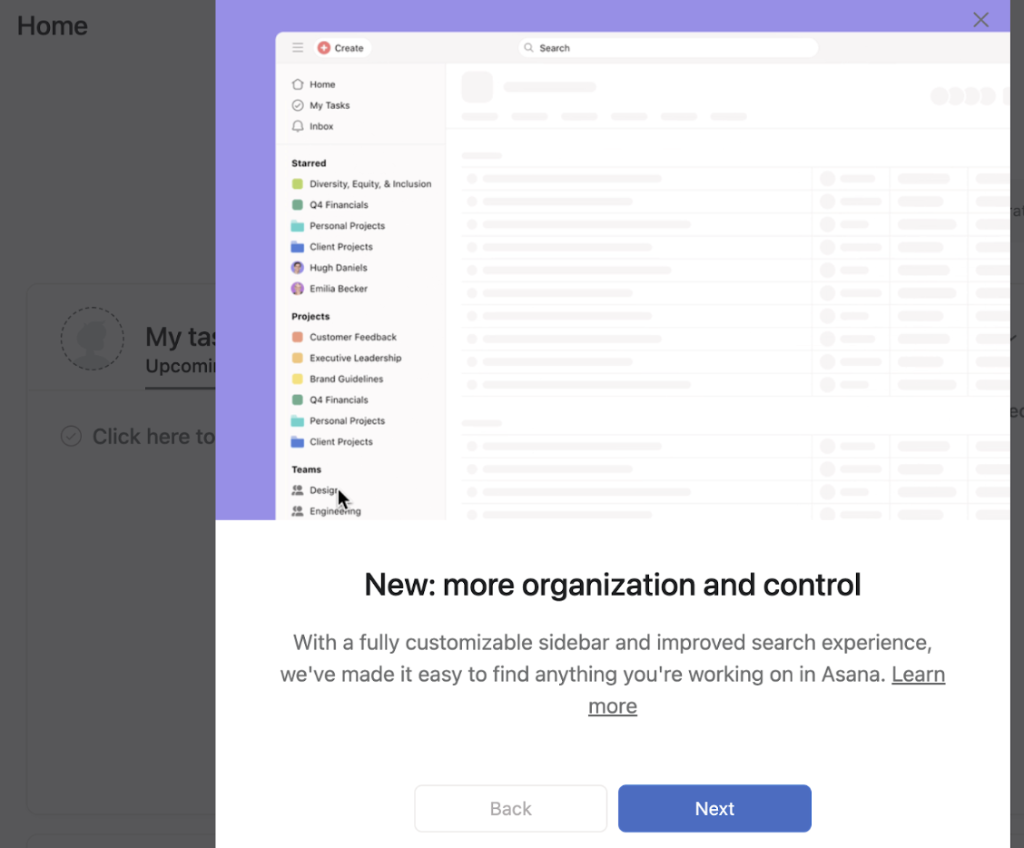
Here’s an example of how Asana announces new features with in-app modal announcements. They combine screenshots, education content, and CTAs for users to learn more.

(Image source: Asana)
Use case: Due to their disruptive and eye-catching nature, modals are best used to share big news, like new features available.
Fruity Tip: Include a tour that gets triggered from in-app announcements to show users around a new feature. This helps build understanding and value of the new product, which promotes engagement.
Banners and toasts pop up at the top or side of a platform screen. Their dynamic and eye-catching positioning is ideal for sharing news.
Banners are helpful features to share information with users, particularly educational content, like for example an upcoming webinar or software maintenance.
Here’s an example of how Slack uses banners to share their upcoming webinar.

(Image source: Slack)
User case: Ideal feature to share information that doesn’t require immediate attention, for example; webinars, surveys, maintenance updates, or newsletter signups.
An in-app notification center helps keep users on track with news and feature updates. They provide a record of all important updates, which are easily accessible.
This type of notification can be used to keep users in the loop on upcoming webinars, software updates, or any other type of content that may be of interest.
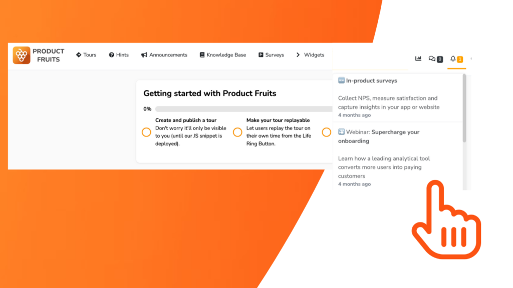
Here’s an example of how Product Fruits uses newsfeeds to keep their users up to date on webinars, features, and product training.

(Image source: Product Fruits)
This form of in-app announcment allows users to continously access updated information and resources. Which avoids users missing out of information from temporary announcements.
For in-app announcements to really make an impact, there needs to be a strategy behind the message, timing, and placement. You can’t just aimlessly send out information.
Each message needs to be supported by:
Here are some tips to help you create in-app announcements that convert and engage.
For announcements to entice users to perform a certain action, they need to be relevant and solve a problem they face. to achieve relevancy, you need to release in-app announcements to the right audience.
It’s good practice to categorize in-app announcements by user segments. For example, is a webinar relevant for new users or existing? Who would benefit from a new feature release? Can this announcement be localized to reach users in a region?
Announcement segmentation will make sure that all content is relevant and interesting for your target audience. This will boost engagement and increase the chances of users taking action.
Create in-app messages that convey time-sensitiveness. You want to provoke immediate action from users.
People respond most when there is an element of exclusivity or urgency. For example, use language such as “limited time” or “only available for 24 hours” to encourage users to act quickly.
Straight and to-the-point message copy will entice and drive more conversion. Aim to craft concise messages that get information across quickly.
Copy should be short and sweet – no longer than two sentences at most – to avoid overwhelming the user with too much information.
Play around with copy that addresses a user’s pain point, and that makes in-app announcements more relatable and actionable.
Include visuals or graphics: Visuals can instantly capture the user’s attention and make it easier for them to understand your message quickly.
If possible, add visuals such as photos, videos, GIFs, or other graphics to your announcements to make them stand out from the rest.
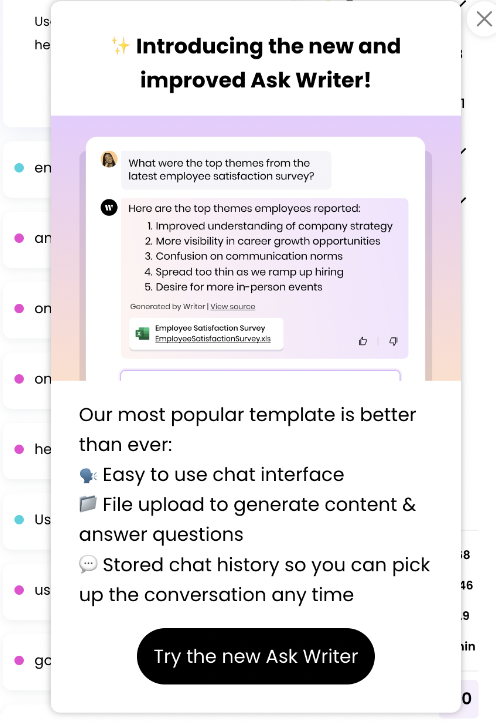
Here’s an example of how Writer uses visuals in their announcements to entice intrigue and curiosity from their users

(Image source: Writer)
The placement of in-app announcements plays a big role in their visibility and enticement.
Timing is also an important factor in how successful an announcement can be. A well-timed announcement can draw attention to new features, remind users of forgotten features, or encourage users to take action.
It’s important to pay attention to user behavior and ensure that the announcement is delivered when users are most likely to engage with it. Additionally, you should consider the frequency of your announcements to ensure that users are not overwhelmed with too much information.
Write action-provoking CTAs that tell users exactly what to expect. Your CTAs must align with the overall message of the announcement.
Use CTAs that hold actionable and active copy. That will make announcements more engaging and actionable for users to respond positively to the announcement and take the desired action.
Here’s an example of how Mailchimp uses a clear CTA to show users what the next step will look like.

(Image source: Mailchimp)
Test out different in-app content and placement options. This will help understand your user’s preferences and behavior to optimize the next announcements.
A/B testing gives you valuable insights into how people interact with your message, enabling you to refine it until it resonates with customers effectively.
By following these best practices for creating effective in-app announcements, companies can ensure that their users receive important information while also increasing engagement levels and boosting customer loyalty.
In-app announcements are a powerful way for companies to communicate with their users, but they must be sent effectively to maximize results.
When looking for an in-app announcement tool, it’s important to consider the following:
In-app announcements are only one small part of an overall successful product feature adoption strategy. To ensure users stick with new features, they must be part of an integrated onboarding process that includes analytics, testing, and other engagement tools.
Product fruits provide an extra layer of customization to your platform, allowing you to craft a tailored feature adoption journey and onboard users to new features, thus giving your platform more worth. Additionally, it needs to be adjustable to a brand’s personality, traceable, and connect to tours, knowledge bases, and in-app demos.
Create your own in-app announcements today, no card (or coding) is required.