Imagine attempting to prepare a fancy meal without a recipe book.
God forbid, the taste and your frustration would directly correlate… If only you’d have followed a book’s recipe, the food would be finger-licking good.
SaaS knowledge bases are like digital recipe books but for software navigation. They help customers find answers to their queries quickly.
A carefully curated knowledge base helps users self-educate and alleviate the pressure on your support team. While a poorly designed knowledge base experience can leave your users confused.
So, if you’re creating a help center or looking to improve your existing one, you’re in the right place. We did the heavy lifting by researching the five best SaaS knowledge base examples to inspire you.
But, first things first…
A SaaS knowledge base is an online repository of information created and made publicly available to help users navigate a platform and its features.
Typically, they contain various information and resources, such as FAQs, troubleshooting guides, video demonstrations, product documentation, company information, best practices, and educational content, such as blog articles, webinars, and case studies.
Interestingly, a survey revealed that 67% of consumers rely on knowledge-base help before talking to a business agent because of privacy issues.
A well-structured knowledge base benefits users by offering instant support while reducing the volume of support requests. This helps save time and resources for your team to concentrate on more strategic initiatives.
A study revealed that 91% of respondents would use an online knowledge base if available and tailored to their needs. It underscores the importance of having a good knowledge base.
With an education knowledge base, your team can:
A user-friendly and straightforward interface characterizes a good knowledge base. It needs to be accessible for both users and employees to quickly and easily find the information they’re looking for.
Let’s dive into some of the best use cases for knowledge bases.
Image source: Product Fruits
Product Fruits is an all-in-one user onboarding platform that offers a variety of tools and features that help businesses improve onboarding conversion and retention rates.
Product Fruits has a knowledge-base feature to create a user-centric experience. The knowledge base (built using Product Fruits) is a testament to our expertise and user engagement.
Image source: Product Fruits
Product Fruits offers users access to their knowledge ring at all times. The help option is always visible on the screen, and direct links to knowledge base articles are included within hints to relevant features.
Fruity tip: Strategically place content so users can swiftly resolve their problems without extensive searches or category browsing.
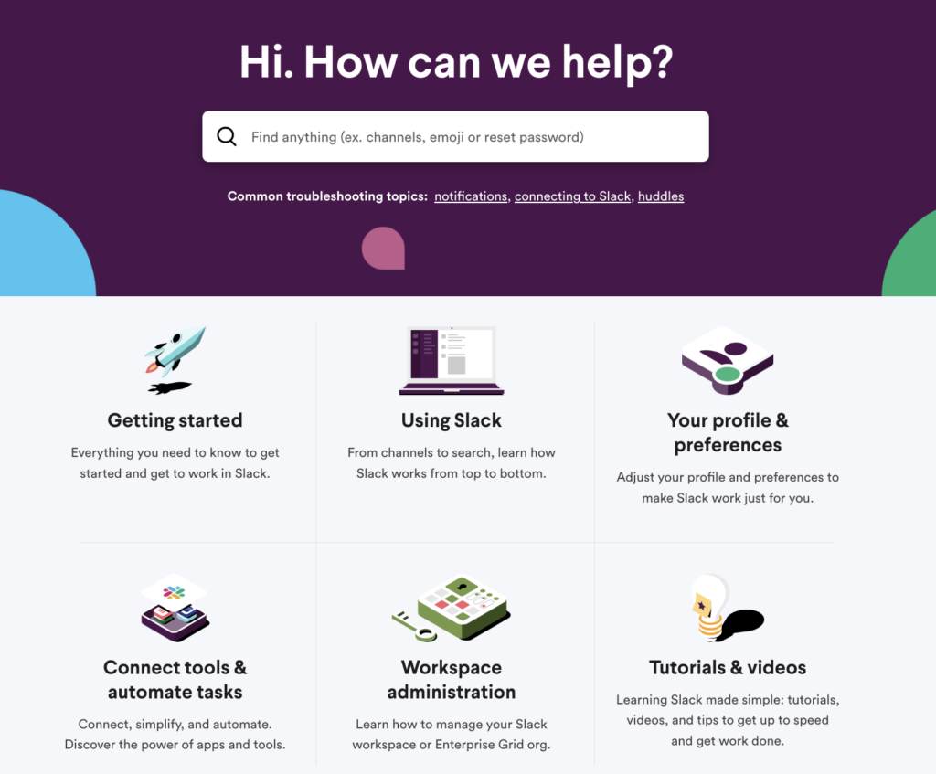
Slack is a popular collaboration and communication platform teams and organizations use to streamline their work processes.

Image source: Slack
Without a doubt, Slack’s knowledge base stands out for its simple navigation and excellent search functionality.
Image source: Slack
Fruity tip: Look for the content/questions people need the most from different support requests, and put those solutions at the beginning of your knowledge base. When customers see answers to their questions right away, they’ll keep returning to your knowledge base.
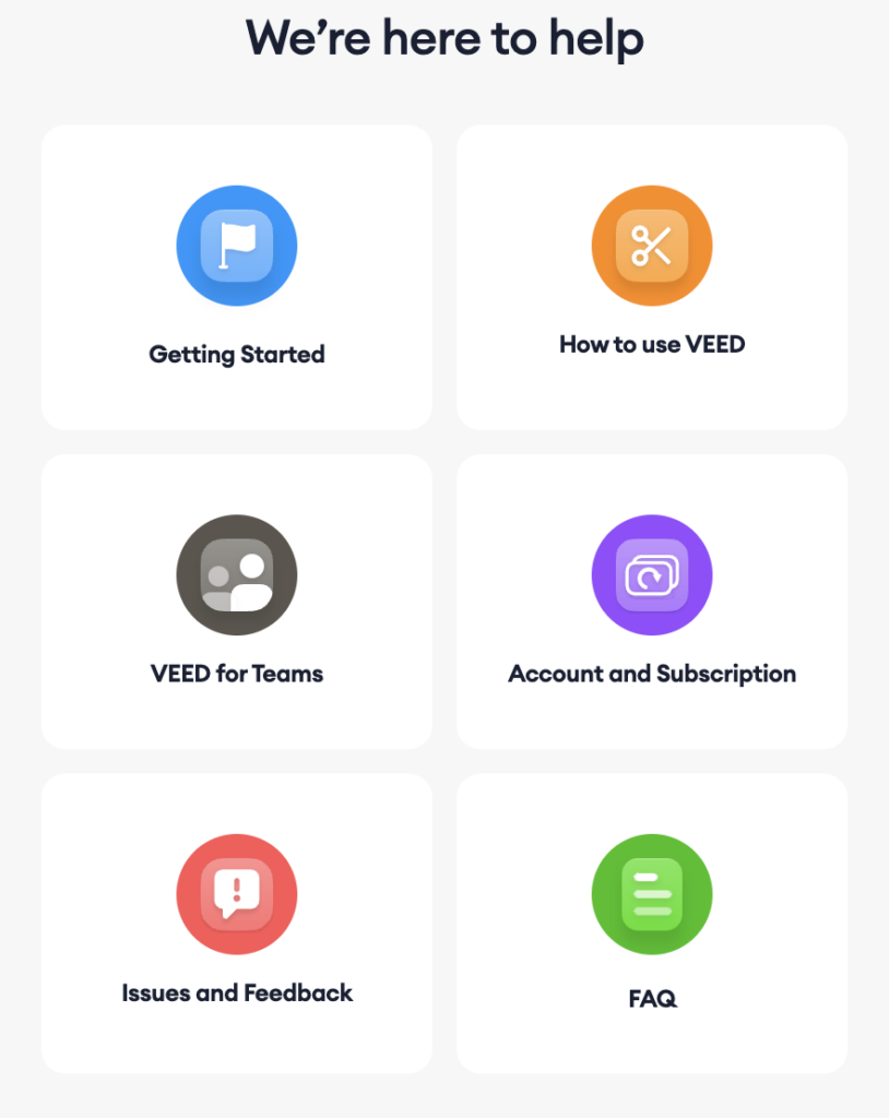
Veed.io is an online video editing platform that offers a range of features to help users create and share short and long-form videos suitable for social media, podcasts, YouTube, ads, and more.

Image source: Veed.io
Fruity tip: Index all the self-serve articles by the search engines. Optimizing your articles will help you to rank high on SERPs and directly increase conversions.
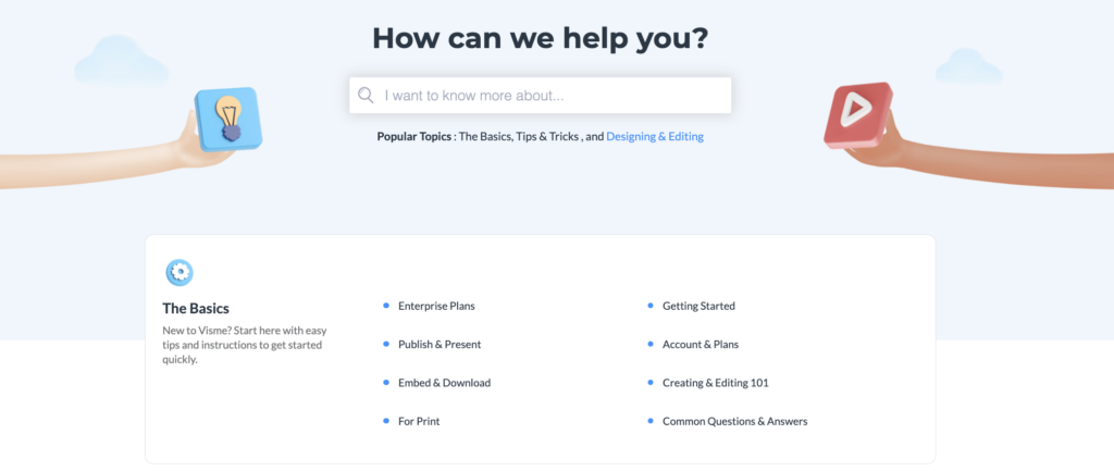
Visme is an all-in-one platform that empowers non-design professionals to create and share engaging visual content, including presentations, interactive infographics, videos, and more.

Image source: Visme
When writing and structuring your knowledge base, be frank and straightforward. And Visme does this very well.
Fruity tip: Always address your reader using active voice. Talk to them like you would over the phone.
Image source: Visme
Dropbox is a file hosting service that offers cloud storage, file synchronization, personal cloud, and client software.

Image source: Dropbox
Image source: Dropbox

Image source: Dropbox
We trust that the showcased help center examples have sparked some creative ideas.
One key takeaway is to ensure that users can effortlessly contact your team for further assistance when necessary, as your success is closely tied to theirs.
Now, it’s your turn to implement these strategies and learnings and build a knowledge base that resolves customers’ issues and inquiries.
Your knowledge platform is only as successful as the platform you use. To impact the user experience, you need a highly customizable knowledge base that adapts to your platform. Product Fruits acts as an invisible layer on top of your platform. You can add links to your knowledge base from hints, features, or triggers.
Product Fruits differentiates itself from other solutions by offering secure and safe knowledge bases. You can restrict knowledge to users through authentication. Or, opt to include your knowledge base in your platform’s domain.
With Product Fruits, no coding is required. Quickly respond to users’ needs by uploading, updating, and editing knowledge articles with a few clicks of a button.
Crafting a knowledge base doesn’t have to be daunting – our no-coding software simplifies creating support content.
Create your knowledge base today with our free 14-day trial, or talk to our onboarding specialists to discuss the best approach to reach your onboarding goals.