Have you ever had that nightmare where your trial users vanish into thin air? Well, it turns out it’s not just a bad dream – it’s a reality for many marketers.
A whopping 40-60% of the users who sign up for a free trial of your software use it once and disappear. Poof, not cool at all.
But converting these users into paying fans isn’t rocket science. You don’t have to slash your prices either.
We have the lowdown on 12 proven strategies from user onboarding experts to convert trial users successfully.
1. Unlock all features during the free trial
Free trials are the best opportunity to show your platform’s features and value. If you keep certain features gated during the free trial period, you risk users missing out on your app’s potential.
To captivate users from the start, heed the advice of Will Yang, Head of Growth & Customer Success at Instrumentl– He discourages withholding features, as reserving too much for paid plans often frustrates free users.
Will suggests offering a robust experience that delivers tangible value to free users, making the product indispensable.
By un-gating all features, you show users the proof of concept and validate the purchase.
2. Drive users to their “aha” moment immediately
Users will stay on your app if they find value during their first interaction. This “aha” moment is the magic key that shows users the benefits of an app. In fact, experience-driven onboarding sees double the amount of retention and purchase, a study by Forrester found.
Joseph Lee, founder of Supademo, shares insights on achieving success through a strategy centered on quick onboarding value.
In fact, by minimizing time-to-value and guiding users swiftly to the ‘aha’ moment, Supademo experienced an 18% increase in free-to-paid conversions and a 12% boost in activated users.
To achieve quick onboarding value, Lee advises aligning onboarding with user segments, showcasing pre-built templates, and personalizing content to have a meaningful impact.
A company that does a great job of matching personalization with user segmentation is Mural. This digital whiteboard platform immediately offers pre-built whiteboards that fit the role of new users.
For example, if a new user is an onboarding manager, Mural has pre-built templates for user stories and mapping. This personalized and pre-built approach immediately validates the value of the app.
3. Build product habits to boost engagement
Users who develop behavioral habits with your app are likely to see the value and convert to paying customers. Habits help build a “need” for your product, where users actively achieve their goal with your platform.
To build habits, you need to create an engagement-oriented strategy. This involves integrating elements that prompt users to incorporate the product into their routines.
Let’s consider the example of HabitBull, a habit-tracking app. HabitBull recognizes that users who consistently track their habits are likely to find value in their app and potentially upgrade to premium plans.
They provide users with daily reminders, insightful progress analytics, and personalized achievement milestones. These features encourage users to incorporate the habit-tracking process into their daily routines, making HabitBull an essential part of their lifestyle.
As users successfully establish and track habits with HabitBull, they are more inclined to convert to premium plans, appreciating the app’s value to their goal-setting and habit-building journey.
4. Complement trials with customer success plans
Onboarding and customer success strategies are like two sides of the same coin — they support users and highlight the benefits of an app. During onboarding, users want to feel supported, and that’s where customer success plans come in handy.
Customer success can create a human touch to the onboarding process. They can help tailor the experience to users and their needs, offering the best journey to solve their challenges.
Gary Hoffman, customer success manager at DonationMatch, suggests introducing success plans during free trials to make sure users keep returning, and to remind customers of the value.
Gary recommends a “land and expand” strategy for SaaS companies to convert free trial users. He identifies expansion and upsells as the leading indicators of renewal and successful conversion from free trials.
*Success plans are structured approaches or strategies designed to help customers achieve their goals and derive value from a product or service. In the context of free trials or onboarding processes, success plans outline specific steps, features, or actions users can take to maximize the product’s benefits.
5. Provide personal attention with webinars
“Webinars humanize the brand and engage with users on a deeper level,” says Kristen Gray Psychas, Senior Customer Success Manager at Banzai.
You can host live sessions and workshops, incorporate interactive elements like polls and live chats, and address users’ specific needs to contribute to a personalized approach.
By adding a human element, you can spark two-way communication and feedback. By doing this, you give your trialists and subscribers real-time feedback on their ideas and genuinely help them improve to reach their goals.
Kristen added that by identifying profound issues paid and trial users face, they could conduct weekly webinars to cover conflicted topics. Kristen’s approach involved leveraging automated webinars, allowing her to present pre-recorded content while actively participating in the chat, addressing queries, and maintaining audience engagement.
Fruity tip: Use a cloud-based webinar platform to create an immersive experience for attendees.
It makes users feel like active participants rather than passive observers. By engaging in real-time discussions, addressing their concerns, and providing valuable insights, you can build a strong connection and increase the chances of conversion.
6. Evoke urgency for instant action
To encourage quicker conversions, instill a feeling that delaying the decision may result in missing out on valuable benefits.
Here are some examples of how it can be achieved;
A. Limited-Time Offers:
Introduce time-sensitive promotions, discounts, or exclusive deals available for a short duration. For instance, offering a 24-hour flash sale with a significant discount for users who upgrade during that period.
See how Brendan Hufford sells his course – SEO for the Rest of Us at a massive 90% off. The offer explicitly outlines the course content and emphasizes a limited-time deal with a specified expiry date. This makes people feel like they must act fast before the deal disappears.
B. Countdown Timers
Display countdown timers on your website or within emails. Highlight the remaining time for a special offer or trial period. This visual countdown creates a time constraint, encouraging users to decide quickly.
C. Scarcity Messaging
Emphasize limited availability or stock to convey scarcity. Communicate that certain features or plans are in high demand. An example could be stating, “Limited spots available for our premium plan upgrade.”
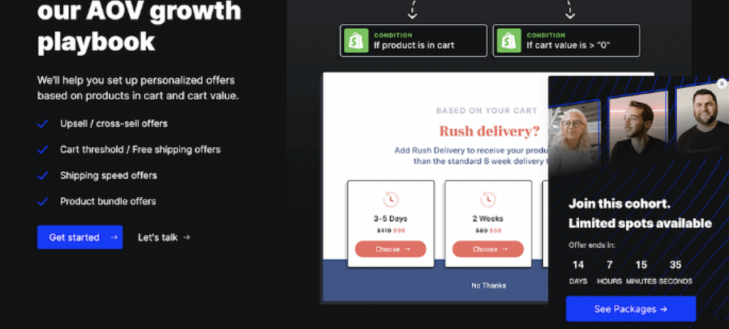
See how ConvertFlow creates a sense of urgency by highlighting the offer’s scarcity with “limited spots available.” Within eight seconds of landing on the page, a sidebar popup features a countdown timer to emphasize the urgency. It guides users straight to the pricing section at the end of the page. As for the CTA button- it stands out in bold blue, encouraging visitors to take action.
They used a countdown timer and scarcity messaging- the ultimate urgency pack!
D. Event-Driven Urgency
Align promotions with specific events, biggest sales, holidays, or milestones. For instance, offering a special discount for users who upgrade on the platform’s anniversary or during a holiday season.
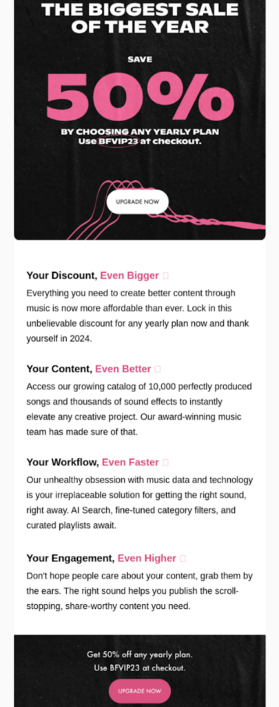
Soundstripe is doing an excellent job with its compelling copy that clearly outlines the benefits of upgrading. Offering early access and a 50% discount on any yearly plan adds an extra incentive for users to upgrade. Their engaging messaging conveys the direct advantages users can enjoy by choosing an annual plan.
E. Personalized Urgency
Tailor urgency messages based on user behavior. If a user has engaged with certain features during the trial, send targeted messages indicating that those features will only be available with the premium plan after a specific date.
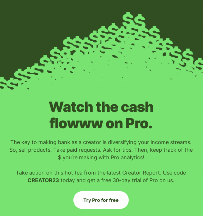
I like how Linktree tempts users to explore Pro Analytics with a 30-day free trial. This allows users to experience the benefits firsthand, and if it proves valuable, it’s a win for both the user and the brand, gaining another paid subscriber!
7. Send behavior-based onboarding emails
Behavior-based onboarding emails offer personalized guidance. These emails trigger based on specific user behaviors like signing up, completing tasks, or reaching milestones, avoiding a one-size-fits-all approach.
This way, users receive information that aligns with their journey, which makes the onboarding process relevant and engaging. It drives product adoption and ultimately contributes to higher conversion rates.
For instance, observe how Zapier sends emails to users who sign up with a Google account, providing additional information and tips on usage.

8. Use clear communication for trial success
Anupam Jindal, co-founder of Fulcrum, emphasized the importance of clear and specific communication.
With targeted messaging, they informed the users about the trial duration, available features, and the benefits awaiting them. Visual aids displaying capabilities and deadlines help convey the product’s potential.
He added, “The messaging wasn’t just a list of features but a conversation aimed at transparency. It highlighted both functional aspects and the genuine impact users could experience. The goal was to make users feel connected and understand how their product could make a difference for them.”
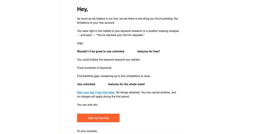
Take a glance at this Semrush email—it’s simply fantastic. Wondering why? It taps into the user’s pain points with a simple, engaging copy that effortlessly guides you to the free trial. The language is refreshingly simple, making it an enjoyable and conversational read.
9. Consider asking for payment info at the start of the free trial (controversial, we know)
Yes- this is a controversial point. But hear us out on considering this argument.
Instead of offering users a free trial without an immediate commitment, this strategy involves collecting payment details at the beginning of the trial period.
I know seeing this meme sucks.
But it filters out spam and opens the gate for little-intent buyers. You need to understand the rationale behind opt-out trials, which lies in user psychology and commitment.
The average free trial conversion rate for opt-out trials is 48.80%, while for opt-in trials, it is 18.20%. It highlights how users will likely perceive trials as a valuable service, and their upfront commitment increases the chances of users converting. DARN GOOD THING.
Fruity tip: With growing concerns about trust, some customers might hesitate to share credit card details. Yet, the smart move is to try different approaches and see what works best. Test whether bringing in more users without asking for payment information upfront increases conversions.
Adapt your strategy based on the results and find the right balance to boost conversions while respecting user concerns.
10. Send timely reminders as trials approach the end
As the trial period winds down, users might be on the verge of deciding whether to continue.
We are all busy professionals, so reminders, whether through emails or in-app notifications, serve as a gentle nudge, bringing the impending deadline to their attention.
Just keep in mind not to spam your prospect’s inbox with unnecessary messages.
For instance, as the Shopify trial entered its final day, users received a thoughtful email emphasizing the platform’s benefits.
What stood out to me was the clear articulation of how Shopify could help users. Plus, including two interactive buttons—”Choose a Plan” and “Compare Plans”—offered users the freedom to explore options effortlessly. It’s a great example of timely and persuasive communication.

Asana, did a good job too. Users receive a simple email when their trial ends. With its to-the-point copy, Asana asks customers to compare plans and find their best fit.
11. Offer clear documentation and tutorials for guidance
Documentation and tutorials guide your product’s features and functionalities. Here’s how this strategy contributes to the conversion process:
- Clear documentation enhances user understanding
- Streamlined tutorials simplify onboarding
- Reduce support tickets and allows your customer success team to focus on adding value
- Accessible documentation reduces user friction, providing quick answers for a positive experience
- Detailed documentation builds user confidence, empowering independent product exploration
- Well-documented products contribute to a positive user experience
Product Fruits is a tool that helps create clear documentation and tutorials by providing a step-by-step guide template. It allows businesses to incorporate visuals, such as screenshots, GIFs, screen recordings, charts, graphs, and videos, to cater to diverse learning preferences and enhance the effectiveness of the documentation.
The example below is of product Fruit’s knowledge base. It’s simple and helps users find answers to specific queries quickly.
12. Optimize conversions with a strategic setup sequence
Optimizing conversions means ensuring users quickly see a product’s value for better chances of them becoming customers.
Khanjan Kotecha, Lead Product Manager at SocialPilot, highlights that getting users to the “Aha” moment, where they understand the product’s value, increases their chances of sticking around.
At SocialPilot, they noticed a trend- users exploring the tool without finishing the setup had lower conversion chances. To tackle this, they ran a test. Trial users had to complete the setup before navigating the product.
There was no significant improvement for users on SMB plans, and in some cases, there was even a slight decrease in conversion rates with the orchestrated setup. But there was a fantastic 10% boost in conversion rates for Agency plan users.
Fruity inspiration- Businesses should keenly observe user behavior, particularly during setup. Doing tests, like ensuring trial users finish setup before exploring, can help. Come up with your ideas and test them before scaling.
But it’s crucial to acknowledge the diversity in user segments; what works for one may not for another. So, it’s wise to personalize strategies for different user types to ensure everyone gets the best experience and becomes a happy customer.
Convert free trial users easily with Product Fruits
Guide users from free trials to paid conversions is a nuanced process, requiring insight into user behavior and effective strategies.
To execute these tactics successfully, you need the right tools. Product Fruits is a powerful onboarding platform that lets you easily create personalized and flexible in-app experiences for different user groups without needing to write any code.
All your onboarding elements, customization, and custom rules in one tool- make your onboarding stand out.
Try it for yourself — 14 free days on us.
